Hello Everyone,
I am working on a web page and I’m just a little stuck in my style. I always feel like my style is soo bulky and 90’s…I was born in the late 80’s sooo…I think this makes sense LOL…Anyway, I’ve posted here before and got a ton of feedback and although some comments were harsh I think it really helped push me. So, here is another site I am working on. I am hoping for feedback that will push me to that next level because I want to become a better designer. I love that clean polished look but have a hard time obtaining it ![]() Here’s the design I came up with. Pointers. advise, feedback is appreciated. I apologize that there is no link, this is still under construction so nothing is live yet.
Here’s the design I came up with. Pointers. advise, feedback is appreciated. I apologize that there is no link, this is still under construction so nothing is live yet.
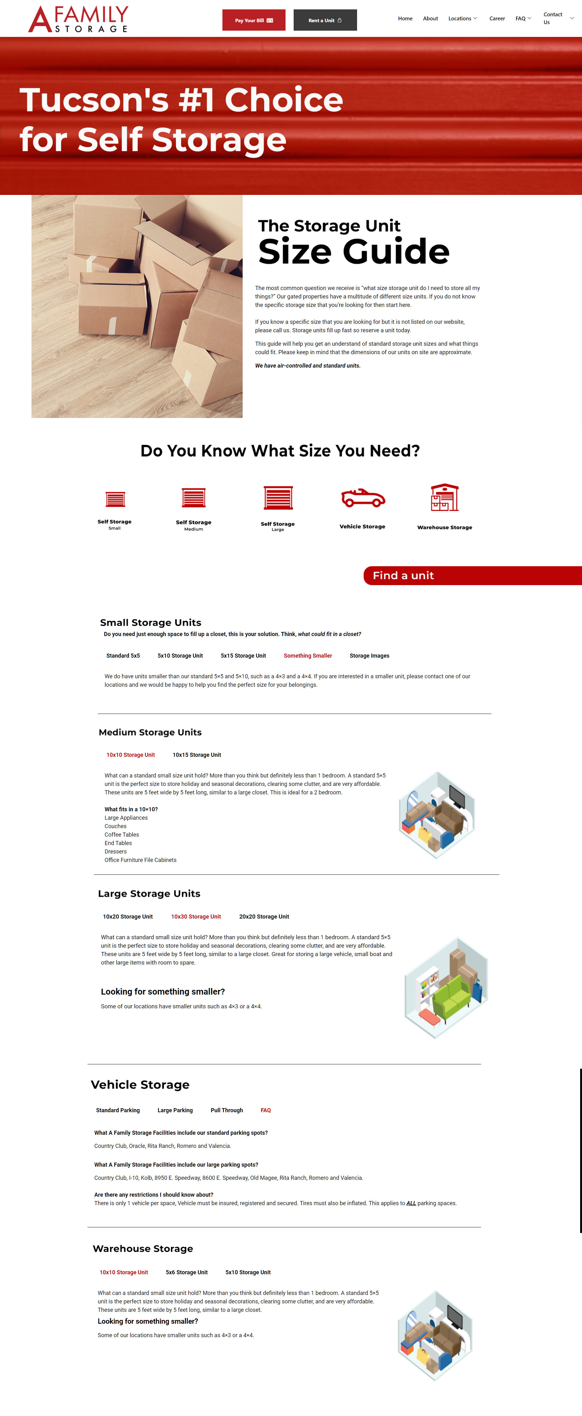
This is a self storage facility kind of like public storage but not as massive.
Their main color is red.
Their other colors are light gray and dark gray.
Animations -
There are some animations on the page. Hovering over the icons under “Do you know what storage you need” will grow the icon to a slightly larger size. The “find a unit” button on the right of the page bounces a few times to redirect your eyes.
The tabs for the sizes are click able but no animations is added to these.
The storage images - are linked to the software that they use. I can change this however, they use these image when reserving a unit.