Hey Guys - looks like I’m doing the same course as another person the forum! Now it’s my turn to design a homepage for The Bag Lady. The premise is that the owner sells at markets and is looking to establish an online presence. In order for that to happen, I need to design a homepage.
I’ve got some questions that need answering - if you have the time I’d really appreciate it if you could look at the design and answer the questions.
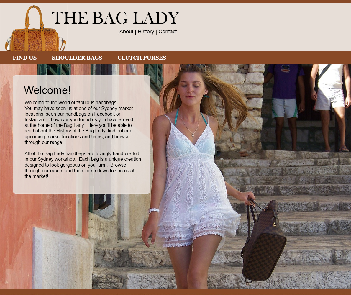
Do you think this site would be attractive to women aged 20-55
– Kind of difficult to answer without taking into account the answers on the other questions. I think this is a good start, but it needs work.
The site aims to give you information about The Bag Lady – does it look like it would achieve that aim?
– Yes. You have the about and history links right up front. If the were for a commercial client, you’d probably put those in a footer menu as it’s secondary information, typically, to the product.
Do you like the colours? Do they say ‘handbags’ to you?
– I like the brown. Not sure about the tint or light brown at the top.
What don’t you like about the design? What’s not working for you?
If you could change something, what would it be?
– I’m going to answer these at the same time. Overall, the layout is pleasing. I like that it looks like it would be easy to navigate, and I like having the large lifestyle image. Here’s what I think you could do to improve this. As I mentioned before, I’m not crazy about the light brown color at the top; it might look good if this was straight white. The Bag Lady type could use some help. It’s a little unimaginative looking to me. I’d put the About, History, and Contact in a footer menu. The welcome copy is too long in my opinion. I doubt people want to read that much. It could be a third of what it is. If you have to have all of the narrative, add a read more link to the about or history page. The photo has potential. I like the look of the model, her attitude, and the way she’s holding the purse. I don’t like the two guys in the back corner. They totally kill the photo. It might take a little work to clone in a stone wall to cover those guys, but it would be worth it. After that, lighten the exposure of the image overall. Either that or leave the overall exposure as it is and lighten the exposure on the model to get her to pop more off the background.
Yes. An unwritten rule: When a person’s head is cut off in a photo, the ape-descendant’s eye finds a different identifying feature; most typically the crotch. For some of us even less evolved specimens, it happens the other way around, but that’s another matter.
If their faces were included, and they look upon the star of the shot with admiration, envy, or lust, it might work in her favor, but the way this is, their nether regions are an unwelcome distraction.
Both Steve and HB beat me to what I was going to say.
The only thing that struck me immediately is the two bodies in the back.
Other than that, I think it does what you need it to. You might want to try a different header color. I’m in agreement with Steve on that one as well. I personally would prefer white over that dull beige/tan/nude (can’t quite tell what color it is)
Uh… what two guys?
Bags? The site sells bags?
The model in the barely there blinding white clothing is drawing all the attention. Even the handbag she is carrying fades into the background.
Obviously I’m not your demographic. I’m not sure in what way the site would appeal to women aged 20-55.
A website to sell bags doesn’t necessarily have to give information about the company. When I go to a retail site I am looking for product first. Maybe someday if I care enough, I find out about the company that makes the product. Or not.
The colors you might consider tipping the pinkish tan one way or the other, that is either going to go green or red depending on individual monitors. The brown is ok. But for representing leather it may be a bit weak.
Yeah, looking at the overall thing, you have to get rid of the bodies in the background.
“If their faces were included, and they look upon the star of the shot with admiration, envy, or lust…”
I’m not sure that’s particularly “woke” these days… Might be more of a detriment to the whole thing.
My general impression is that a young woman, who appears to have neglected to wear a dress over her underwear, has two anonymous men checking her out as she jauntily bounces down some steps with a handbag. The fact that the men lack heads seems to suggest they’re thinking with body parts not normally associated with their brains.
Will this appeal to women between the ages of 20–55. I don’t know. It got my attention, though.
Aside from all that, it’s a nice color scheme. I like the browns. The boxed typography seems a bit too corporate. It’s really not a bad layout at all. I’m just not sure that photo is appropriate — maybe for a Victoria’s Secret handbag collection (if there is such a thing), but, I do have reservations about it conveying the right message for the product unless a deliberate decision has been made about the personality of the entire website being one that plays on sex appeal to sell handbags, which, honestly, might work — I don’t know. Like PrintDriver said, I’m not exactly the target audience.
There are some overall touches of sophistication in the design, but there are many details (as pointed out) that drag it down (color, photo subject matter, etc). On top of that, the overall look and feel says “2008” which IMHO is actually favorable for web design because it feels like it has personality, but it probably won’t come across to most other contemporary web users as a site that is ‘up-to-date’. This feels like a website that was created by a print designer, and yes, that is a bad thing (even if you are a really great print designer). There’s just some principles to web design that are very different from print, so please don’t take that at all personally.
Specifically, the browns hinder the sense of contemporary design. The other major matter here is the use of two different menus, and the way you placed them on the page. The menu under the title is right aligned and the menu inside the ‘menu bar’ is left aligned. The block of text inside the white/faded box has the effect of seeming too small and looking like too much to read.
I suggest you take the "about/history/contact’ menu and place it on the far right instead of directly under the title. Put more options in the menu bar, and make that bar about twice as tall so there’s more emphasis on “these are important buttons”. Then, I would say you need to break up the rest of the page beneath that. There should be more buttons, more options, more ‘sections’ to the page. (Not that you need to just make up stuff in order to do that, but surely there’s more to this site than just 6 pages? You can even feature a handbag or two? Just some ideas.) Lastly, do you plan to give this site a footer? I might just be missing it but I don’t see one currently. There’s a few reasons to have one.
I hate to sound harsh in any way, but I think there is some leveling of ‘going back to the drawing board’ that is needed here. Take a good look at other sites that you find successful and try to emulate some of the styling that you see there, to some degree. Web is very different from print design in that far less of it is ‘plagarism’ because websites are more impacted by user behavior and maximizing usability and “style” is ultimately less important for it to be successful. You wouldn’t blame a child for attempting to walk like the adults around them…“hey, you need to walk your own style!!” No way…you’d call that child wise for doing so (by no means calling you a child, that’s just the analogy that came to mind first).
I hope that makes sense and isn’t too overwhelming.
Thanks for all your feedback! I’m getting very strongly that the image I’ve chosen isn’t working at all. I’ll change that up. I’ll also add a footer and look at finding a more ‘modern’ brown.
@Steve_O - I’ve removed the tint - yeah, does look better!
@grady00 - many thanks for your detailed notes. Unfortunately I haven’t got time to go back to the drawing board (left it all to the last minute - natch) but I will take on board everything you’ve said. I’ll move the header links to the top right and increase the size of the menu bar. It did make me laugh that it’s all a bit 2008!! Doh!! I was really trying to not make it look like a cookie cutter WP site and clearly went a bit too retro.. >.<
If you’re going for a trendy, in-today, out-tomorrow look you’ve missed the mark, but if you’re aiming for clean, simple, uncluttered, usable and able to appeal to the unusually wide age group you mentioned, I think the look is probably appropriate with a few changes. As mentioned, the photo is an odd combination of good and not so good, and the typography is more corporate than stylish. As for the general look, I would characterize it more as conservative or traditional than “retro,” which, depending on the merchandise and target audience, might be a good sweet spot.
Do you think this site would be attractive to women aged 20-55
Perhaps. It looks more like an Etsy shop or similar hand-made goods-esk webpage. I image it would appeal to a narrower demographic of woman, but that could very well be the target audience.
The typeface, color, and the handbag at the header seems to lean to the more 40+ age group, while the photo sports a younger model - It’s not easy to design a piece that both a 55 year old, and a 20 year old college student would both equally like. You risk losing both audiences.
The site aims to give you information about The Bag Lady – does it look like it would achieve that aim?
It gives the information I would need to understand the product and the creator.
Do you like the colours? Do they say ‘handbags’ to you?
It’s all very neutral with little contrast. My eyes tend to wonder aimlessly a bit until hitting something pertinent. Perhaps if the photo had a transparency over a dark background, you could focus the eye to something specific. Say, perhaps a small cluster of handbags in the foreground.
What don’t you like about the design? What’s not working for you?
Thankyou! I have to say in 100% of the cases I’ve put up work for review, my design has gotten 100% better! When the first designs I put up were ripped apart it was pretty rough, but in every negative response there were good learning opportunities. So all good. I just appreciate the time people take to give their expertise and opinions.
My assignment is in - I’ll wait until it’s graded and then pop it up. I’m still not completely happy with it, but deadlines are deadlines!
Eeek, I kept meaning to come back to this and never did. The end of my course raced towards me like a freight train and everything else got thrown out the window.
If you were wondering, the final designs ended up on my (really rubbish and needing work) portfolio site: http://gandercom.com/
No critique required at this stage!! I’ll start a new thread when it’s ready