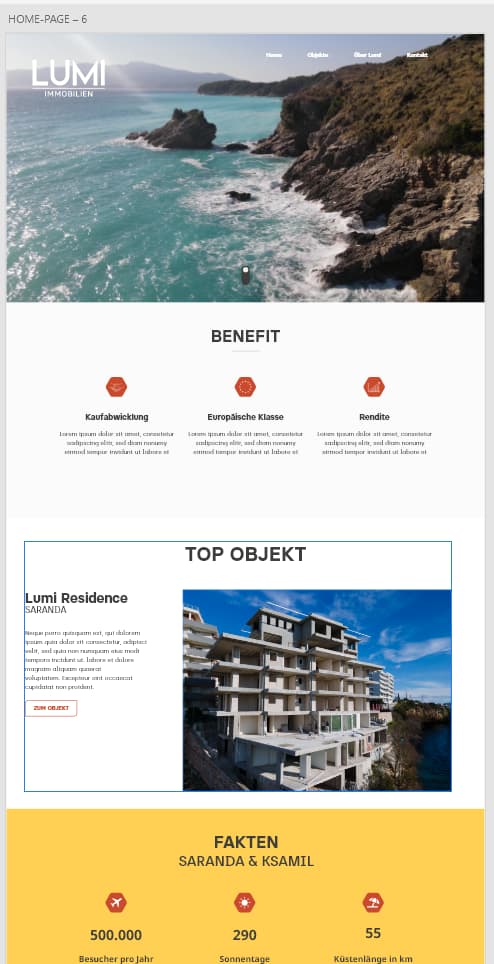
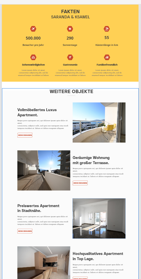
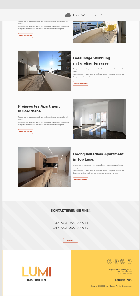
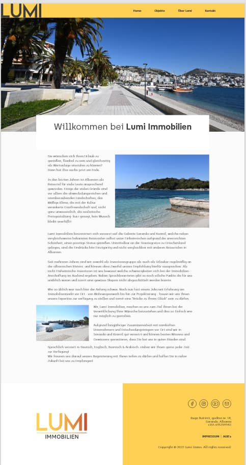
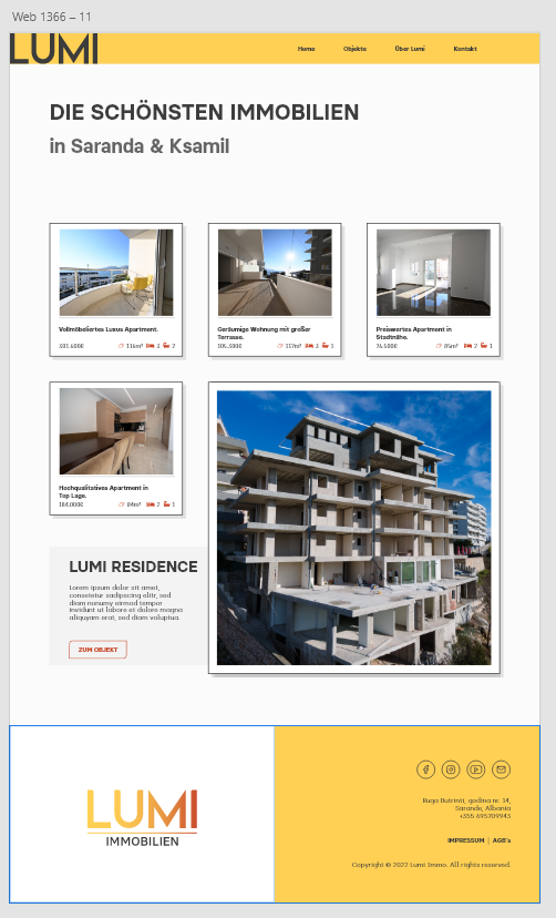
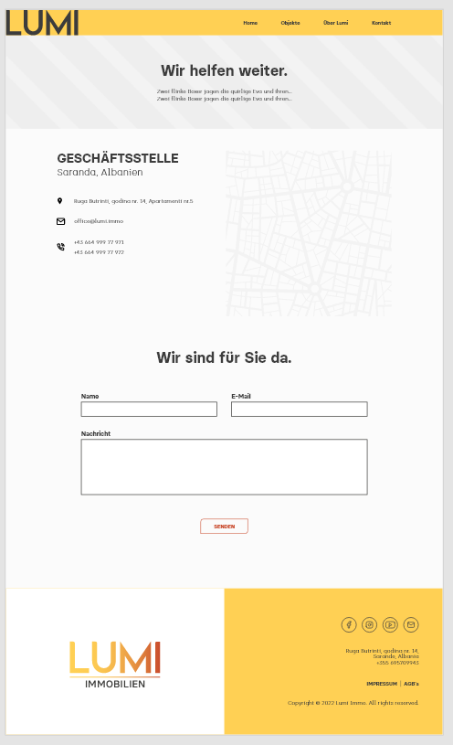
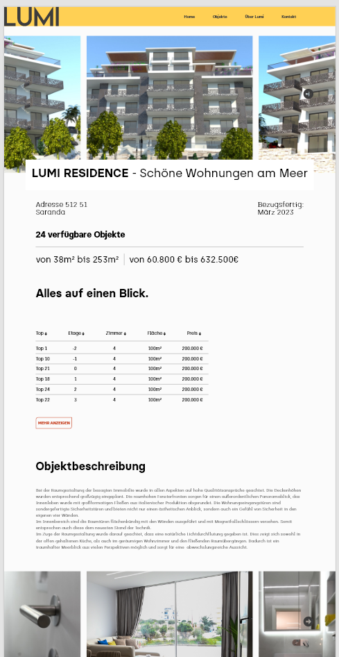
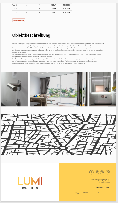
Hello guys, I designed a wireframe for my website, it’s about a real estate company by the sea.
The photos and some elements are currently only intended as placeholders.
Do you have any suggestions for improving the design and structure of the pages? I’m particularly dissatisfied with the header.
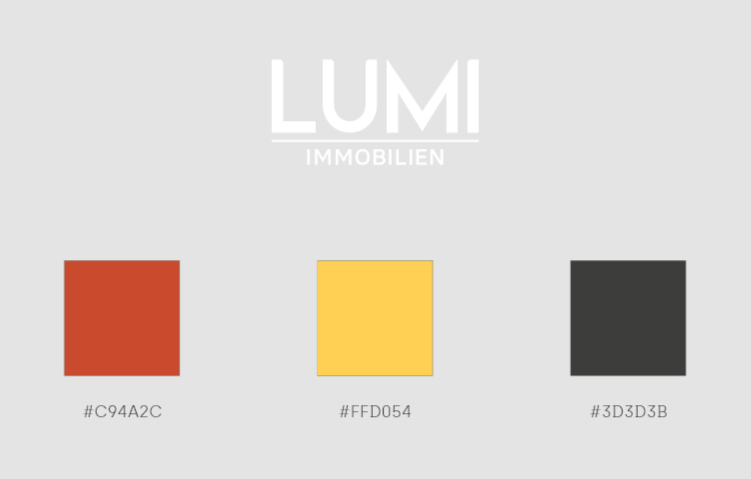
May be little more bright colors ?
It’s difficult for anyone to say anything about your website without knowing what you’re trying to achieve.
Who is your target audience?
What is the purpose of the website - to advertise properties, maybe?
What kind of return on investment do you think your business will get for your website?
What’s the cost to your business if customers go to your website and are left feeling underwehlmed or with the impression you’re not a reputable business?
Not to be mean, but do you think it could be worth hiring a professional?
I actually wrote something similar as a response initially then didn’t post it, but that was exactly my first thought.
I am afraid, this looks like a website conceived by someone more used to producing in-house Word documents and bullet-pointed Powerpoint presentations.
There are so many things wrong with it, typographically, that it is not an easy thing to address. Ideally, you need the services of someone who understands communication, clarity, legibility, hierarchy – that is not something that can be fixed with a couple of forum answers.
Typography aside, although the first page is not unattractive (largely due to a nice photo), it definitely does not say coastal real estate. It more says coastal holiday getaway – that’s half your visitors down at the first hurdle. You need to define your audience and then speak to them in language (visual and lexical) that they are going to respond to and feel comfortable with.
Not particularly positive on my part I am afraid, but I hope it helps in some small way – even if slightly deflating.
Good luck.
2 Likes
It was so boring, I didn’t even look at it. Just skimmed and said, whatever.
too many words, not enough focus.
I don’t know German so I can’t tell what sections are titled but by their layout it looks like your website is for a hotel and has a page for different room options, a page about the hotel, a section of hotel amenities, etc.
First place to start is always layout and, in consideration with that, page hierarchy. When making a website I think “what is the first thing I expect to see on this (be specific) website.” Then I’ll build what I can of the Home page. Then I think about if I was a potential client “where am I most likely to want to click on next?”. This is page 2 in terms of hierarchy and I would make sure that on Home in the Landing, there are immediately 2 ways for the client to click to page 2 without scrolling. This is one example of making happy clientele on your site. They don’t want to read so make it obvious to navigate to the most popular pages.
Also the pretty ocean front picture is nice and a good size but I recommend picking a new layout for that Landing. Full image backgrounds in Landings have fallen out of style because it ends up being useless space and forces a client to need to scroll to learn more about what kind of website they’re on. Research competitors and similar tier real estate companies across the country to see what layout their website’s Landing is.