For quite some time now, I have been wanting to ease up on client work and do some more self-initiated projects, specifically around type and font designs that I have been working on for years in and around paid work. I have finally forced my own hand and signed myself up to exhibit at show that is linked to a local Literary Festival. This weekend I have been preparing the various parts of it.
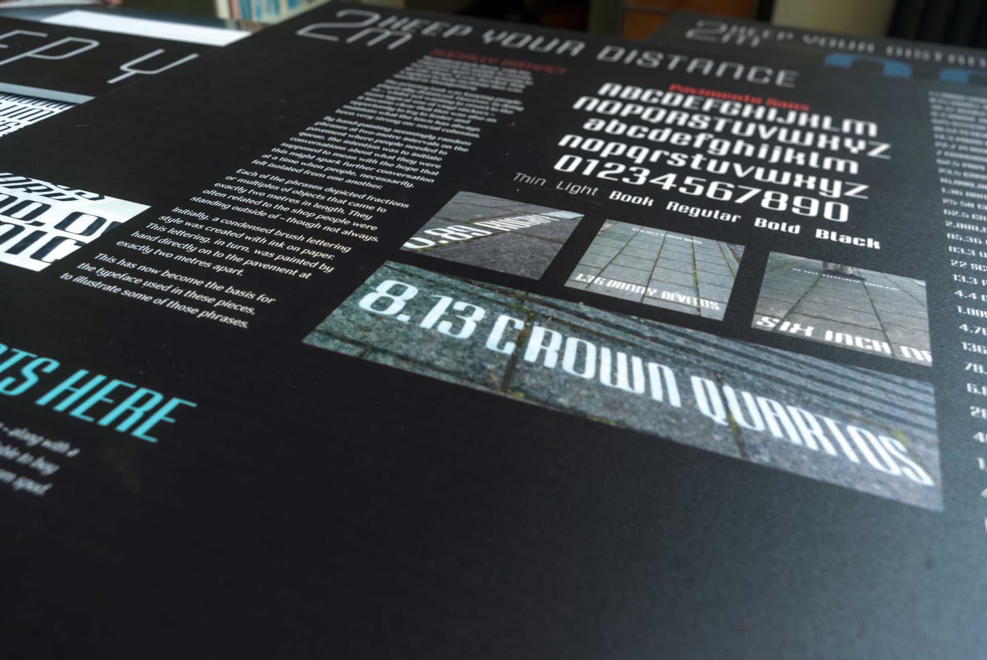
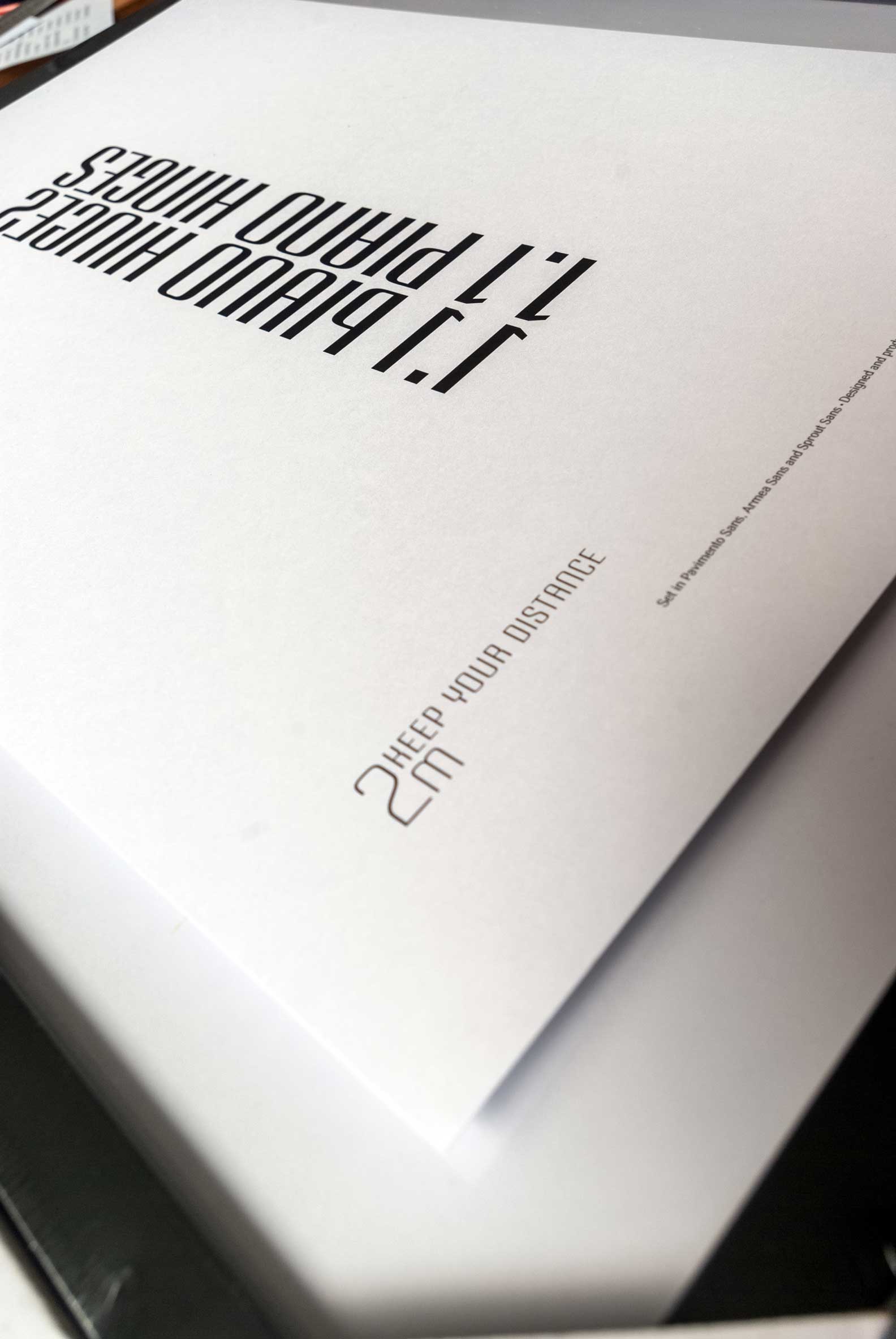
What I am using for it was something I started in Covid Lockdown. I was asked to create something that would help keep people 2m apart when they queued to go into shops. I knew, I didn’t want to use those vinyl stickers. I also wanted to create something that got people talking, in a time when we were all very isolated from one another.
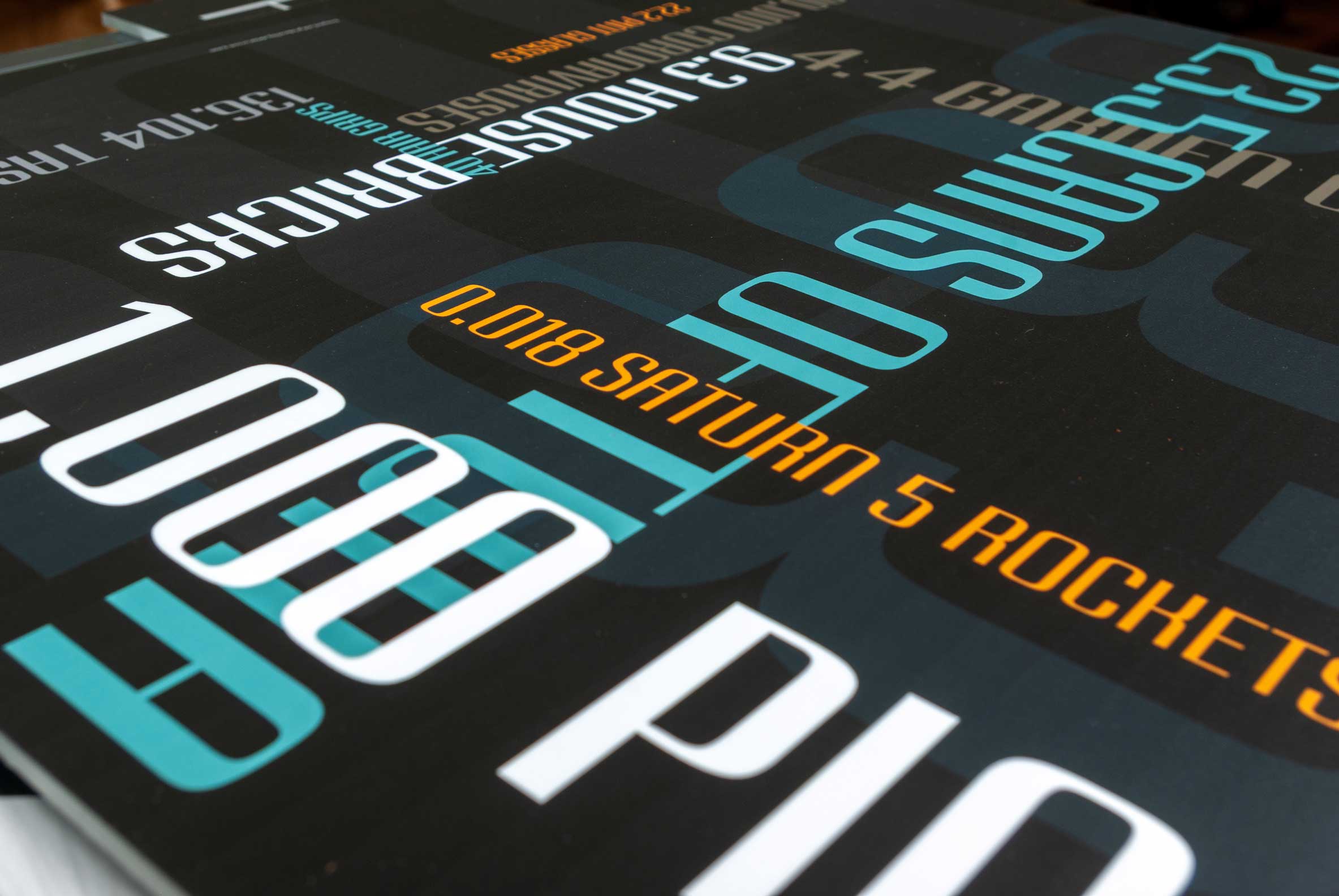
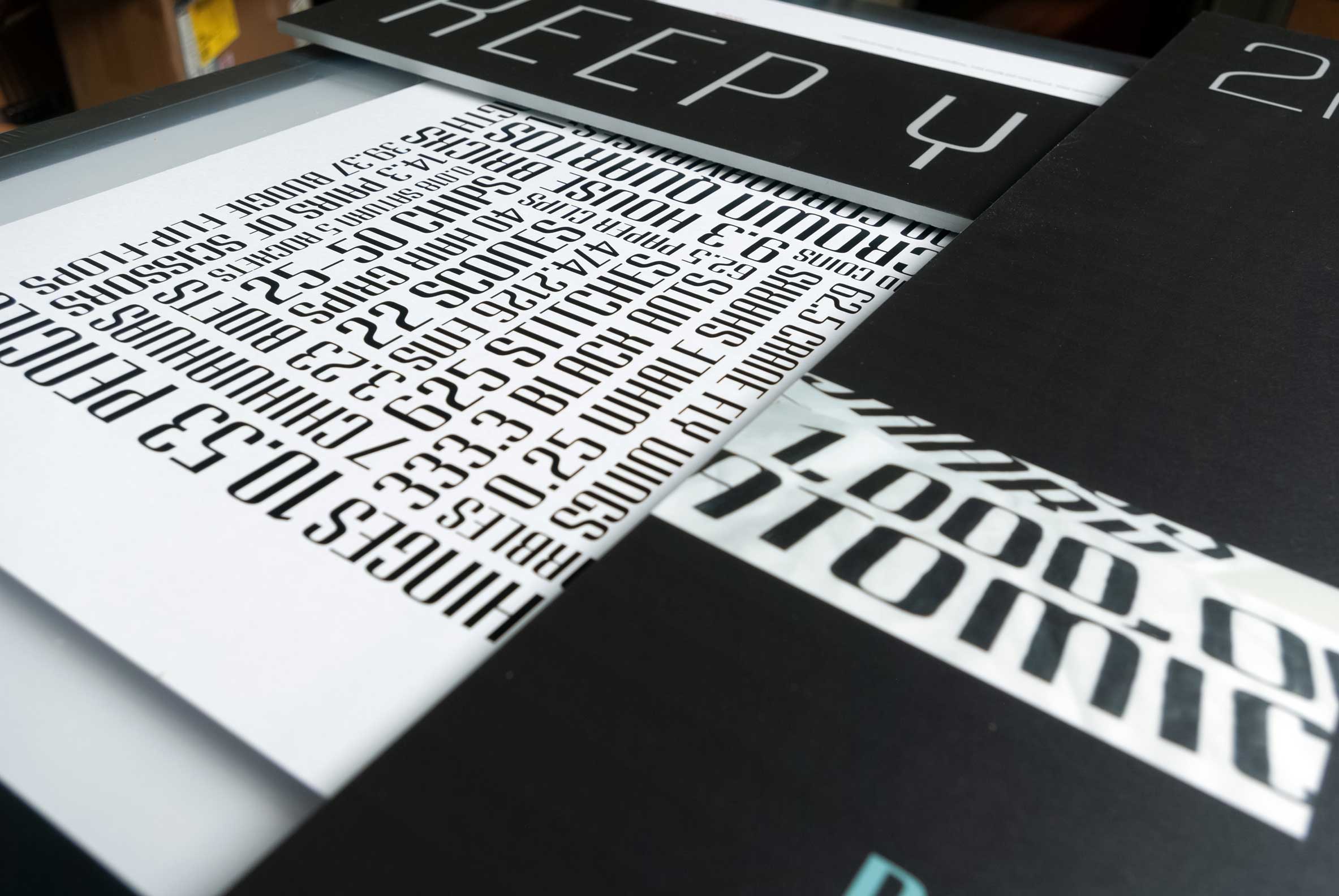
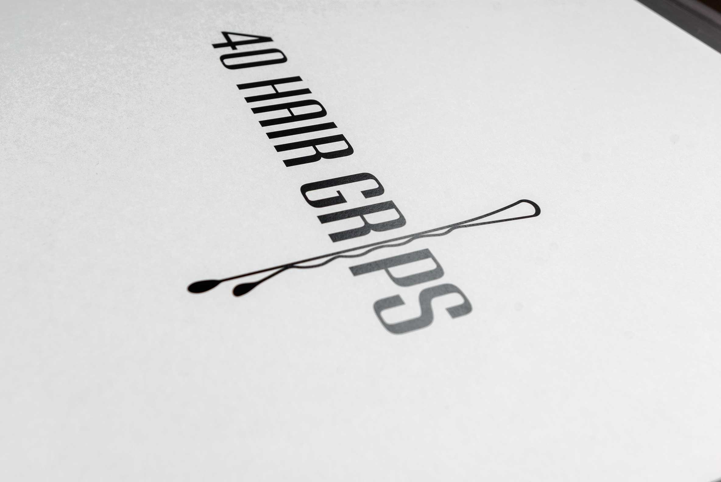
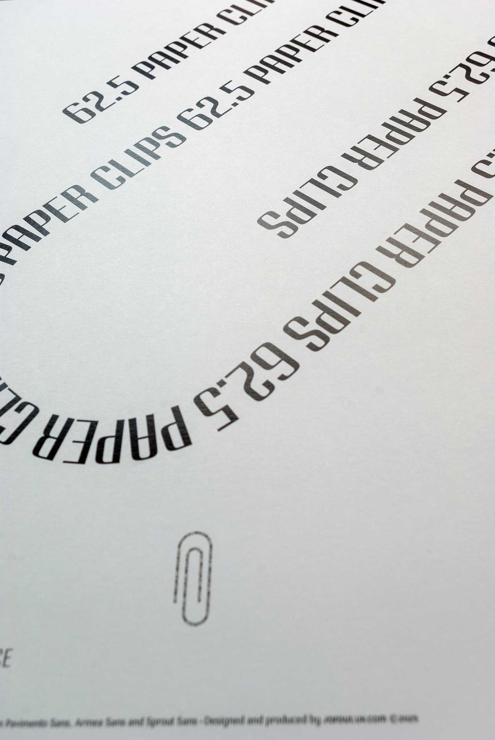
I came up with the idea of using things (multiples and parts of) that were exactly 2m in length, but were ambiguous enough that without any sort of explanation, might get people talking and questioning them. Sometimes, they related to the shops they were outside of. Sometimes not.
Either, way, it seemed to work, and I’d often overhear people questioning them and then they’d end up having longer conversations whilst they waited.
To do this, I devised some brush lettering with ink on paper, then using these designs, I just painted them in white masonry paint on the pavements all around the main square and a few side roads of our town.
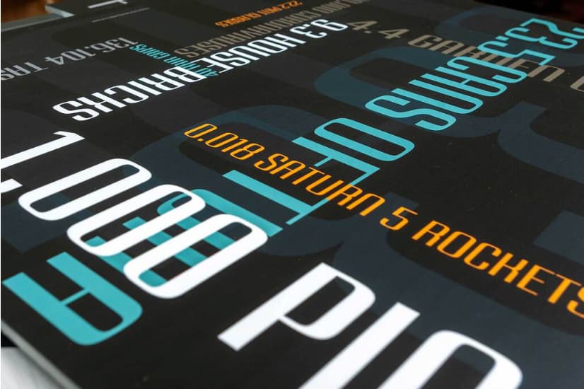
Recently, I decided to go further and make this into a display typeface and then use that to illustrate some of the phrases – 7 Chihuahuas, 0.018 Saturn 5 Rockets, etc, etc – for this exhibition. It is by no means finished, but I have done enough of it to do this exhibition.
I have no idea what I hope to gain from it, but I just wanted to force my own hand to do some thing that wasn’t a client-led, brief-driven thing.
I used this and another of my fonts (for longer tracts of text) that I will finish in the coming months.
Generally, I want to move towards font design and all things typographic and drop many of my clients. I will keep doing books, as I love them and book design is directly related. I have also been talking to someone about setting up a small private press as well. We’ll see. Again, early days, but all very exciting.
Things are all a change for me. Not sure where it will go, but for the first time ever, you never know, I may actually get my own website up and running.
I may even include (or build a separate site) some portfolio pieces of historic work, if for no other reason than as a record of what I have done over the last three decades. Most of the stuff I have done is archived, in plans chests, or boxes in the loft.
I’m not even quite sure why I am writing this now. Maybe to force my hand even more. If I’ve said it out loud, there’s no going back!!
Anyway, I have attached a few WiP pics of the various parts of the exhibition. Best I go install it now!