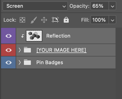
I’m wondering what the different color boxes are in the layers panel.
This is something I’ve seen before when working with pre-made mockup templates but always kind of ignored them because I just need to get the job done.
Is this something that is put there just to make it easier to differentiate the different layer groups? Or is there something else going on?
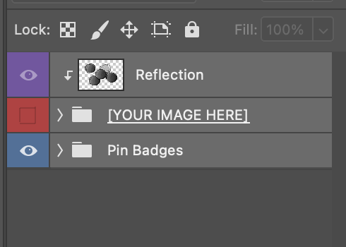
Also, when I turn off the visibility for the second layer, it automatically turns it off for the “Reflection” layer. I was hoping to see the reflection layer as is to study it, but I can’t look at it alone. What’s going on here?
As for the Reflection layer, see that little downward facing arrow? That indicates that the layer/affect/filter only applies to the layer below. So when you turn off visibility for YOUR IMAGE HERE, it automatically turns off visibility for Reflection. When you turn on visibility for YOUR IMAGE HERE, the visibility for the Reflection layer will automatically turn back on.