No idea - you haven’t told us anything about it.
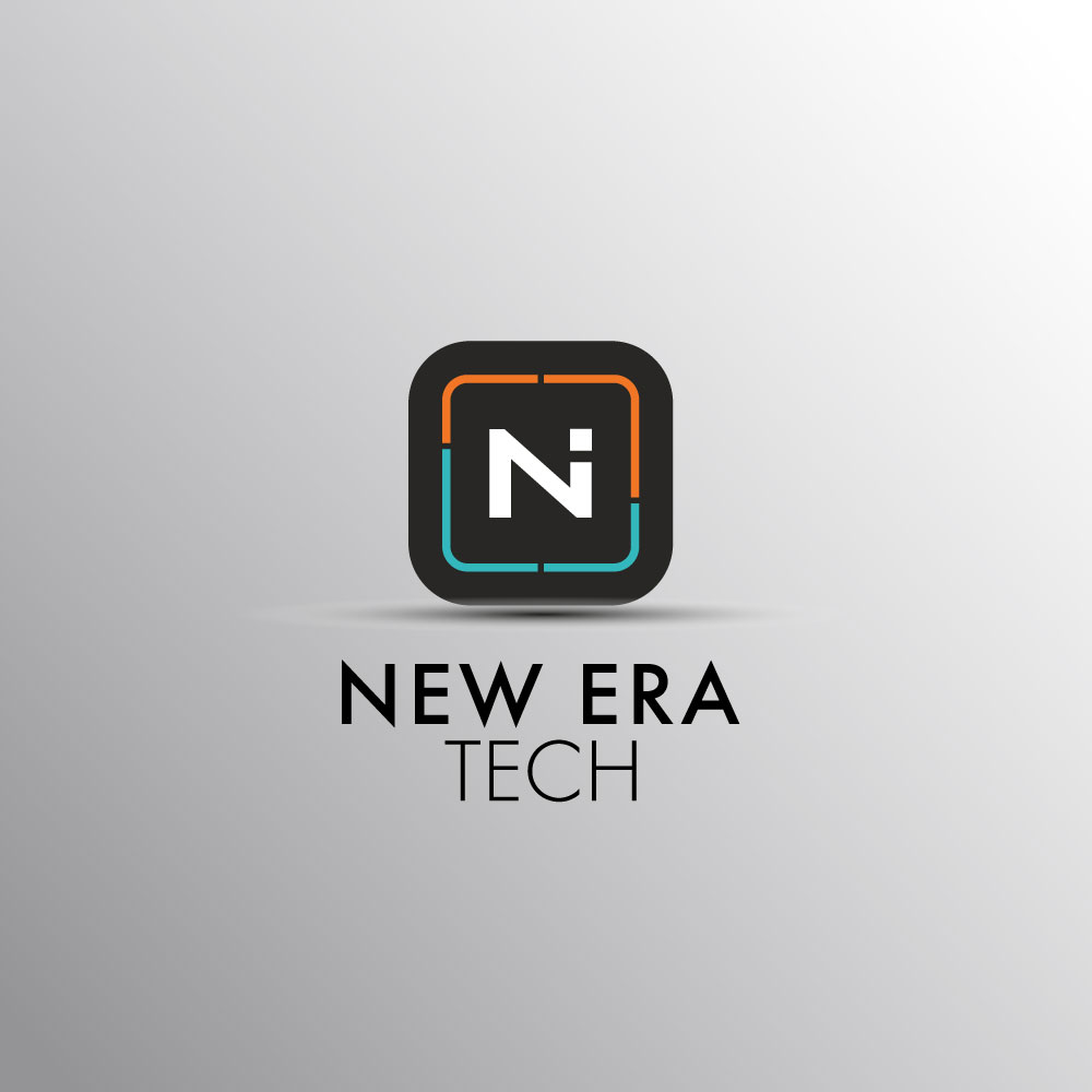
“NEW ERA TECH” logo already has a modern, tech-driven feel with its clean typography, futuristic “N” symbol, and vibrant line accents.
That’s not what Smurf meant.
Who are they, what do they do, who are their clients, who is their competition, where are they located?
“Modern,” “futuristic” and “vibrant” don’t describe whether or not the logo is appropriate for what the client is selling.
Furthermore, one would expect the logo to show some representation of the company name: NE, or NET. Instead, I am looking at Ai, or Ni, if I stretch my imagination more.
We seem to be confusing branding with logo.
Logo Brief – NEW ERA TECH
- Symbol/Mark:
A bold square icon with rounded corners, containing the letter “N” with a dot accent (hinting at innovation and digital identity). The letter is framed by dynamic orange and teal line segments, suggesting technology, connectivity, and progress. - Typography:
The name is split into two parts:- NEW ERA in bold, modern sans-serif font – strong and forward-looking.
- TECH in a lighter, clean sans-serif – sleek and minimal, emphasizing the technological aspect.
- Colors:
- Orange: Creativity, energy, and innovation.
- Teal/Blue: Technology, trust, and digital progress.
- Black/Grey: Strength, professionalism, and modernism.
Read my post above.
What you have is a logo. Not a brand. Big difference.
o be precise:
- It’s a visual identity mark made up of a symbol (the stylized “N” inside a rounded square) and typography (NEW ERA TECH).
- This combination makes it the logo of your brand — the first impression and recognizable face of New Era Tech.
@hitchgraphics I feel like there is a disconnect. The logo brief you posted above is more of a logo description. That reads like something I’d write up to explain the logo to the client. A brief is typically given before the assignment starts and is going to tell you about the company, the product/service, USPs, the target market, an overview of the marketplace and the client’s competitors, possibly a SWOT analysis, etc. Now, if that truly was the brief you were given ahead of the assignment, congratulations, you nailed it.
All of that said, my initial reaction is that it looks like an “NI” monogram. Since the client’s initials are not “NI,” I think you have some work to do.
Thank you for the thoughtful feedback and for pointing out the distinction between a logo description and a creative brief — you’re absolutely right. A proper brief would indeed cover the brand background, target audience, competitors, and positioning, and that’s always the foundation I like to work from.
Regarding your observation about the “NI” monogram impression, I appreciate you catching that. My intention was to emphasize the “N” for New Era and use the dot as a modern tech-inspired detail, but I can see how it might be read as “NI.” I’ll revisit the design to refine the form so that it communicates the brand’s identity more clearly without creating any confusion.
Your feedback is really valuable and helps push the design toward a stronger, clearer outcome.
Is this some kind of crowdsource thing?
From the description, it’s a waste of the client’s time, and possibly yours. The first is their problem. The second, billable time is billable time.
That’s what I assumed when I read the “Logo Brief.” It sounds like a client who doesn’t understand what a designer does and only wants to rent a pair of hands to bring their mediocre idea to life.
I’m assuming it’s from this company that came to realize their current fluttering man in a wing suit logo was embarrassing.
One thing I learned over the years was that when a potential client with poor visual branding contacted me to make improvements, they rarely understood what those improvements entailed; otherwise, they would never have used the mediocre branding they currently had.
They almost always wanted to toss out the old stuff, then bring in a new batch of detritus to take its place. Instead of realizing they were clueless about good design, they usually mistakenly concluded that the only way to ensure the new stuff was done correctly was to double down on their meddling.
I have no idea why they think a dot hints at innovation and digital identity. However, it’s part of their original wordmark, so I assume they’re enamoured with it. However, I’d be willing to bet that what they want is an N or an NE followed by the dot and not something that looks like an Ni ligature.
Appreciate the follow-up, but you’re still describing the logo, not the brand. Right now it looks like it’s spelling ‘Ni’ more than ‘N’ which could be confusing if the whole point is to stamp ‘New Era Tech’ into people’s heads. A logo should be instantly legible and tie into the brand story, not make the viewer puzzle it out. Until we know who they are, what they do, and who they’re up against, it’s hard to say if this is the right face for them or just a nice graphic. Logos are cheap, brands are priceless.
I suggest you create something minimal and creative… What you’ve done so far is good, but it can still be made even better.
I just finished watching about a dozen episodes of The Outer Limits.
Coming here is like watching another…
![]()
I do think that the colors does not make the perfect combination but about logo there is a “N” and “i” the N has a meaning but the “i” ? I mean … is this for IT or music instruments ? if you want to sell a product then you need to specify what are you selling! just saying “New Tech Era” doesn’t mean anything … are you selling what ? music, it service or gold ?
Thank you for sharing your thoughts, I really appreciate the honest feedback. You make a great point — colors and symbols should always work together to create clarity. The “N” is intentional to represent New Era, while the dot was meant to add a modern, tech-inspired element, though I can see how it might read as an “i” and cause some confusion.
You’re also right that a brand name like “New Era Tech” needs context. A logo on its own can’t always tell the full story — that’s where brand messaging, tagline, and positioning come in to clearly define what the company does (IT services, software, hardware, etc.). The logo is just one piece of the bigger identity puzzle.
Your comment is a good reminder to keep refining both the visuals and the brand narrative so they align more strongly. Thanks again for pointing that out.
Thanks, I just want to help but one thing about the colors, the “N” white is intensive, catch the attention but also people would be asking (What’s the I for ?) =, I mean the “N” is in the center of the attention from the customer and “I” does not have a meaning so why is there ?. I would just suggest to add something like “New Tech Era Inspiration” and also would be nice if you change the color of the “N” for the grey that is on this design because the white color is too intensive. You can also try to combine the other two colors and combine with the “N” for example, one part is orange and one part blue and it is to create some harmony because the “n” white logo is too intensive. Try to change the color of the “N” for orange and also the color of the point of the “i” for blue to create some contrast and see how it different it looks like.
If you have to explain because nobody else understands, it is already a problem in itself.
Thank you so much for the detailed feedback — I really appreciate the time you took to break this down. You’re right that the white “N” becomes the focal point and that can make the “i” feel a bit unresolved. The idea of exploring a meaning behind it, like “Inspiration,” is a great suggestion.
I also agree with your thoughts on color harmony. The current white may feel a bit too strong against the background, so experimenting with grey or splitting the “N” into the orange/blue palette for balance and contrast is definitely worth testing. Same with adjusting the dot to blue — I can see how that could create a nice dynamic while keeping the tech feel.
Your input gives me some great directions to refine and explore further. Thanks again for sharing your perspective — it’s always valuable to see how others interpret the design.