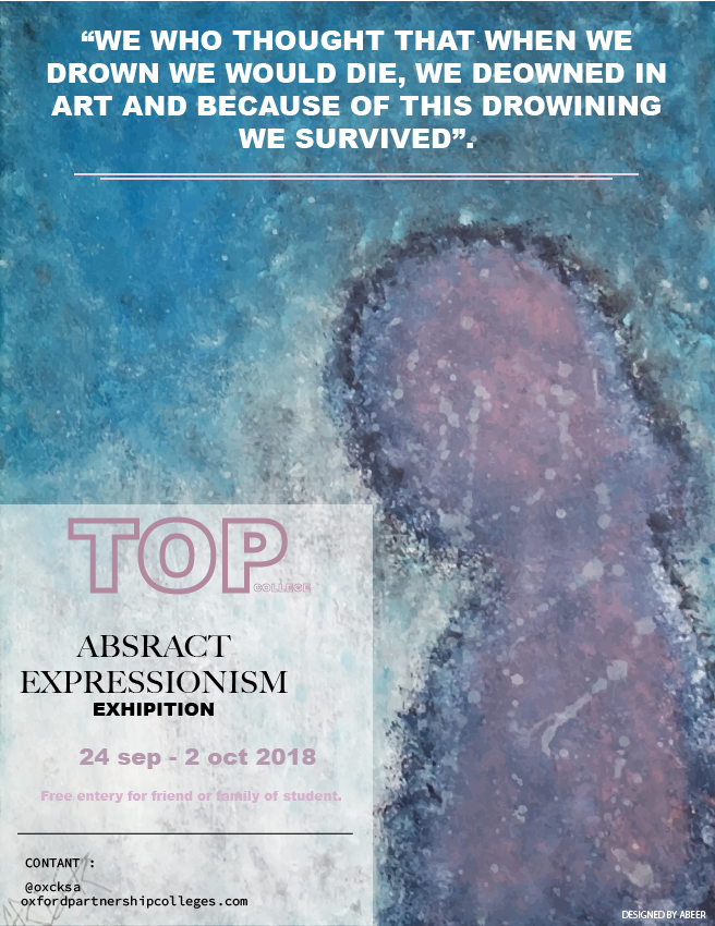
You have a few spelling typos.
Also, the pink color font on a white background are difficult to read. You may need a higher contrast.
Using all caps for the quote in my opinion should be avoided. It is difficult to read, and gives the impression of screaming.
Lastly, I would narrow down the amount of typefaces you are using.
thank you for that mention.
The text in the box at the bottom is not centred (not sure if this is intentional) but it looks like it should be. I’d say either make it obviously not centred (if that’s the intention) or ensure the “abstract expressionism exhibition” and the dates are centred within that box.
Can I also suggest using a different font for the text and the top of the page, the dates and the text below them, correct me if I’m wrong but it looks like Arial Black? Considering the context of the poster (an art exhibition) try something a bit different/more original.
Other than that, nice image, nice colours. Just needs a bit of refining ![]()
Yes, i obey with @Trent and one more change the font styles and use some brush paint at background of text.
Regarding
@LearnTheNew
I would try and keep it as simple as possible. As some people mentioned here, there are too many typefaces here on this poster and I am unable to see the date and the text underneath. Perhaps print this poster out and see if you can see the font and colours from a distance. I would also have the information “TOP, Abstract Expressionism…” in the middle, just to catch people’s attention.
I do like the effect in the background though. The cool colour scheme you have shown here looks amazing and it does fit well with the writing above. Well done.