Feel free to give your suggestion or opinion here! I want to make it look perfect before i pass it to my cilent.
The cilent is a digital marketing agency.
Feel free to give your suggestion or opinion here! I want to make it look perfect before i pass it to my cilent.
The cilent is a digital marketing agency.
The cilent is a digital marketing agency.
Is that all you had to go on?
With only that amount of information, there’s no way for us to tell you whether you hit or missed.
I see two things that would help you right away.
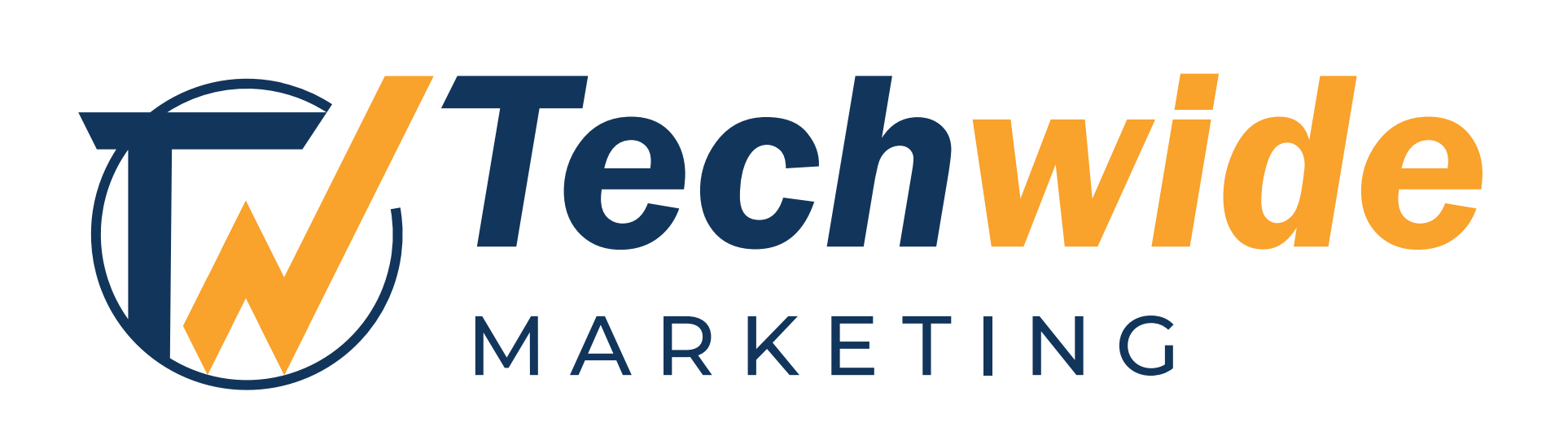
(1) Never use lines or typefaces in a logo that may get lost when the logo is reduced to the size of a postage stamp. Your own uploaded image proves that the circle and the word “Marketing” are a good example of what to avoid.
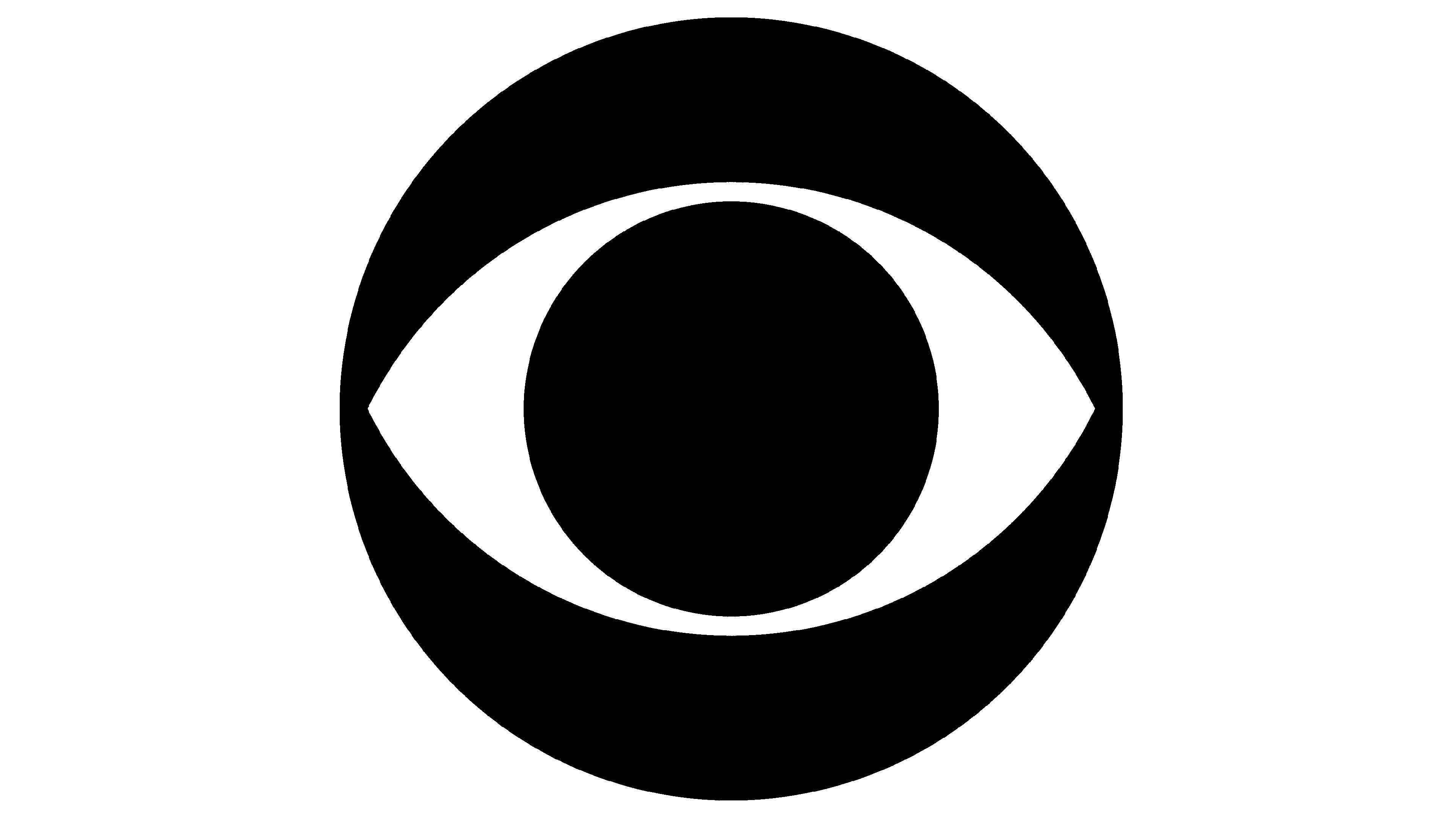
(2) Have you ever studied the concept of Unit Sizing in graphic design? One of my favorite designers who totally understood the concept was CBS Network Art Director in the 1960’s, William (Bill) Golden. He designed the CBS “Eye” back then and it is still in use today. No one has ever been able to improve upon it. Unit Sizing & Unit Spacing is lacking in your design which makes it look disjointed and keeps it from appearing as a single unit.
There are many more advisors here and I have given you only a small piece of the overall help you need. I’m sure my fellow professionals will help you further.
It’s a pleasant looking logo and easy to read.
Overall it’s a nice job.
However, the gap between the T and circle is too thin and can/will cause printing issues. This applies where the T almost meets the W.
The tapering of the circle is too thin - you should really try and have that tapering at least 0.1mm at the end - that will give it a nice printed finish (0.1mm is approx 0.25pt which is good number for print, you can go as low as .125pt in positive print).
I’m unsure why the Marketing is so spread out - it looks really wrong.
It’s good - but it has a lot of room for improvement in the technical areas.
Techwide Marketing helps retail companies become digitally native and expand their e-commerce presence.
They are a one-stop marketing agency in Malaysia specializing in digital marketing, creative design & video production, and ads management.
Techwide offers digital marketing services for your business such as SEO, Google Ads, Facebook Ads, and Tiktok ads.
Thanks!! Your response helps a lot!
Thanks!! ![]()
![]() Will make an amendment based on your advice!
Will make an amendment based on your advice!
You are kindly welcome! Let me add this—remember that your logo has to have both color and black & white versions to cover all applications. I wish you the best of success with your final design.
Pity you didn’t flatten the peak of the w the same as the lettering.
But it’s ok.
Now it reads TN.
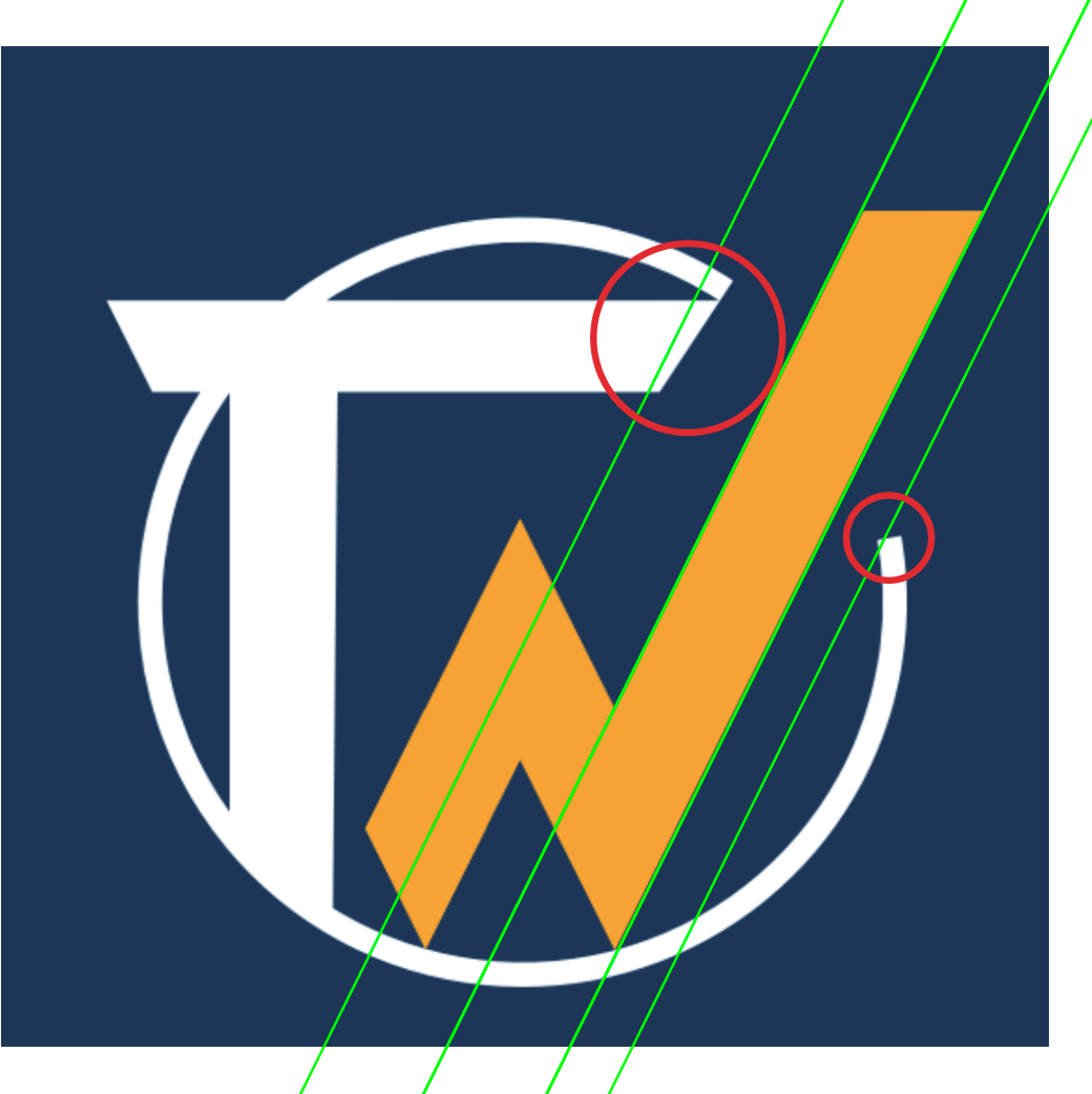
I’ve circled a couple of places in red where the angles and spacing are needlessly inconsistent with the geometry of everything else.
This topic was automatically closed 365 days after the last reply. New replies are no longer allowed.