I’ve just made my new website for the nice singer, I would be very glad to have some critique about it.
Thank you ![]()
www.aglatova-anna.com
1 Like
Hi,
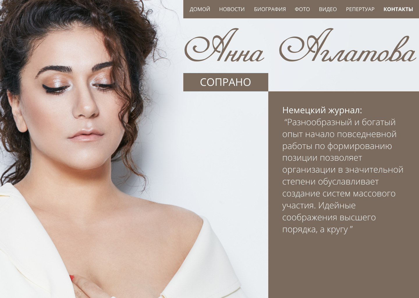
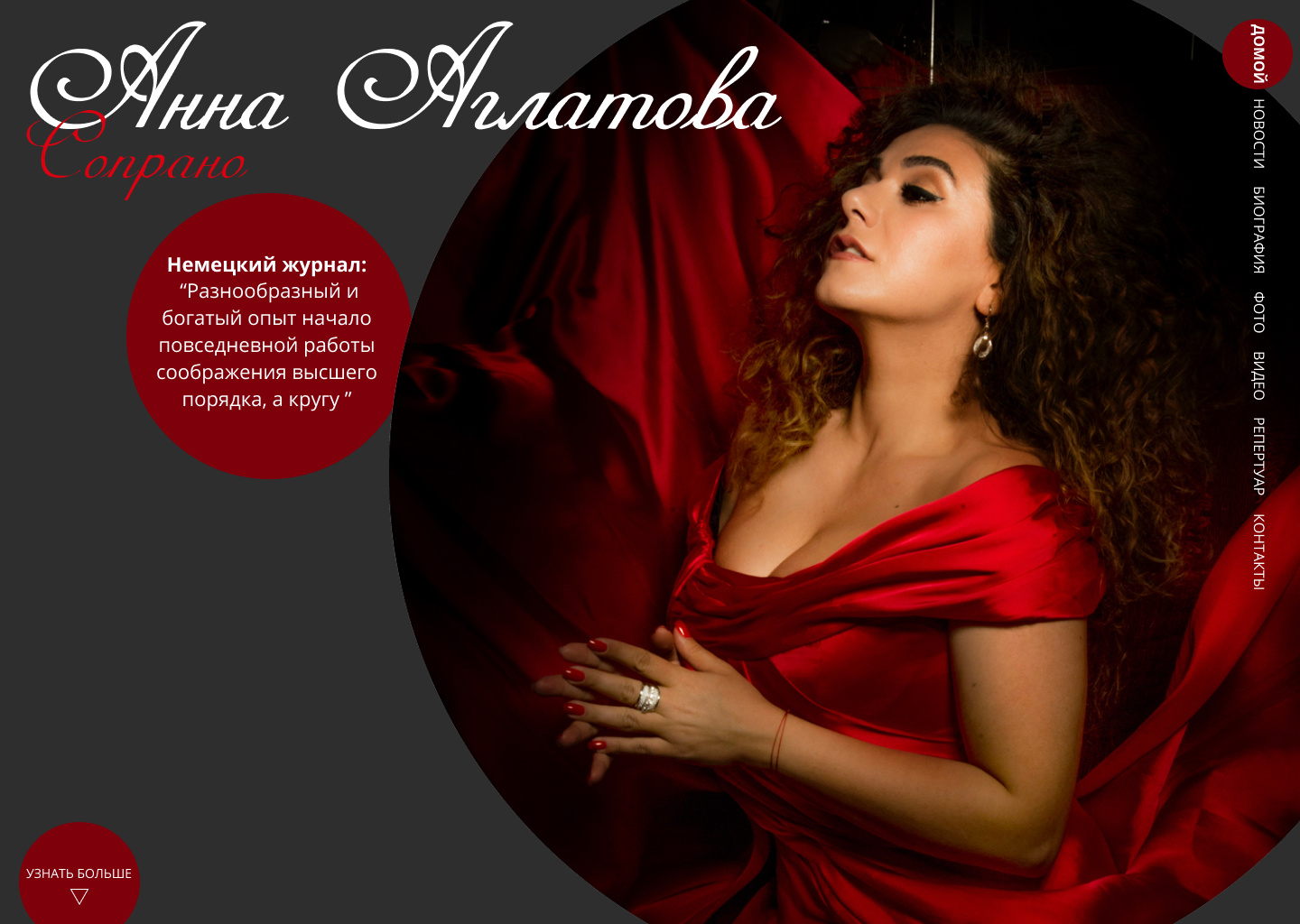
what I first noticed is the burger menu in the desktop version.
I personally would get rid of it and here is why:
You create a barrier to content with it - every time the user comes back to your website he has to click on the menu again to show the content he wants or could have access to immediately when entering the website.
In the mobile version it’s very hard to read aswell, because you have no background in the menu.
I like the color palette you chose, but I would change the icons in the footer + they look a bit blurred ![]()
If you want some more feedback just tell me and I will have a closer look :).
Looks nice.
I’m always concerned with large photos not loading fast enough. With some images, it’s possible to keep the resolution low and compress them to very small sizes. But when the main photo is a hero shot of the person the site is about, it becomes much more difficult to keep the byte size small and the person’s face sharp enough to be acceptable.
Some of the photos on some of the pages didn’t load for me. Perhaps they’re missing.
The “Read More” button also did not work on any of the pages (Mac Chrome).
I agree with Incompleteclothing about the menu on the desktop size. A hamburger menu is great for mobile when space is tight, but on a desktop display, it just creates a needless obstacle to the other pages.
I do like what you’ve done, though,
Thanks for advice It’s very important ![]()
Thanks for your advice! I’ve changed all icons and please take a close look
Dear all I know maybe it’s not the best way to put gamburger on the desctop verstion but we had 12 sketches before :)!
Please tell me should I put them on my portfolio page.
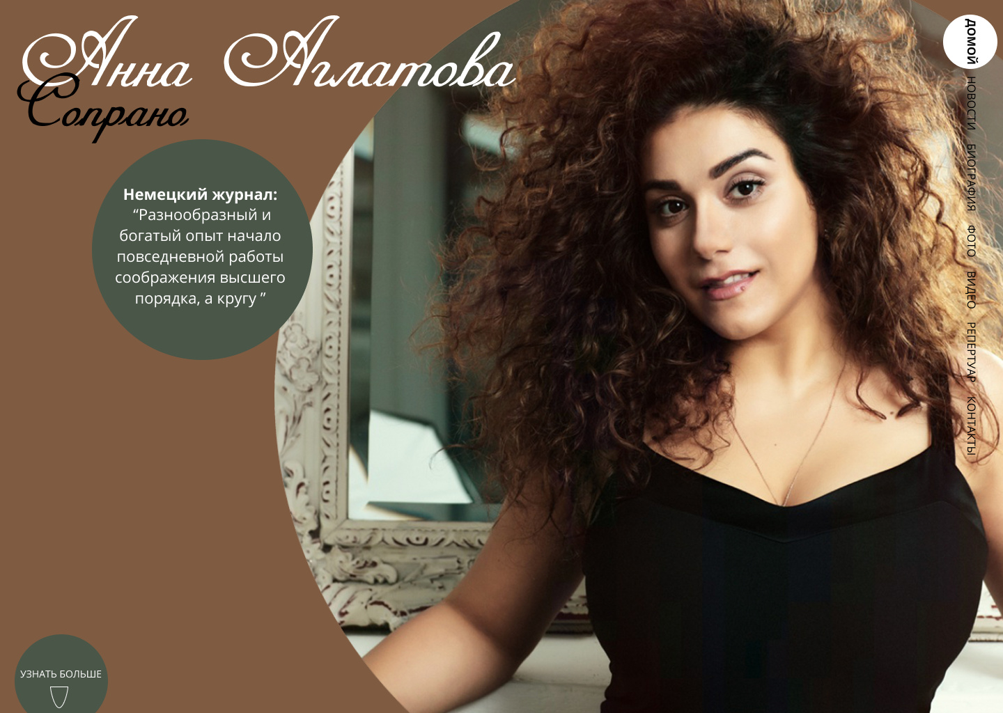
%D1%81%D0%B0%D0%B9%D1%82%20%D0%90%D0%BD%D0%BD%D1%8B%20%D0%90%D0%B3%D0%BB%D0%B0%D1%82%D0%BE%D0%B2%D0%BE%D0%B9%20%D0%B2%20%D0%BA%D1%80%D0%B0%D1%81%D0%BD%D0%BE%D0%BC2|690x490

I ![]() LOVE
LOVE ![]() the color scheme/ layout/font choices. Overall it is an amazing website! The only change I would advise:
the color scheme/ layout/font choices. Overall it is an amazing website! The only change I would advise:
• On the homepage • Making the photos (on the right) of the event listings larger.
Nice work! I really like what you’ve done.
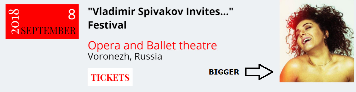
Looks cheap … feels cheap.
The text is swimming. The images need styling. The first three Ticket button cursor over don’t change to a pointer … and if that is because the event is sold out … then write some more code saying so.
All-in-all it seem what little content there is has been over played.
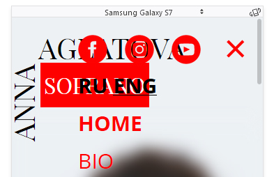
And in mobile here’s a screen grab using FF Inspector for Samsung Galaxy S7 clicked on the hamburger menu … what’s her again? And why are those social media icons jammed in like that?
Did you write some media queries for mobile?
Cluttered maybe? Ironic, compared to the desk top viewport!
Dear all, Thanks for your kind advice, I’ll try fix everything, Have a good weekend! ![]()
Hi,
I visited your website. The website needs some improvements:
Images need styling
Website speed need to improve
Thanks.