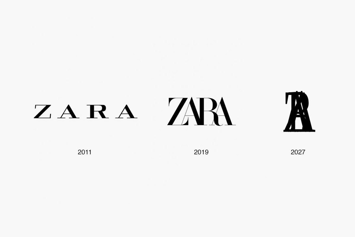
Tight kerning:

That’s funny ![]()
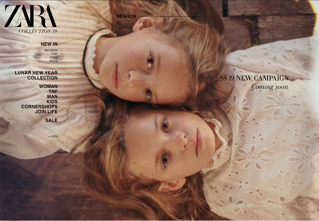
I don’t really get most women’s fashion, so I don’t get this with the kerchiefs on the heads. A throwback to the 50’s?
Bad Hair Day
Kerchiefs = Handmaid’s Tale?
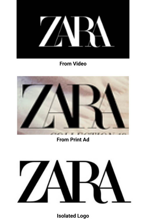
Type mending is always a bit risky. Where it’s superimposed on the photo of the girls, my eye reads ZABA.
The letters don’t really come together to form a cohesive unit — they seem to be tripping all over themselves instead.
Why is the logo different every time?
The hairlines look a little thicker on the print ad then on the video, maybe just an optical illusion, but they’re definitely different form the isolated logo at top.
I don’t understand why these large companies are thinking it’s time to change their well established logo. Do you think this is just becoming a new marketing trend, to promote the brand?
I have no idea how the ZARA thing came to be. But from my experience, as often as not, these kinds of seemingly pointless brand changes are driven by less-than-informed reasoning by over-confident upper management people. These are typically people who believe their abilities extend into areas they know little about.
For example, a new CEO or a poorly qualified marketing head has an idea about something that he or she doesn’t fully understand, then it proceeds from there in a haphazard sort of way as misguided orders are given and conflicting solutions are implemented.
The in-house staffs try to make the best of the bad ideas. Any outside agencies that get involved, try to do the same while balancing a paying job with their skepticism about what they’ve been hired to to.
The end result, when things happen this way, is usually a mess.
Just as often, it can happen in the opposite way with a lack of direction or concern at the top and a marketing staff trying to do their own thing without sufficient direction or buy-off from those above them.
In the end, though, it amounts to the same thing: a lack of informed leadership at the top resulting in a mess.
I think they look back and experience one of those ‘oh crap’ moments. The previous one was clumsy with the legs of the A left in. Removing them at the same spot and adjusting the kerning is just evolving the logo to represent professionalism. It’s not like they’re marking a style or market change. I think the new one reads quite well.
Really? I find the new logo to be harder to read. I feel like if you look at it for too long it starts to play tricks with your eyes, and blends together weird… but that’s my observation lol.
turns out I was going off the wrong image. I was talking about the isolated logo being the strongest option and what is now their current logo, as being their 1970 initial design mistake. The 2011 logo looks like a male cologne brand.
I personally love the look! Great font choice in my mind.
Yes, Didot is a beautiful typeface, which makes what they did to it even more awful. ![]()
Yeah, I don’t like it.
I hate it.
Its a bit weird and unconventional, i see what they were going for but can’t say i like the result. The fonts weird and the lines are too thin. I find it hard to believe it’s going to be readable from a distance but that is just my opinion.
It looks a bit rushed but I like the font. Reminds me of Vogue, which is probably the link with fashion they want to make. Would’ve been a bit better with more spacing like the first logo.
Previous one was far more better than this.