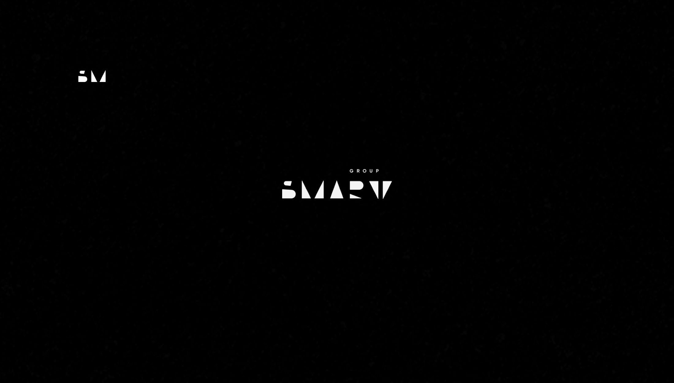
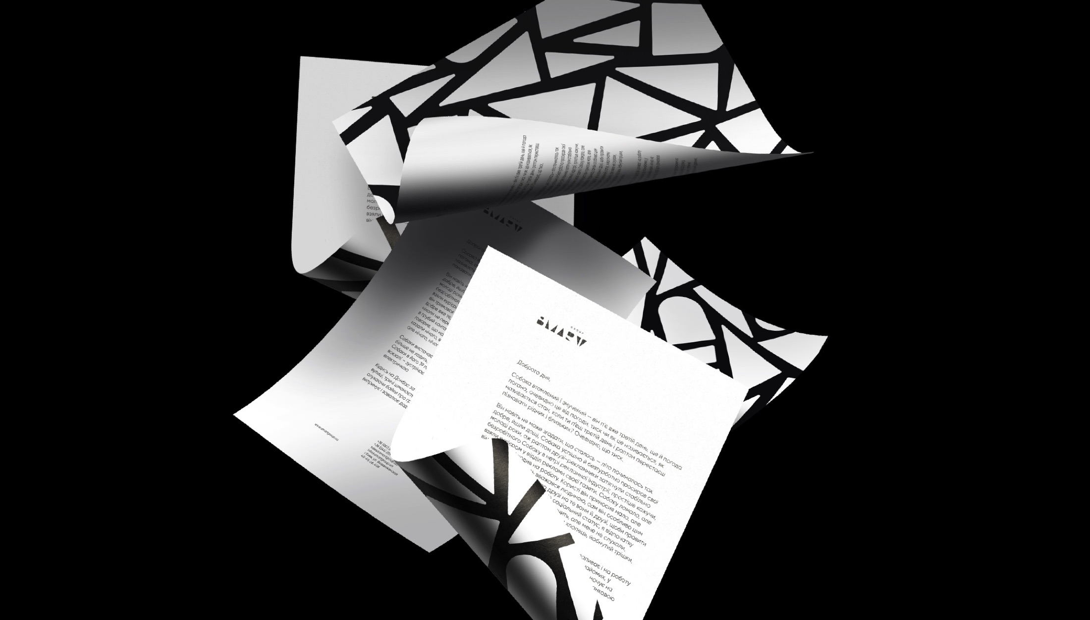
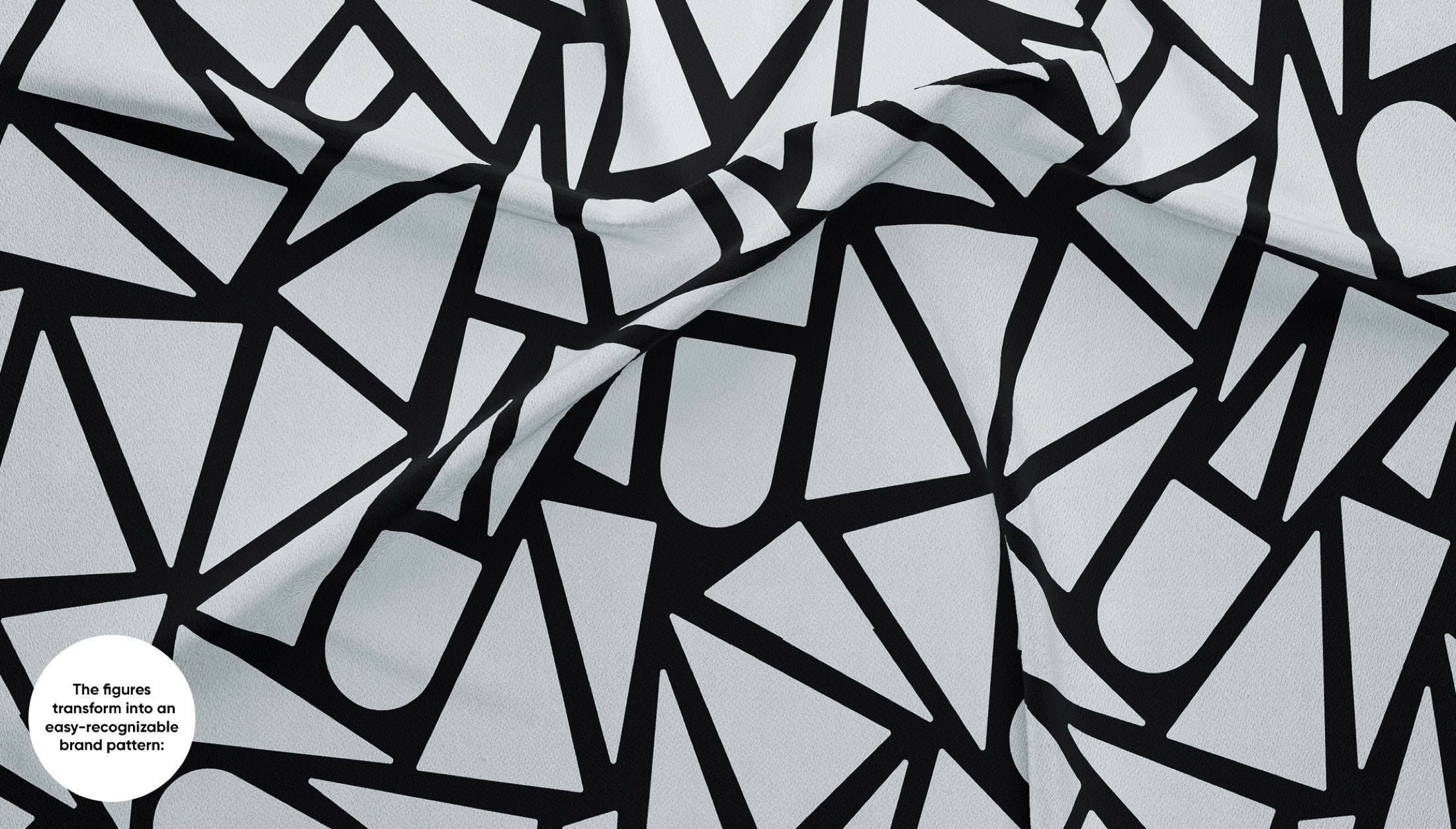
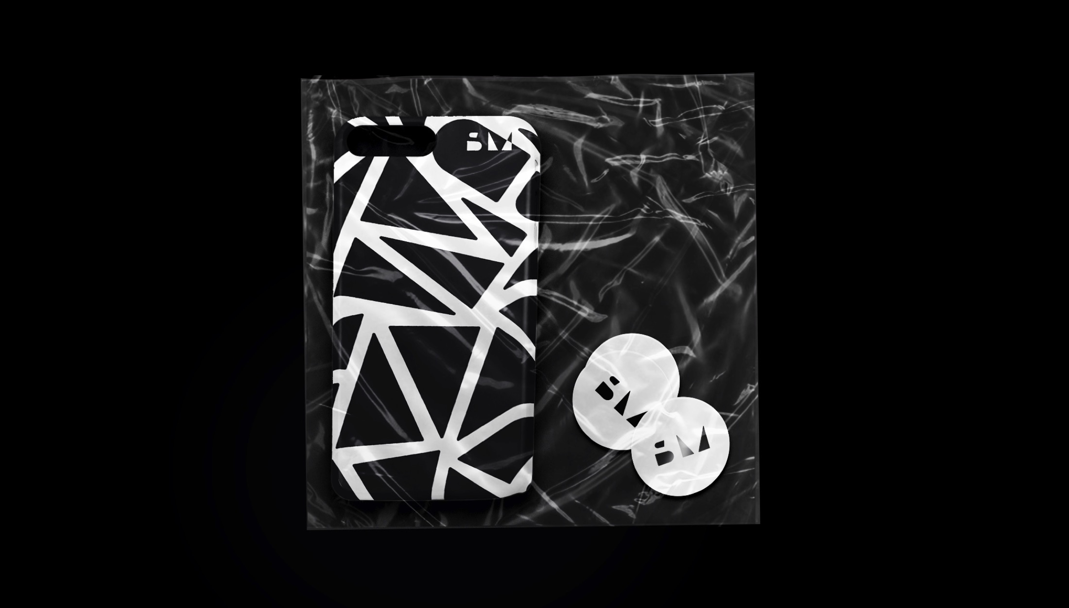
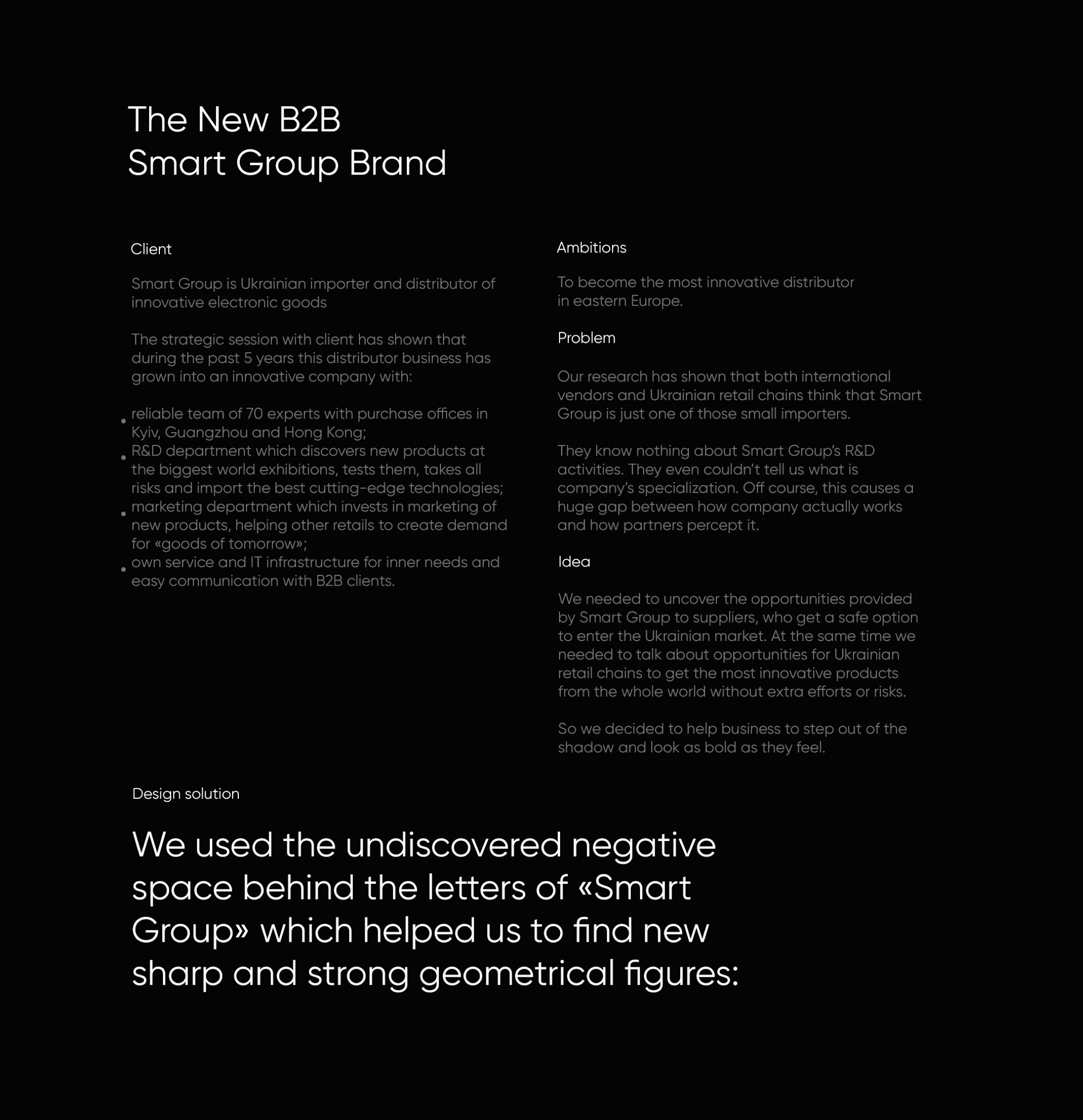
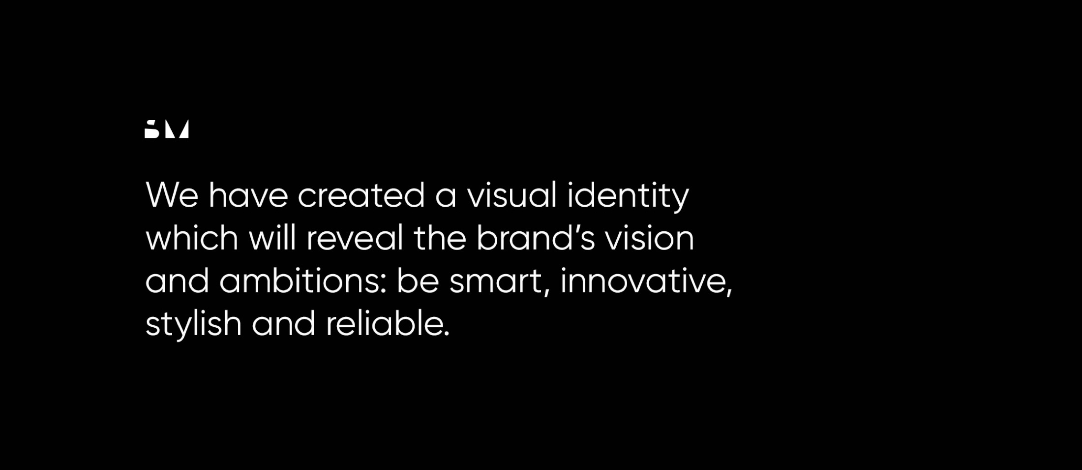
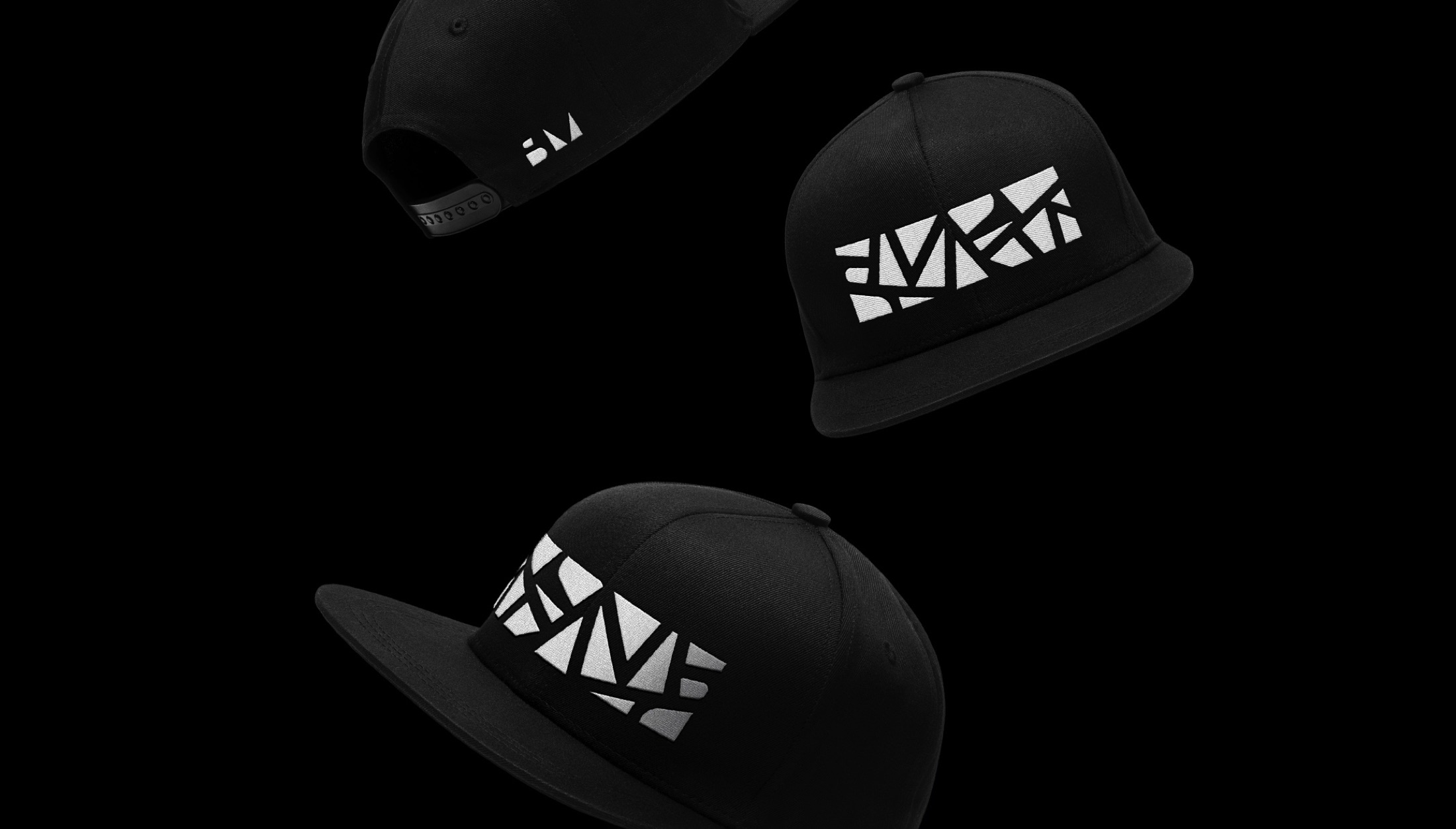
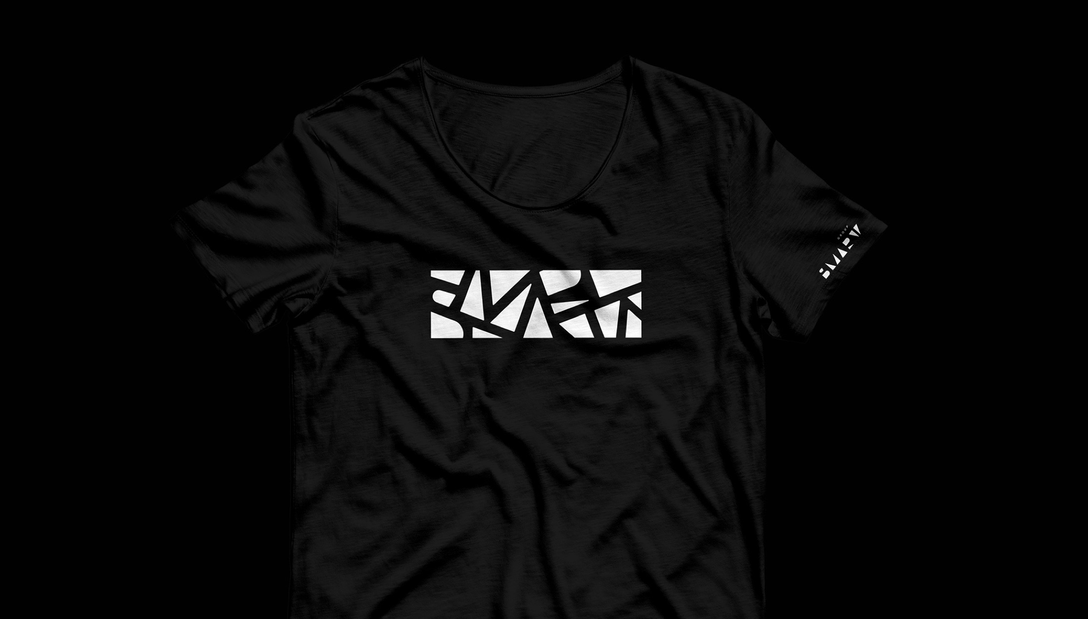
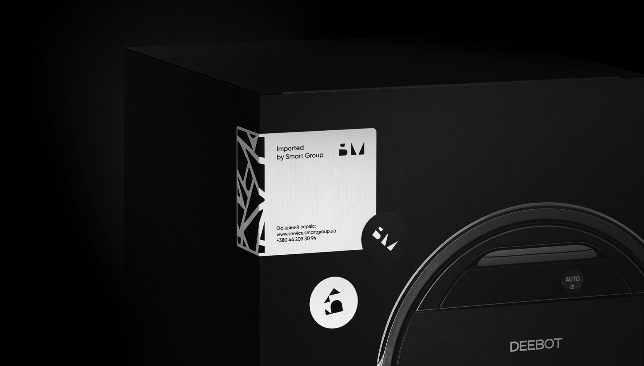
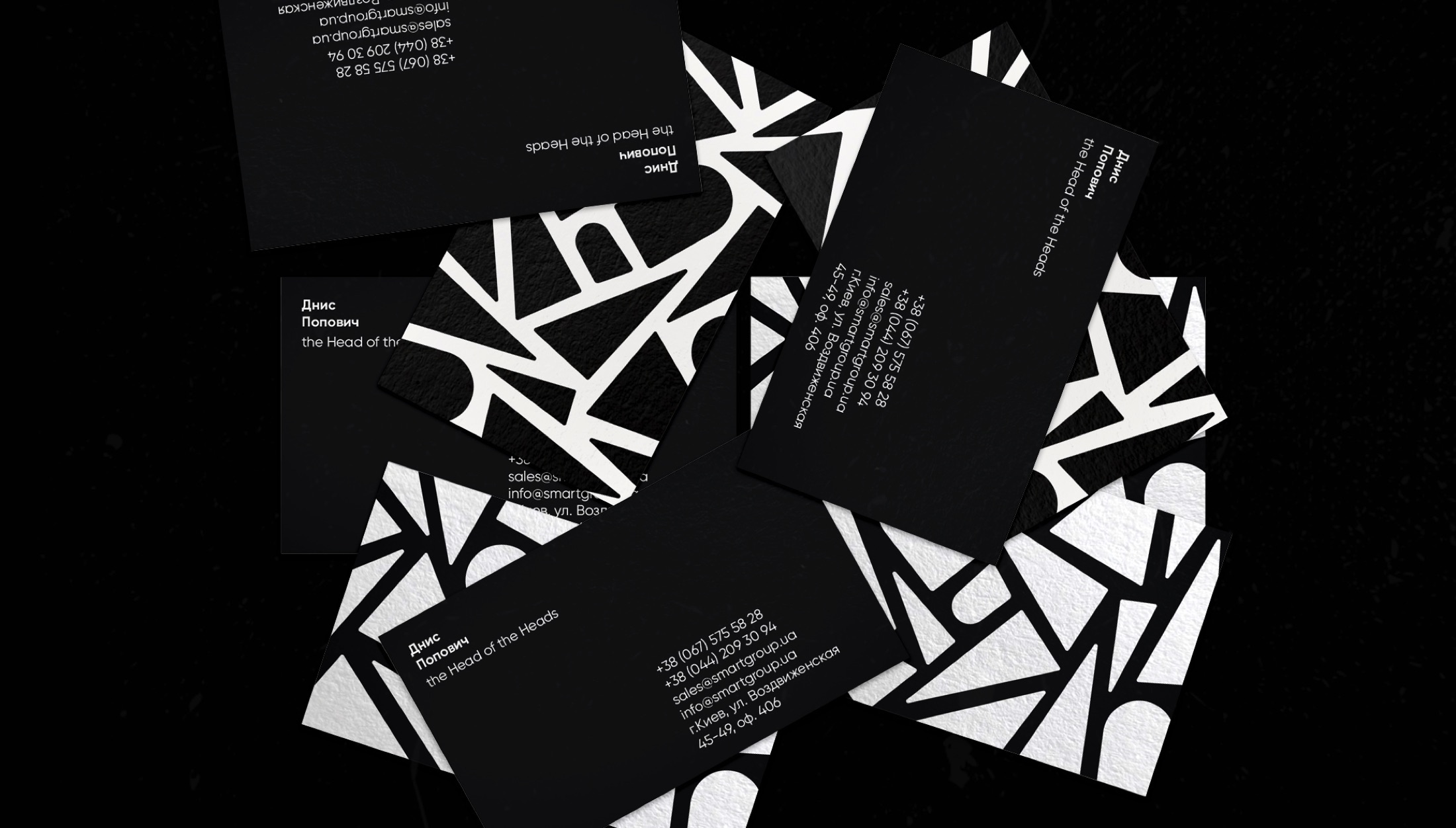
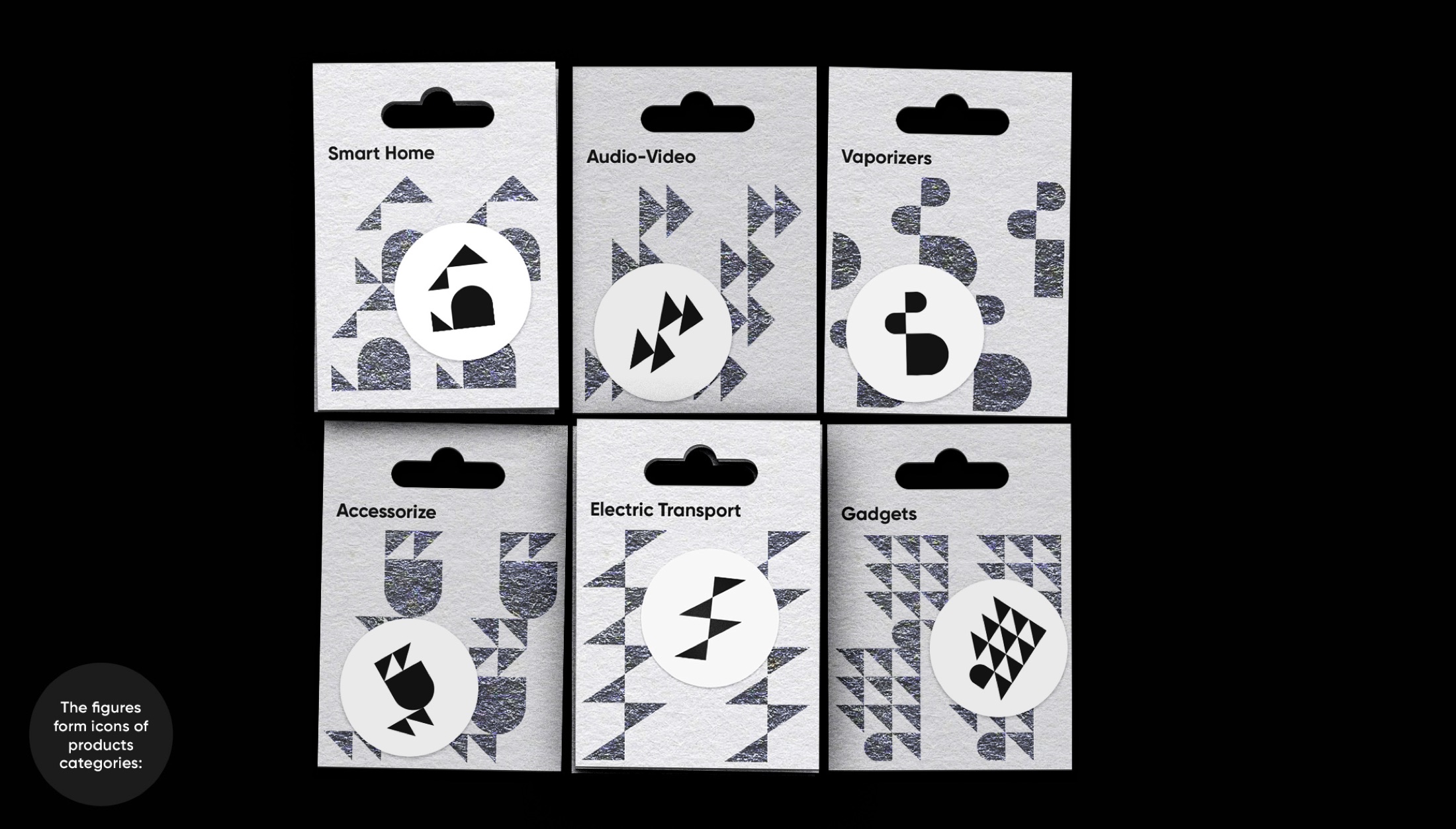
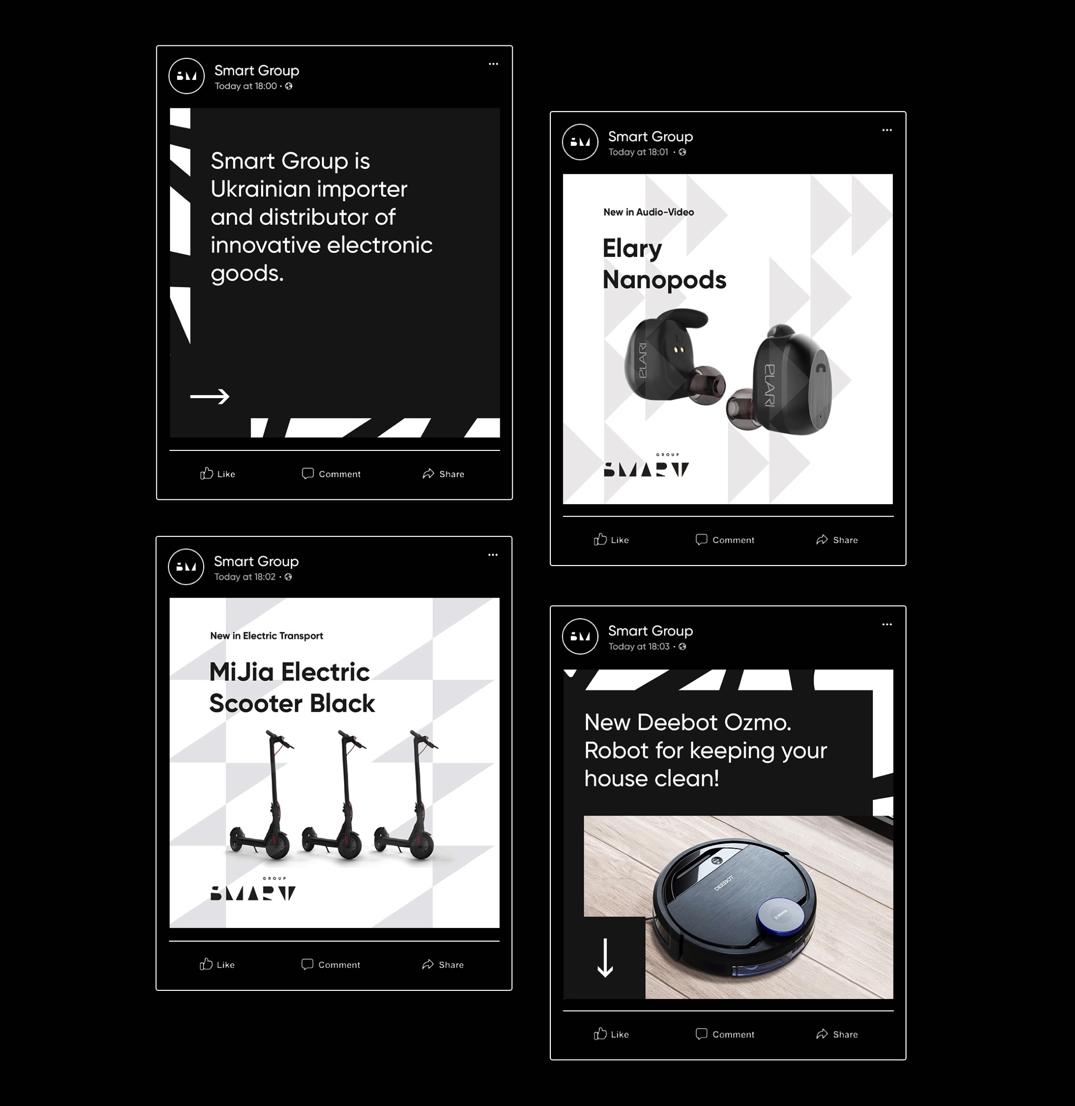
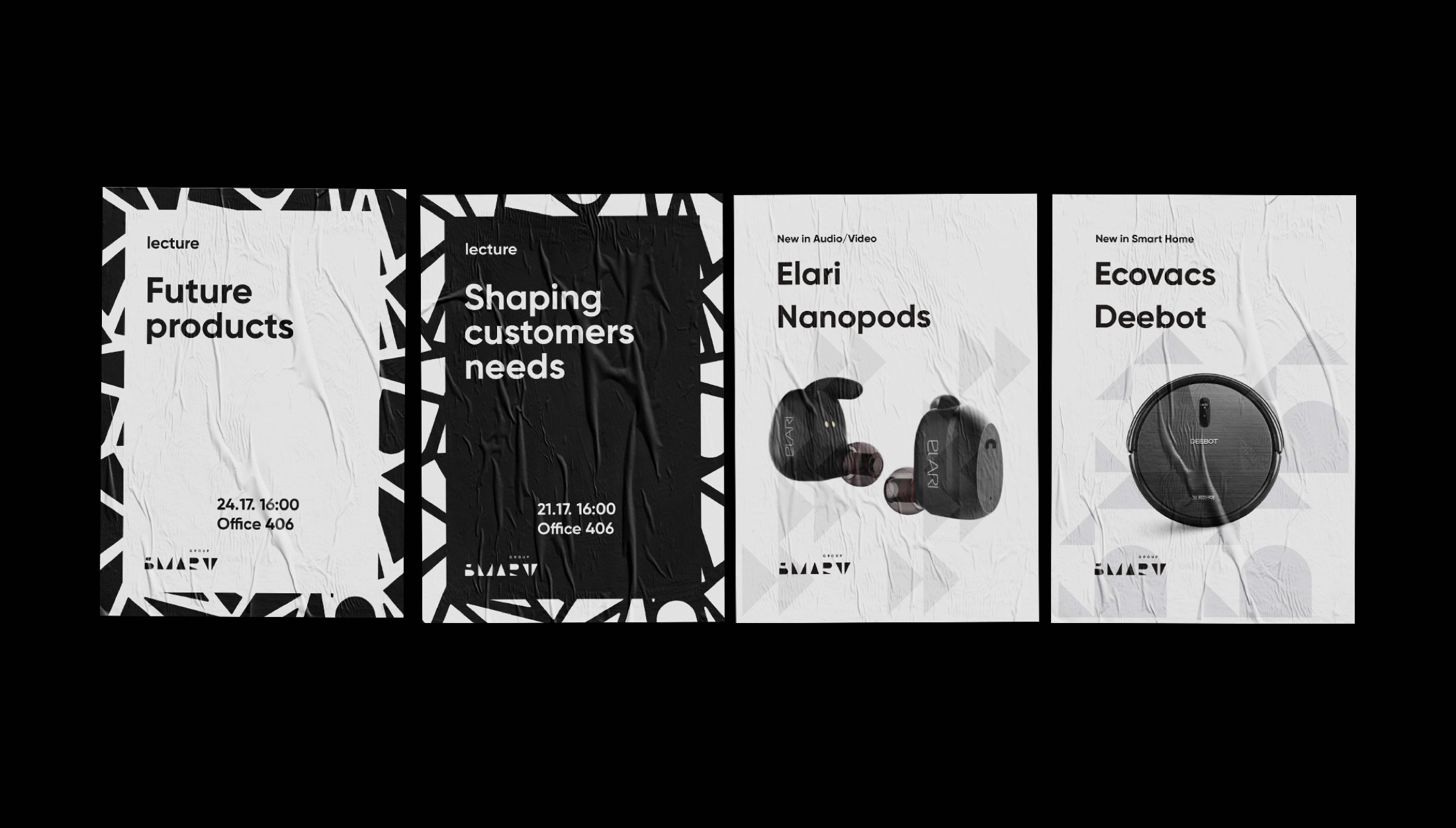
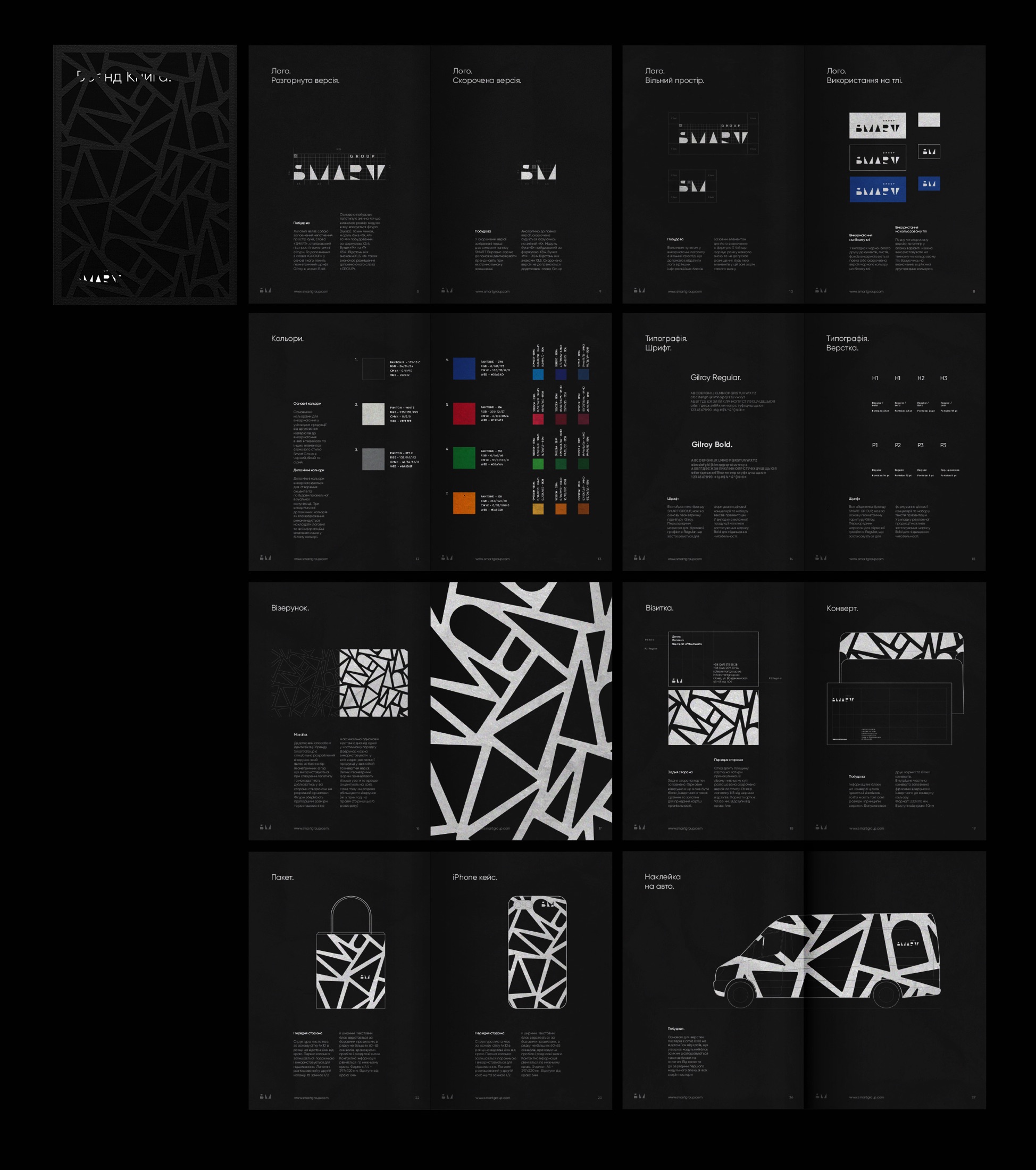
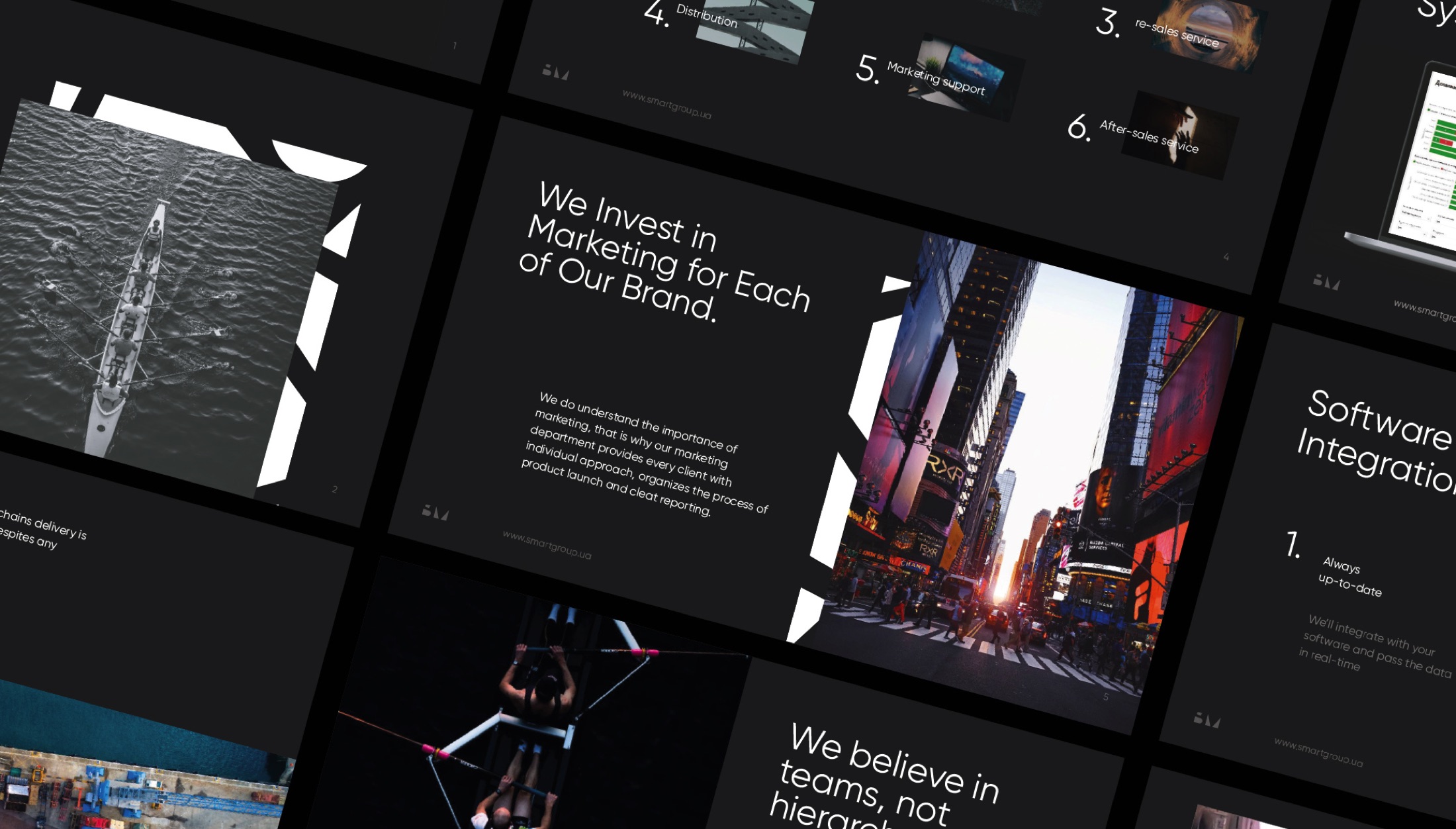
Smart Group has ambitions to become the most innovative distributor of electronics in eastern Europe. But partners know nothing about company’s R&D activities and innovations, they perceive it as an average small importer. We decided to help the business to step out of the shadow and look as bold as they feel. To illustrate this we used the undiscovered negative space behind the letters of «Smart Group», which helped us to find new sharp and strong geometrical figures. The idea is implemented in brand identity, website design and animations.
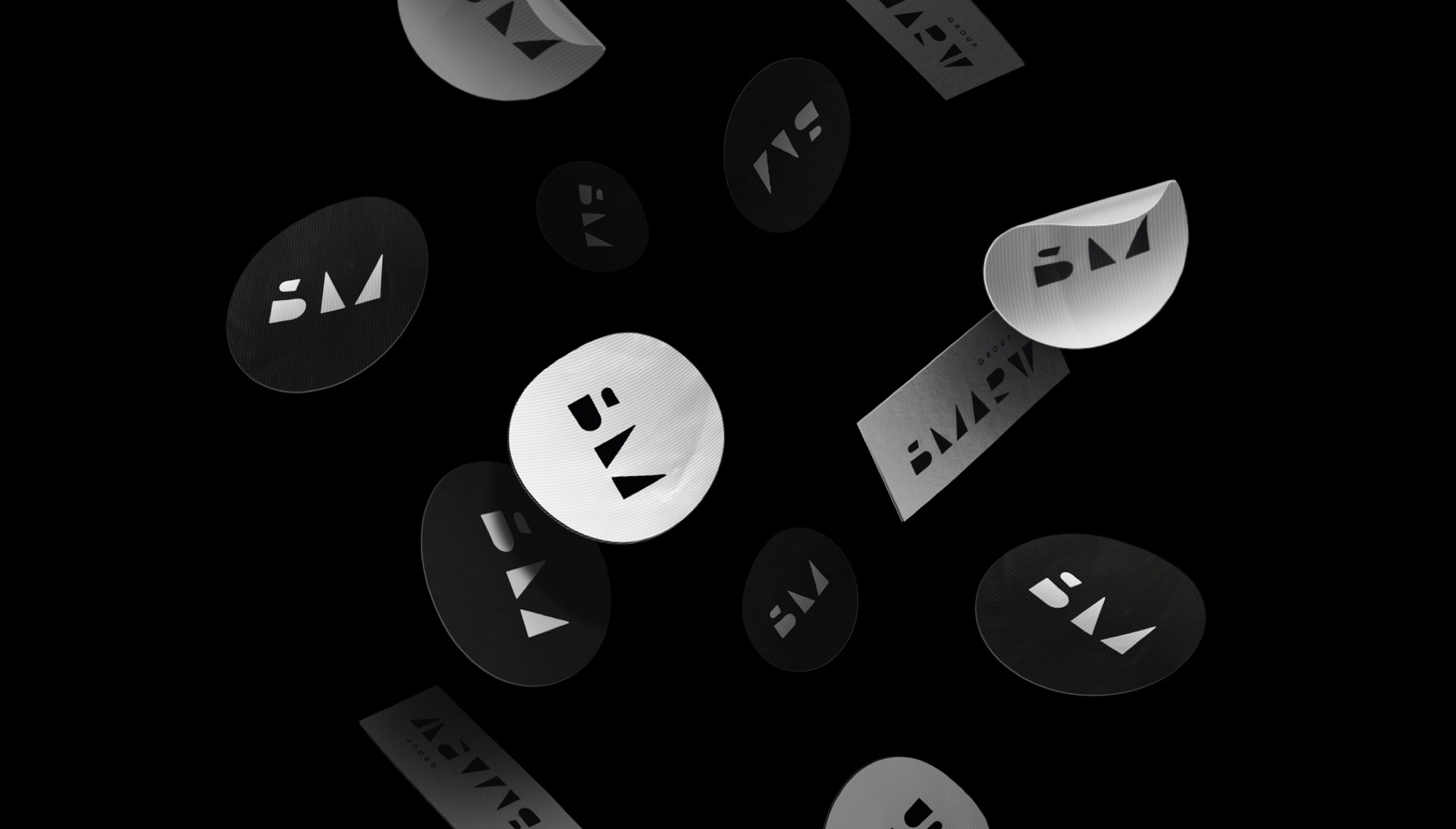
It’s an interesting use of color (or no color). It’s also bold look that speaks of confidence. If it were me, I think I would have integrated a spot or two of color here and there.
I agree with the others on the logo. Reversing out type and only using the counters is an old idea that I’ve rarely seen pulled off very well. To me, it reads as SMARV instead of SMART.
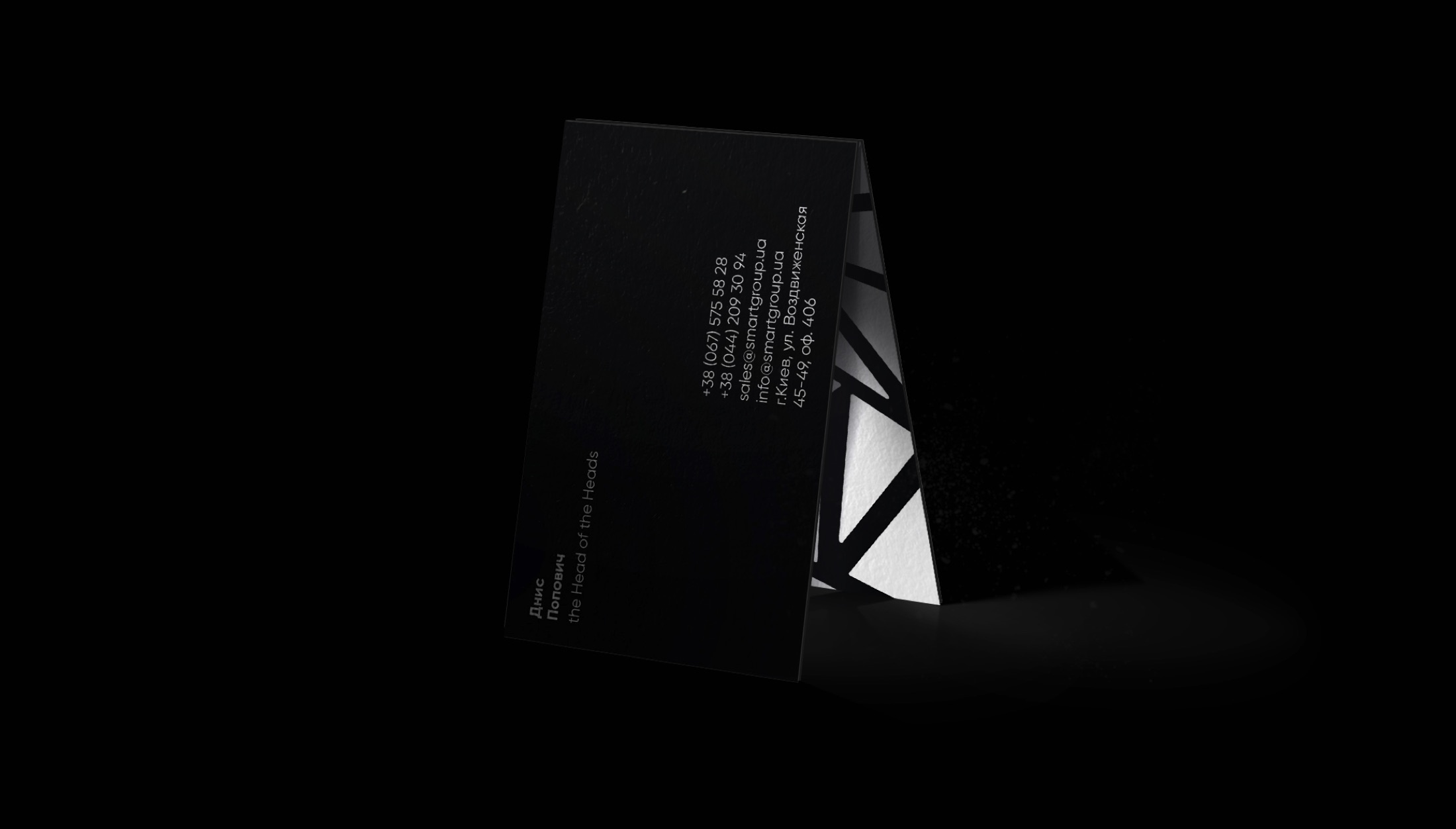
The highly angled black and white broken glass line work (IMO) communicates chaos, brokenness, trapped, etc. which all seem like an odd thing to communicate with your brand, especially for something like an Electronics distributor. For distribution and electronics I want things to be smooth, uncomplicated, street free. Not jagged, complicated and stressful.
I purposefully glanced through this… looks pretty, but I have no idea what B M means or what this company does.
My first thoughts: Is this for an abstract art gallery? Is this a clothing brand? Do they just sell stickers?
after reading the brief, I’d say you should try honing in on a style that is more representative of what they do as a company.