A celebration cake company. What do you think of my new logo design and which do you like?
No context
1 Like
it’s all information I have, it’s for the contest
All we have to judge it by is the aesthetics of the logo and its presentation, which are both nice. As Smurf2 said, though, there’s no context to judge whether or not it’s appropriate for the company, the client, their potential customers, or the space in which they’ll be selling their products.
The lack of these considerations is one of several reasons why contest sites do a disservice to everyone involved except the contest site’s stockholders.
Anyway, judging by only what we have to work with, I like the top one better. It’s cleaner, more legible, and just looks a bit more organized and tidy. I’m not a fan of the script type on the bottom mockup or the typeface you’ve paired it with.
Contest?
Working for free.
Stop it.
And what am I getting out of your contest winnings?
You really have to tackle this on your own.
I’m not going to help you win a ‘contest’ when I get nothing from it.
2 Likes
It’s impossible for anyone here to give any meaningful feedback about the effectiveness of your logo without knowing more about the business you’re designing it for, their goals for it and their customers.
What if you win this contest and someone uses your logo, pays thousands and thousands of dollars to get signage, advertisements, packaging, napkins, etc.. all produced and it actually ends up hurting their business, because it doesn’t connect with their audience at all?
…How would you feel about that?
Design is building something for a very specific purpose.
Thank you so much for all feedback ![]() I feel like I’m not alone anymore
I feel like I’m not alone anymore ![]()
I absolutely agree with you, but for me it’s a good chance to show people my work (it’s only contest on instagram, no money involved)
I’m happy stop it, I had a job interview yesterday but no reply so far, maybe I’m not good enough for them) In contest no mony involved, it’s just for fun in instagram and don’t worry if you help somebody you’ll get a good carma lol
next time first what I’m going to do is to write a brief!
if they stupid enouth to do so I doubt it’s my problem lol
I have no idea if you’re good enough or not.
But this type of speculative work is probably frowned on - especially if you’re serving it up in your portfolio. If they think that you will be spending your time entering contests rather than working for them - it could be a red flag for them.
I’ve no idea what Instagram contest this could possibly be - but at the end of the day - a company is getting designs done for free and picking a winner. And they shouldn’t be getting anything for free.
I don’t go into their shop and say I’m testing all the local tea makers in the area, give me a cup of yours for free and see if you win best cup of tea in the area.
I don’t need karma, don’t believe in it. Hard work for a wage is what I believe in.
1 Like
In the real world, that attitude will get you sued. It actually is your problem and part of the due diligence of a “logo designer” (whatever that is.) Hope you have your assets separated from your business when that happens.
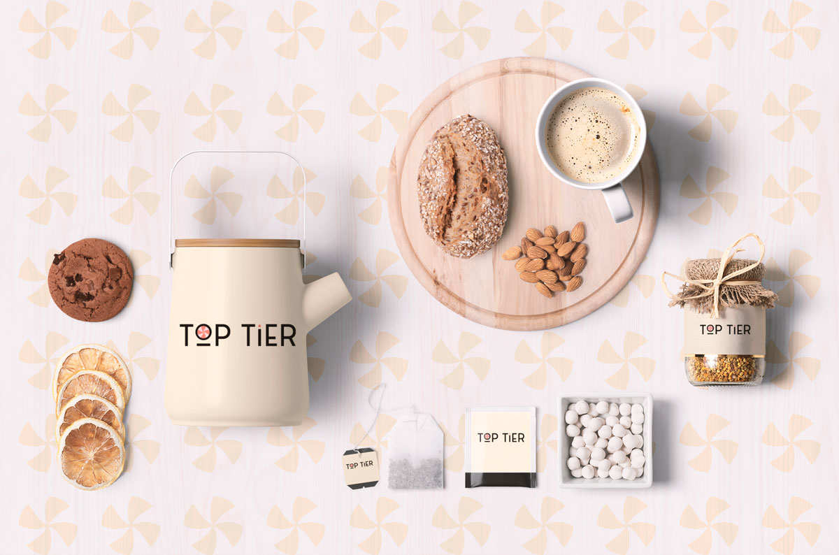
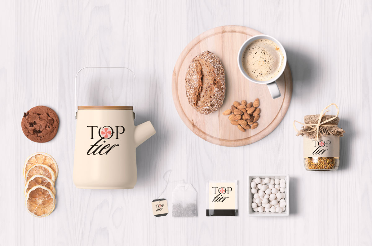
What has a beachball of death anything to do with baking?
Please answer the following questions:
- Who is the target market?
- Did you create an avatar for the ideal customer? If so, please post. If not, why not?
- Did you create a mood board? If so, please post. If not, why not?
- Who are the competitors for this company? If you know, please post links to the competitor’s websites. If you do not know, why not?
- Did you spend time sketching concepts? If so, please post. If not, why not?
- Why did you choose a tea-themed mockup for a cake company?
2 Likes
It’s like jazz. the real art is found in the notes they’re not playing.
The mockup includes tea, a teapot, bread, nuts, a cookie, dried fruit, a cup of something frothy, a jar of seeds, and mothballs representing sugar. When you’re selling cake, you can’t get jazzier than that.
2 Likes
Downloadable, pre-built themes and templates are another pet peeve of mine. They can be time-savers on jobs that lack the budget for custom work, but their proliferation is a menace to good design.
It’s as though graphic design is increasingly Canvaized by off-the-shelf, mix-and-match solutions to problems. I suppose that approach has its place, but the increasing reliance on pre-made solutions is warping the profession in ways that are creating a monotonous and generic sameness that’s, in many ways, the antithesis of good design. To me, this isn’t design and is more akin to buying and arranging furniture.
Similarly, many new designers seem to confuse the artfulness of their comps and mockups with addressing the problem their clients are paying for. It’s appropriate to show clients what the work will look like in real life. But all too often, the artfulness of the mockups starts overpowering what those mockups are supposed to communicate.
For example, when I show a client a proposal for an energy drink label, I show them the label on a bottle. I don’t spend five hours putting together a mockup to demonstrate what their bottle will look like on a moonlight night at the beach with friends gathered around a campfire. If I were a client, I’d begin to question whether my money was being spent on the label or serving as an excuse for the designer to create a fancy mockup.
2 Likes
One of my concerns is that mockups, particularly with logo design, can make the work look stronger than it really is.
2 Likes
It’s always hard to me to undestand is it good font or not, I’m a big fan of Chris Do, but use everywhere only helvetica is a bit borring, I usualy watch adobe youtube chanel and I like Paul Trainy, he adviced to use Catalina font (top mockup)