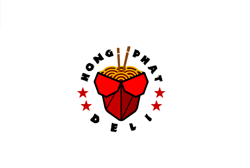
Hello, I am designing this logo for a client. He told me it looks great bu he want me to add a yellow stroke around the stars. I know it’s not a smart touch but should I do it anyway? Or should I advise him not to?
You’ll run into a lot instances in your career when I client wants to make a change that you know is not a wise choice. Rather than not supplying the client the requested change, and assuming the change isn’t something time consuming (like in this case), save a new version of the art and show the client the proof while explaining why this isn’t a good choice.
Many clients don’t have the same visualization skills as you do, and more often than not, once the client sees the art, they will realize their error.
Lastly you can offer a replacement change to the client. In this case, perhaps a yellow star with a red stroke. which makes more sense that have a lighter color stoke a darker one on a white background.
1 Like
Yellow against white doesn’t offer enough contrast. Even if you use that mustard yellow in the noodles.
You have a 4-color logo here (if the reds on the box are derivative, but I doubt it, making it more like 5 color… Just sayin’…)
1 Like
what do you mean by 5 colors?
thanks that was so helpful
Once you go beyond 3 colors in a logo, you pretty much relegate it to CMYK-only production.
5 colors (or more) in spot color, where every color is a plate, gets expensive. If the reds are tints of the same red, then that only counts as one plate, but where you have a bright red and two darker ones, I doubt they are tints.
I charge by the color in logos where a spot match is important, even in digital print.
1 Like
Thank you so much