It works as an alternative to a dropdown/picker/switch.
I don’t know of any name for these kinds of buttons, but I’m a little confused by them.
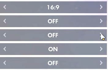
What are the arrows on either side supposed to do? On the top button, I’m assuming that
repeatedly clicking on one or the other will cause the ratio to change in a series of incremental steps.
However, that doesn’t appear to be the case with the on/off buttons since there are no incremental steps in toggling between on and off.
I agree with Just-B. I would need to see some context to better understand the function of these buttons in order to be able to figure out what they might be called. Most of them are on/off so I assume they’re just a sort of switch.
Hey, sorry for the late reply.
I’m a student who’s making a game for their game development course. At the moment I’m working on the settings menu but I’m having trouble naming one my prefabs. It looks and works identically to what you see in the example above.
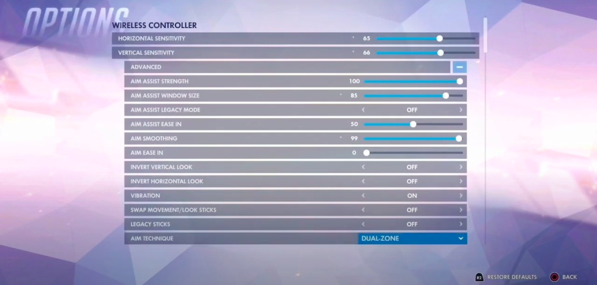
I’ve seen many different games use this UI component and I can’t figure out why. The ones from the example above are from a game called Overwatch. In the example, the first component is for the monitor’s aspect ratio. What’s confusing is that some of the settings in Overwatch use drop-downs, so then why doesn’t the aspect ratio setting use a drop-down as well?
Well, from what I’ve noticed, changes made to settings that use drop-downs require the user to manually apply/save said changes before the game and UI can update accordingly. On the other hand, settings that use the component from the example are automatically applied/saved as soon as changes are made.
So, if I had to guess, the reason why the aspect ratio setting uses the component from the example instead of a drop-down is to allow the display resolution setting (which uses a drop-down) to only display the options that are compatible with the currently selected aspect ratio.
Whatever the reason may be, do you think I should just stick to drop-downs for settings such are these, or are there benefits to using the component in the example.
Also, is a drop-down and a picker the same thing?
Thanks in advance.
I still don’t understand why arrows are on both sides of an on/off switch.
I’m unfamiliar with Overwatch, so I can only speculate. In my opinion, when there’s a selection of options, such as aspect ratios, a drop-down is appropriate since it provides the users with a visual display of all the options from which to choose. Stepping through a sequence of choices one at a time is less efficient.
That might be the case in Overwatch, but there’s no reason why it must be the case. Whether the updated settings are activated in one or two steps is just a matter of how the script is structured and what event the event handler triggers.
I’m not quite following you. Whatever options are available with the selected aspect ratio could be dynamically configured no matter how the buttons or menus look. This sort of thing isn’t typically a programming problem or limitation — it’s mostly a matter of choosing what makes the most sense and is most intuitive and efficient for the user in the context of the situation. I have a feeling I’ve misinterpreted your statement, though.