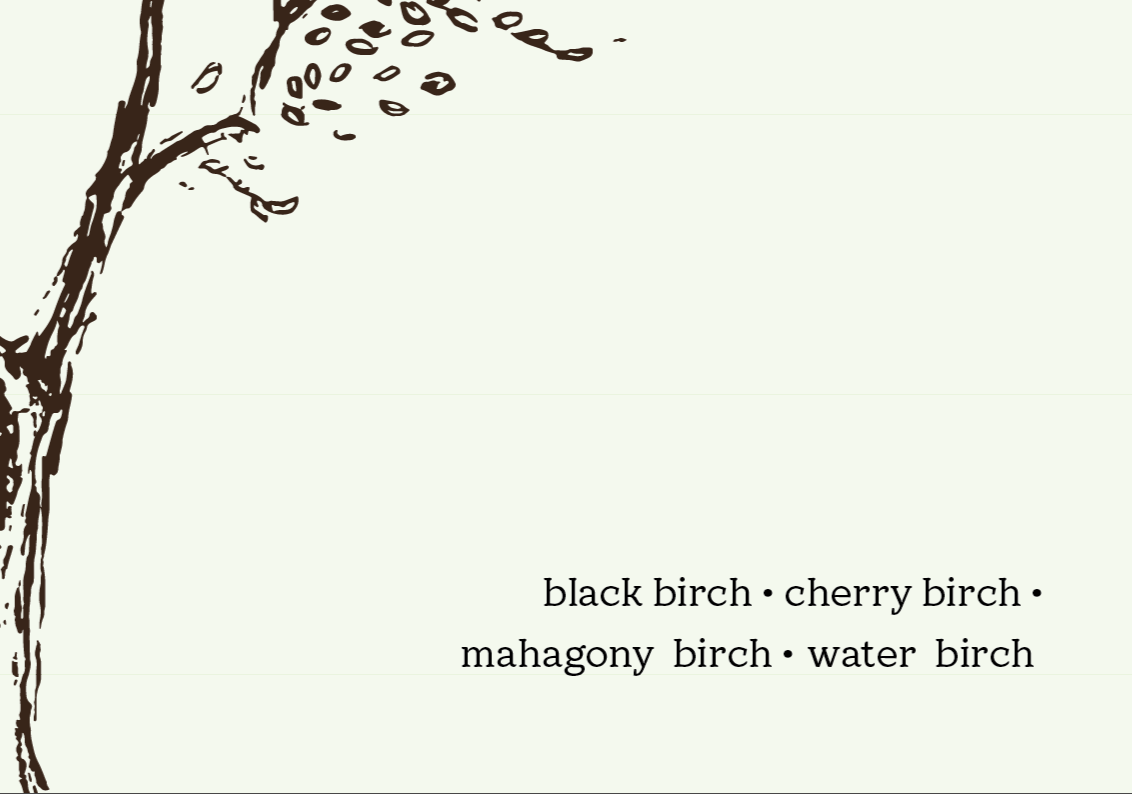
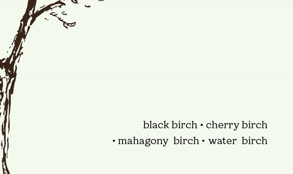
I can’t recall if there’s a typographic term for a glyph being used a stylistic divider, but which version do you prefer: the first (divider dot on the first line), or second (divider dot on the second line)?
Neither should be there. It should only be set between two items, never orphaned at the beginning or end of a line. You can get them all on one line if you try. Or perhaps a simple, vertical list would be better.
3 Likes
The word you are looking for is interpunct. ![]()
3 Likes
I agree with @HotButton and of course @RedKittieKat
In regards to the points to separate the words, there should not be any at the end or beginning of sentences.
If you do want to keep the dingbat for consistency it’s best at the end of the sentence - where cherry birch is.
1 Like
I can’t get them on one line for every tree… ![]()
@HotButton is correct, neither. Only between items, not at the end or beginning of a line. They don’t need to be on one line. Having them between the two trees on each line is fine.
With the first one there is no visible (or at least prevalent) alignment, which helps create more structure and draw our eye to things. Unfortunately, with the second one the dot looks completely out of place as there isn’t one in the first line.
On a side note, something interesting you could try is aligning by the dots
Nice!