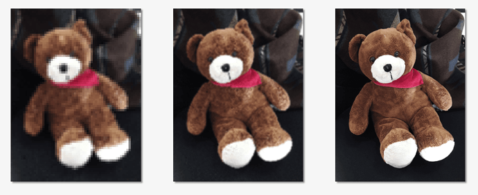
So the 72 PPI rule is a myth for exporting files to the web. No matter what your resolution is, the image will appear the same on the web. If that’s the case: 1. why do my exports vary in quality/size depending on the resolution I export them at, and 2. what PPI should I be exporting files for the web?
Pixels per inch have nothing to do with the web because the web isn’t built on fixed measurements. As a result, there can be no amount of pixels in an inch because an inch doesn’t exist.
The only thing that matters are the number of pixels in the image for the space you’ve made for it. If the space you’ve allocated for a photo is, say 800 pixels wide, make the artwork 800 pixels wide. Save it at any PPI you want — the results will be the same.
How many pixels you cram into a linear inch is only relevant when you print out the file onto a physical surface where an inch means something. In print, the resolution should be around 250–300 pixels per inch to keep it from looking blurry at arm’s length. On an electronic display, where there’s no such thing as a fixed-size linear measurement, as I said, all that matters is that you allocate an adequate number of pixels for the space you’ve created.
So is 144ppi
Any much higher than that and you run the risk of other people stealing your imagery and using it for their own nefarious purposes. Adequate won’t stop them, but better than adequate will encourage them.
Dealing with that right now with a stock image…
People still steal at 72ppi with a watermark and blow up to A1 and A0 sizes… it happens
As is 5 ppi or 50,000 ppi or, as Smurf2 said, 144ppi.
Some things in design are based on opinions that differ from one person to the next. This subject, however, isn’t an opinion. PPI is utterly, totally, and completely irrelevant to website imagery.
I’ll restate in another way what I’ve already said. Inches, centimeters, picas, furlongs, or whatever are real-world measurements that mean absolutely nothing on a website. An 800x800 image saved at 72 ppi or 7200 ppi is exactly the same — an 800x800-pixel image.
In print, if you have a 2x2-inch space in which to position a photo, you specify in Photoshop the pixels per inch (PPI) you want and the physical dimensions. From that Photoshop calculates the number of pixels to include in the files.
For example, if your halftone frequency is 150 lines per inch (150 lpi), you might want to include 300 pixels per linear inch. From this, Photoshop figures out how many pixels are needed for the image, which in the case of this hypothetical, 2x2-inch image, would be 600x600 pixels.
However, the web isn’t a real-world environment. It’s a virtual environment in which real-world measurements of physical space don’t exist. Inches, centimeters, and other physical measurements do not exist except in relation to how they will print to a physical product, such as a piece of paper.
However, the web has no physical end product. It exists solely as a bunch of pixels arranged on a computer display. The same image might display large on one monitor, but small on another.
Because of this lack of fixed, physical dimensions, those kinds of measurements are meaningless on the web. Instead, website measurements are specified in pixels, which aren’t fixed measurements at all. Instead, they’re a reflection of the data contained within the file, which are displayed at different sizes depending on the resolution of the monitor.
The bottom line in this is that images, for computer display purposes, are measured in pixels — there is no PPI.
Because somewhere in your workflow you’re incorporating meaningless print measurements, and whatever image processing app you’re using is processing your images with print considerations in mind. If I had a better idea of how you’re creating these images, I could probably tell you want you’re doing wrong, but without that information, all I can say is that you’re preparing and/or saving them the wrong way.
what confuses me is when I upload a 300ppi image onto a webpage it takes longer to load than a 144ppi image does—why is that?
Just to repeat myself, inches, as in ppi (pixel per inch) have nothing whatsoever to do with website graphics. The only size that’s relevant to images on the web is the number of pixels in the image. If the space you need to fill on a website is 900x900 pixels, that’s the only measurement that’s relevant. It makes no difference whether you save that 900x900-pixel images a 1 ppi or 1,000,000 ppi, just as long as it stays at 900x900 pixels.
If somehow, you’re saving with ppi mixed into the equation, you’re saving them the wrong way and somehow sampling up the image and making the file larger (as in adding more pixels), which slows the download time.
Thanks for answering my questions and explaining further. I understand what you are trying to say now. Have a nice day!
And then there is the retina resolution where you double the pixel dimensions and quadruple the pixel count.
If you need to fill the space of 900x900px you create an image of 1800x1800 but it just fills the space of 900x900px so it looks crisp on high resolution displays like smartphones or tablets and or can get zoomed.
Well, sort of, kind of, sometimes… I was afraid someone was going to bring up that bit of added technical complexity that muddies the water. ![]()
If everyone were accessing the web from a super-fast internet connection, quadrupling the number of pixels (and the byte size of the image) would pose no problems. However, it’s a tradeoff: somewhat sharper-looking photos on high-density-pixel displays vs. slower load times.
Take my iPhone, for example. It has a high-ppi display, but I’m mostly limited to 3G speeds when out and about. Despite the high-density display, I can’t really tell the difference in image quality because the screen is too small to see a noticeable difference. What I do notice are the insufferably long wait times for some websites to load.
There’s also the issue of creating two separate images: one for lower-resolution displays and one for higher-resolution, plus the media queries and CSS needed to identify the resolution of the querying device’s display to serve it the appropriate image. Of course, plugins are available for most CMSs that will handle this automatically, but it’s still an extra level of complexity.
I think high-res. displays are fantastic for rendering sharp typography at small sizes — especially on small-physical-dimension displays, such as smartphones. Live typography is vector-based, so there’s no extra download time.
Anyway, most sites these days are responsive, which leaves browsers scaling raster images on the fly to fit browser window width.
It all adds up to a big pile of dubious complexity with marginal benefits, which is typical of where website-related technologies have, um, devolved (my opinion) over the past several years.
I think the best way to handle the Retina display images problem is with judicious, case-by-case decisions regarding whether or not the extra effort and download times are worth it — coupled with a reasonable compromise on the degree of JPEG compression. In addition, using SVG instead of PNG eliminates the problem for images that lend themselves to a vector format.
good websites do loading management if possible and for example load more when scrolling.
and then there is progressive jpg which I quite like (for large images)
it fully shows even when partially loaded and gains quality while loading
compared to baseline jpg
Yeah, progressive-loading image have been around for a long time, and they’re useful.
One thing I didn’t mention is that, on cell phone wireless connections, lots of people have a set number of bytes they can download per month without incurring additional charges. Those high-pixel-count images can gobble up a user’s download allocation.
Of course, as you mentioned, good websites intelligently deal with these things. A good, responsive website will strip the bandwidth-hogging extras from a website site before serving it to a smartphone.
What makes no sense at all to me is when people quadruple the pixel count in an image for high-resolution displays then increase the JPEG compression to bring the byte size down — essentially erasing any increase in sharpness and detail that the high pixel count gave them.
It all gets too complicated for most people to deal with. They buy a WordPress theme and just assume it’s already set up to handle everything in the most optimal way possible when it really isn’t.
This topic was automatically closed 365 days after the last reply. New replies are no longer allowed.

