I want to make sure my responsive site design work looks the way I want it to on devices.
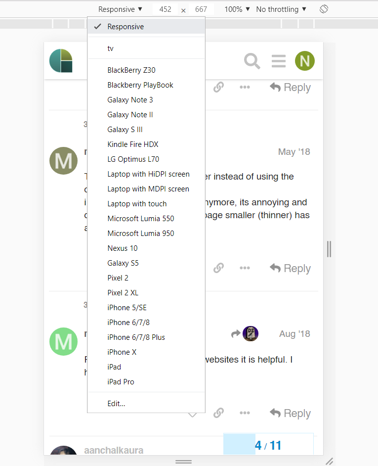
I’ve found that the responsive tools in chrome are not accurate. My colleagues/friends have sent me screenshots from their physical devices and have displayed different things.
Is there a site out there that actually does submit screenshots from actual devices so I can see how my responsive site design looks without having to bother everyone for screenshots?
Thanks @designzombie yea, I am afraid that an emulator may not do the same as the real device so i’m trying not to use emulators and hoping for a site that actually takes screenshots from physical devices. (even if a fee incurred)
A company would have to have every actual device running an API that takes in URLs from everywhere and sends back screenshots. I can’t imagine that there would be a company that provides that much hardware and bandwidth on the off chance that someone wants that much perfection.
Your best bet is to not expect perfection. The technology is changing too fast. When I used to develop web pages often, I would use the least compatible hardware and platforms to test on. It’s more likely that the newer platforms and hardware are backward compatible than it’s likely that older hardware and platforms will work with the new.
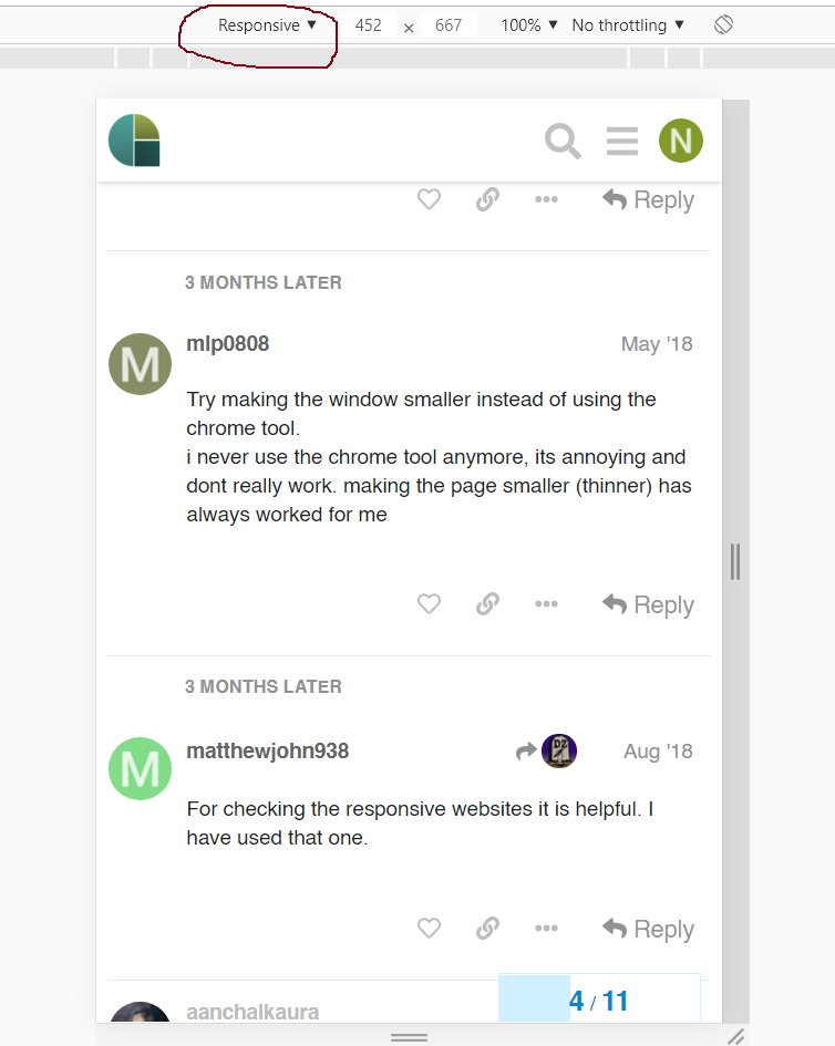
Try making the window smaller instead of using the chrome tool.
i never use the chrome tool anymore, its annoying and dont really work. making the page smaller (thinner) has always worked for me
http://responsiv.eu/ is also one of the best website for responsive view i used it for my project Webmization and it works like a charm the best thing is you can see all the popular devices on one page. Must try it guys