I think it’s very minimal.
Two things:
-
The top line should be centred.
-
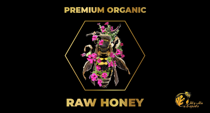
If that’s a bee, it must be a giant species.
-
How’d it look on a white background?
-
Designers can’t count.
-
How’d it look as a monochromic version?
That’s anything but minimal, I’m afraid. You need to make it far more minimal than it is. The type feels wrong for the product. The general approach just all feels a little obvious and predictable. What is special and unique about this honey, compared to its competitors?
1 Like
the clients mentioned it’s organic , the nature there is very clean , the bees are on top of the mountain that is surrounded with oak trees and wild flowers .
Sometimes I’m so without words here in the forum.
Most of the time my approach is listening to/asking the customer for an hour or two.
I don’t have that here. Therefore educated statements are difficult to make.
We don’t even know if it’s a front label for a glass or just a logo or something else.
I can say though the bee flower mashup is hardly recognizable.
1 Like
- Is that a honeybee? Or some kind of wasp?
- You couldn’t find an image of a honeybee that wasn’t a pin specimen so old the wings are all dried up and shriveled
- Are those petunias? One of the most evil smelling but pretty flowers on the planet, not one associated with something tasty.
- New to photoshop? Your image cutting and montage skills need a lot more practice.
Do over.
2 Likes
With any logo you need to see how it looks
- on different backgrounds (white / black / flat colour / photo)
- in black and white
- white on a background
- really small (is it still recognisable?)
The photo of the bee/flower is too complex and the hexagon line is too thin. You might be better with a stylised line drawing of a bee in a hexagon but there are a million of those.
I think the logo is down in the lower right corner. This may just be a label for a jar.
In which case, I’d sure as heck not pick it up. It’s actually kinda creepy, in a way.
2 Likes
That explains a lot.
The logo doesn’t match the context to me. I will advise you redesign the bee in form of an illustration.
The idea is to make your design simple.
I really don’t think that mangled bee that crashed into a mini-petunia patch is a logo.
The real logo appears to be in the lower right corner.
I think this is supposed to be a label design for “raw honey” as opposed to “clover honey” or “apple blossom honey” etc.
But since the OP hasn’t been back, we’ll keep guessing. ![]()
A designer’s job isn’t complete when there is nothing left to add. It is complete when there is nothing left to take away.
3 Likes
This topic was automatically closed 365 days after the last reply. New replies are no longer allowed.