I was wondering what would be a few timeless fonts like Helvetica which a designer must have?
Thanks in advance!
I was wondering what would be a few timeless fonts like Helvetica which a designer must have?
Thanks in advance!
univers, futura, garamond, syntax, open sans and so on..
I’ve got no idea if those are the common ones around the globe or only in europe ^^
Frutiger’s Univers typeface is very visually aesthetic. Rivaling Helvetica not only in the face, but use of negative space and kern as well.
Very well done.
Garamond is a nice go-to serif typeface also.
Here in the U.S. (At least I am) tired of Futura. It’s razor sharp peaks and wide letter stance irritate me.
Unrelated - but Juice’s Juice icon reminds me of a Mojito. And the sudden urge for an inappropriate morning drink puts my employment at risk.
Sigh
Myriad Pro (san serif) and Minion Pro (serif) have turned into my go-to typefaces. It’s not that I don’t use others, but when I need something generic, it’ll typically be these two.
As for essential typefaces, I’ll add Franklin Gothic to the list.
Massimo Vignelli, for what it’s worth, always advocated the idea that only about six typefaces were really needed to cover almost every situation: Garamond, Bodoni, Century Expanded, Futura, Times, Helvetica.
There are some nice faces on this list.
Personally, I’ve always preferred Goudy over Garamond as my go-to serif face.
Ditto. Those features have always been my hesitation about Futura also. In those instances where that kind of personality is warranted, Futura can work great. In most situations, however, they’re a visual irritant (at least for me).
I’m tired of Futura too. But I learned it in school, so I thought maybe it still is popular..
Haha sorry for that. I was to lazy to set up an orange juice icon, so I went with that whatever it is.
Ugh that sucks..
Wow, there’s so many.
Since script has yet to be mentioned … Burgues Script is also handy to have around.
Bleeding Cowboys!!!
![]()
I never really got on well with Garamond or Futura, or Bodoni for that matter. Maybe I just haven’t had a project these worked for, or at least didn’t work as well as something else.
I probably have about 20 fonts which are my go to fonts. Off the top of my head these are, Proxima Nova, Effra, Trade Gothic, Helvetica Neue, Frutiger, Bank Gothic, Century Gothic, Din, Avenir, Assistant, Brandon Grotesque, Industry, Rift, Sabon, Didot, Imprint, New Baskerville etc etc
There are definitely more, but really there are no must have fonts IMO as there are always multiple options that could work for almost any project.
A couple I don’t have that I would like are Akzidenz Grotesk and Gotham but these are expensive, and being that I already pay for library subscriptions, I can’t really justify spending that sort of money on fonts. If I win the lottery though, they will be some of my first purchases lol.
Thanks for this! I’m so bad at choosing fonts. I think I’m going to make a laminated folder with different fonts. Makes it easier for me to visualize printed font versus on a screen for some reason.
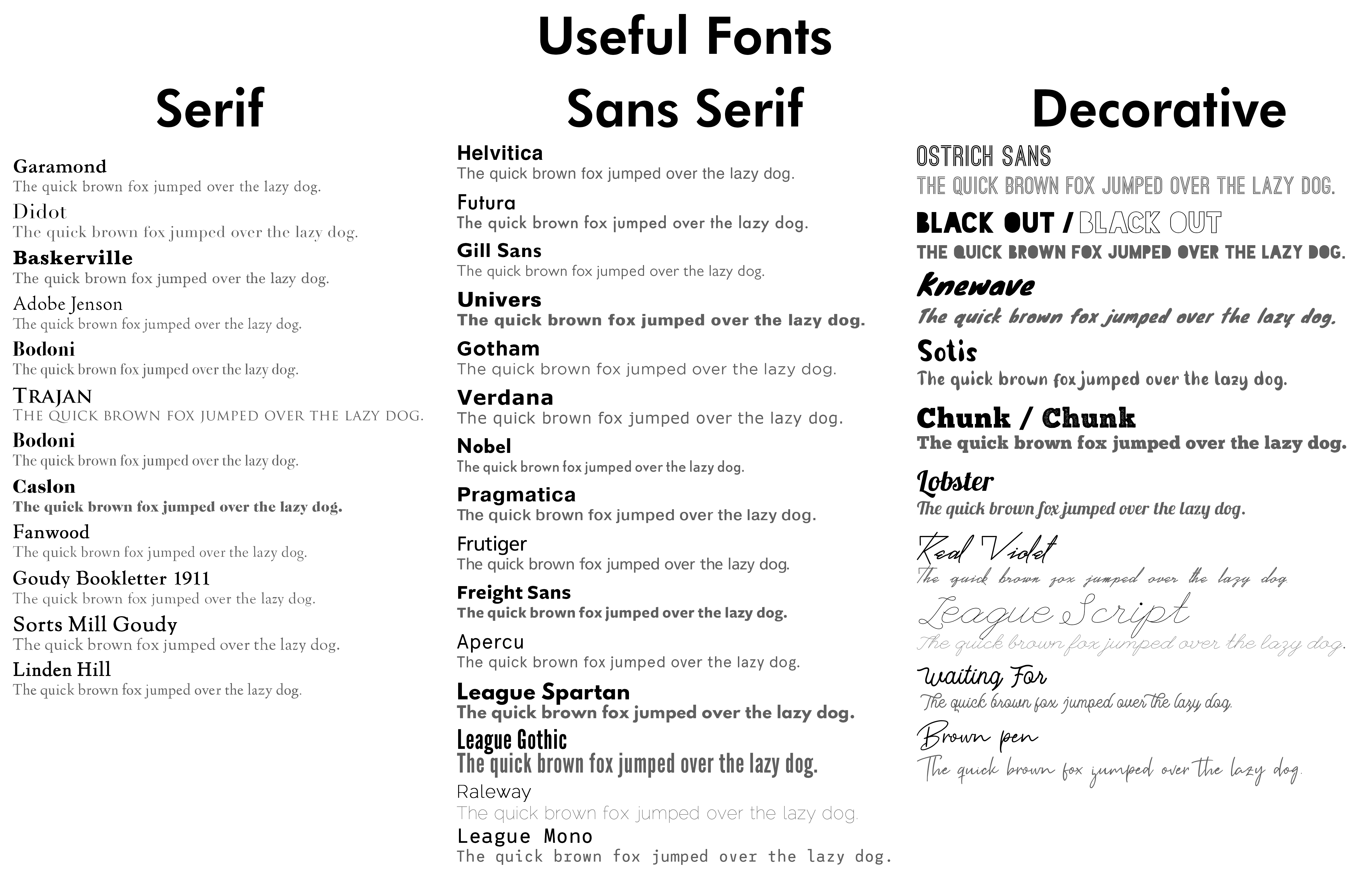
I actually created a collection that I use at work. Here is the image detailing some useful fonts. You can find many of the fonts free online. However, some of them are paid (work bought them for us ![]() ). I’d be willing to share the free fonts with you or at least point you in the right direction on finding them.
). I’d be willing to share the free fonts with you or at least point you in the right direction on finding them.
Hope this helps!
EDIT: Just realized I have Bodoni on there twice. Oops.
Glitchin, expensive typefaces, just bill them to a job.
Good plan. If the right job came up that called for a typeface I didn’t have, then I might do that.
Only ever billed one font to a job before, but that was because the client specifically asked for a particular font.
Raleway is a nice free font I use quite a lot as well. A nice font except for those weird W’s.
I’d say, the more you study type and the history of type, the more obvious which the ‘big hitters’ are. Also, the more you know and appreciate, you will develop your own preferences that will all go towards developing a personal style.
That said, any typeface you choose should be based on the job at hand and the audience you are communicating to. Sometimes that requires knowledge and experience and sometimes, research.
For example, not that long ago I did a book about American railroad journeys, so I spent some time researching typefaces that were produced by American Type Founders from the time of the heyday of railroad development in the US. All adds to evoking the right feel for the book. The cover was done in-house by the publisher and sadly they used Gill Sans, which, although beautiful (and definitely one of my staple fonts) it is about as quintessentially English as you can get. It irks me every time I look at it.
Anyway, see what I am getting at? The use of a particular face should be appropriate and relevant, rather than simply because the designer likes it.
^ This.