I desperately need some help, have been researching for days and cannot come up with a solution.
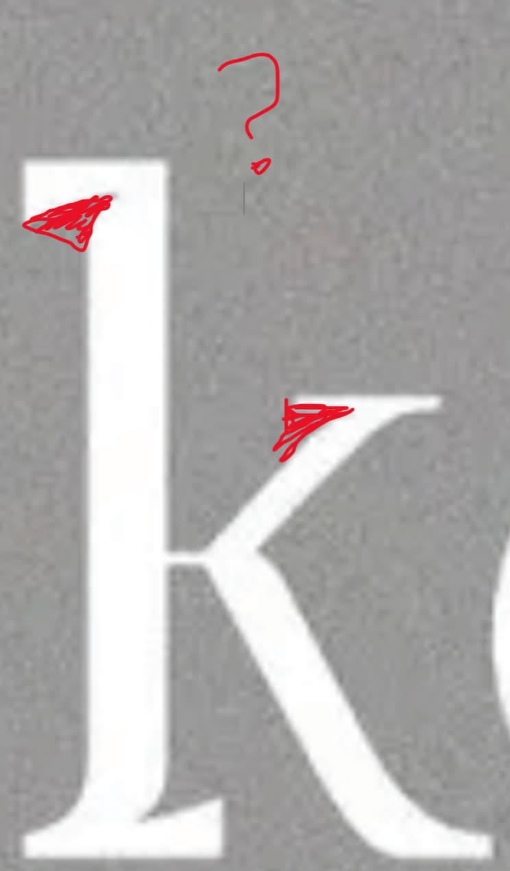
I noticed in recent design trends this thing in fonts, where they make the blank spaces larger and longer. I have marked it with red color.
You could help me with
A: What’s the correct term for this style/part, and where can i fin similar fonts?
B: What’s the name of the font of the lumela bonono Logo?
Well, they’re not real ink traps. They’re trendy affectations pretending to be ink traps. These pseudo ink traps have come about as the result of some typeface designers looking at old printing samples, seeing real ink traps, deciding they’re cool and copying them.
I’ll explain. Head back a hundred or two hundred years ago, and printing was rarely crisp and clear like it is today. After a few uses, the metal type would get grimy with ink. The paper was typically soft and absorbent. The relief printing methods used at the time, such as letterpress, were rather crude by today’s standards.
Anyway, between the absorbent paper, the metal letters pressed against the paper, and the sticky ink spreading, the printing would lose its sharpness. The spots particularly prone to blurring and filling in were the tight spaces where two strokes came together at acute angles. To help mitigate the problem of these spaces gumming up with ink, the metal type designers would cut tiny grooves into the sharp corners. These small notches were known as ink traps because they provided a little extra space for the ink to accumulate. The result was the ink filling in these little gaps, which allowed the sharp angles to remain mostly sharp when printed.
Today, there’s little practical need for ink traps, but some type designers have engaged in a fad of including them in their type designs — not to trap the ink, but because they think they’re cool, in sort of a hipsterish kind of way. If you haven’t guessed, I think the fad is a bit stupid.
But it isn’t new. It’s a non-functional imitation of something old that once served a behind-the-scenes purpose. (The ink trap notches were mainly for text sizes and didn’t show in the final printed pieces.) If you like the looks, that’s OK, but it’s a fad that’s just taking off and catching people’s attention. It will likely peak with overuse and go out of style within months.
I want to use it for a logo, obviously not in text. But it’s sth great to remember a brand, even though it’s from very old printing techniques, it looks modern to most people.
A fad isn’t typically appropriate for a logo unless the logo is for something with a lifespan no longer than the fad.
These new ink trap typefaces sprang out of nowhere and are taking off like rockets on the free font sites. It shows all the signs of a fad that will burn itself out and look outdated within a couple of years, if not sooner.
Do you remember the Bleeding Cowboys font fad from four or five years ago? Within months, it became something to avoid. I doubt the ink trap faces will burn out quite so quickly, but they’re definitely a fad.
B wasn’t comparing ink traps with Bleeding Cowboys.
He was pointing out that ink traps are the current latest trend slated for overuse just as much as Bleeding Cowboys was overused
Trends…End.
So not really appropriate for logos that should stay relatively timeless.
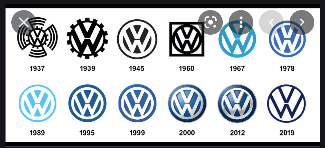
Not really in for a dispute but Logos shouldn’t be timeless. They should be suited for the current Zeitgeist in design, which many company logo histories show. VW i.e. is a perfect example of a hard base logo symbol, which changes slightly accordingly all 5-10 years.
Could be that ink traps will be considered ugly in a few years but the statement of timelessness I find to be very broad.
That’s not a text logo. But I’d argue that it is the exact same logo in all iterations, even the two with the candylicious bevel/emboss lighting and the really ugly 2019 version.
Sure brands undergo evolution but it is usually due to a company branding necessity, not necessarily to match any particular current design style. Sure you can use a trendy thing now and a trendy thing tomorrow, as long as the idea behind the brand recognition stays there. You have to change ALL of your collateral when doing so though, so it isn’t something to be taken lightly on the whim of matching a current trend.
Timeless logos are often tweaked and refreshed. However, when the initial logo design hinges on something tied to a specific time period or fad, it’s not timeless — it’s doomed for a major redo as soon as the fad passes.
The first and much-less-than-timeless Volkwagen logos are great examples of that. The 1945, after-the-war major overhaul produced a timeless logo. Everything since has been minor tweaks.