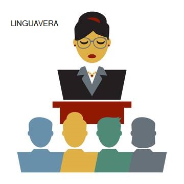
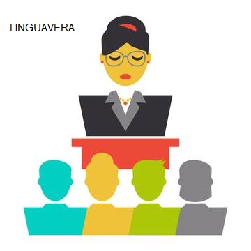
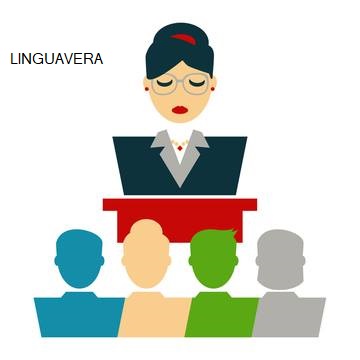
Hello everyone! I would like your help if you have some spare time:). Could you please tell me which of the color palette below you find most modern? I need to choose a color palette for our website and and I am trying to get some feedback from people who see them for the first time. Thank you! Best wishes!
The most modern? I can tell you which I like the best (the first one), but that has nothing to with it being modern or not.
There are certain types of color combinations that people pick up on and start using for a year or two before abandoning them (trends), but the similar color palettes you’ve used in the illustrations are not reflective of any particular trends that I’m aware of.
Why are you concerned with trendiness and why are you letting that concern influence your decisions? In my opinion, you should just use the color palette that works the best for the job at hand, which in this case just might boil down to personal opinion.
I am less concerned about trendiness but more with creating a pleasant eye experience for the user. I am trying to find a color palette that appeals to both children and adults. Adults (teachers and content creators in the educational field contribute) and children use the content. We initially started with the first combination (thinking to have a more serious tone) but then we were thought it might turn off the younger audience so we are trying to find a way to appeal to both. So, we created the other three versions. What I am looking for is to hear some feedback about which one might be more current and appealing visually at first eye contact. I am trying to address both the job at hand and how the user perceives it :).
To me, those seem like contradictory statements, but setting aside the terminology and going more off your description of the problem, I might choose the last one.
As I mentioned, the first one appeals more to me, but the colors are more muted, more earthy and more somber. If the target audience includes children, however, I’d probably pick the last one since it’s a bit brighter without bordering on being garish. By garish I mean it might be a bit overwhelming to use that same palette as the color scheme for your entire website. Even that, though, would depend on how you integrate those colors into the website.