or you can go to my website Soccer club manager at soccerclubmanager .com and select the color schemes manually
unfortunately i cannot add the link, so you have to remove the space manually
i dont know, i guess the same as the general population so according to google 8%
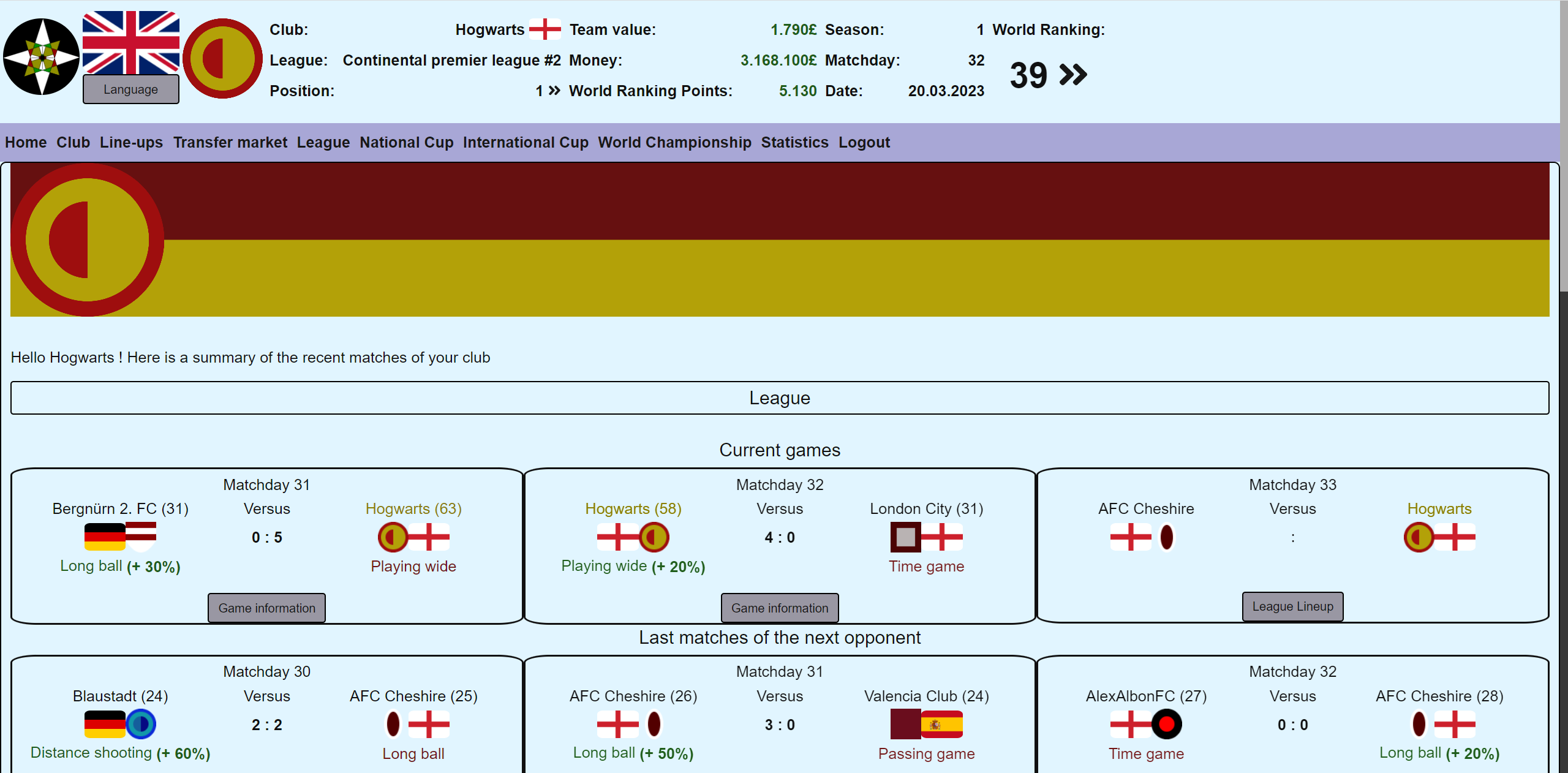
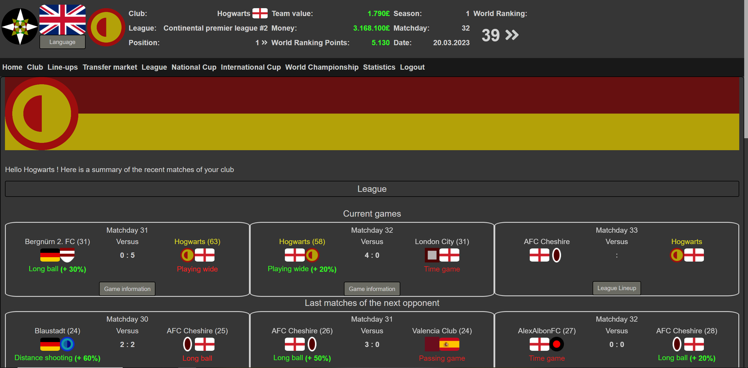
of course colorblind people would have difficulties with the blue and green color schemes, but there is still the black-white color scheme that should be fine to use
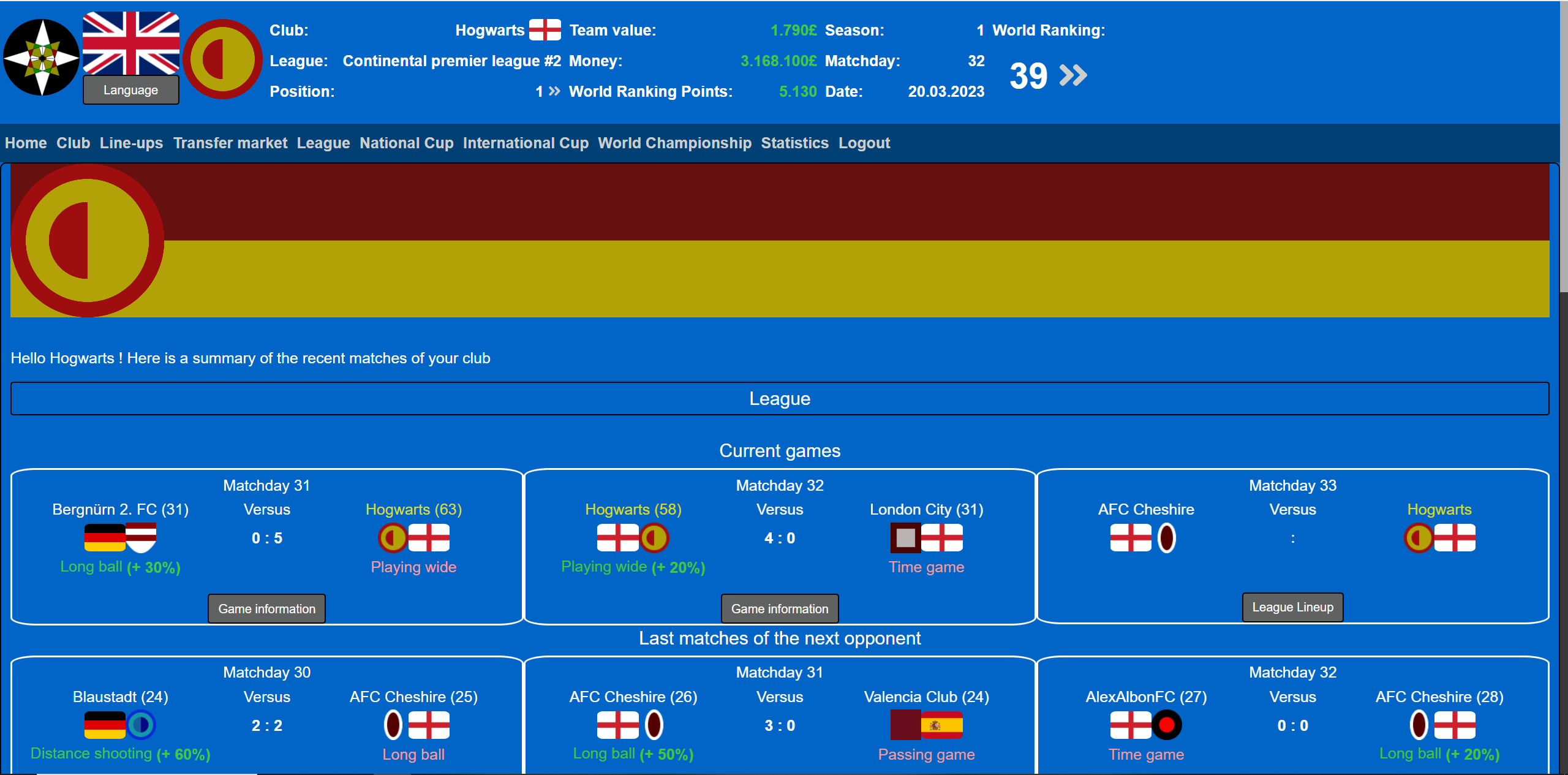
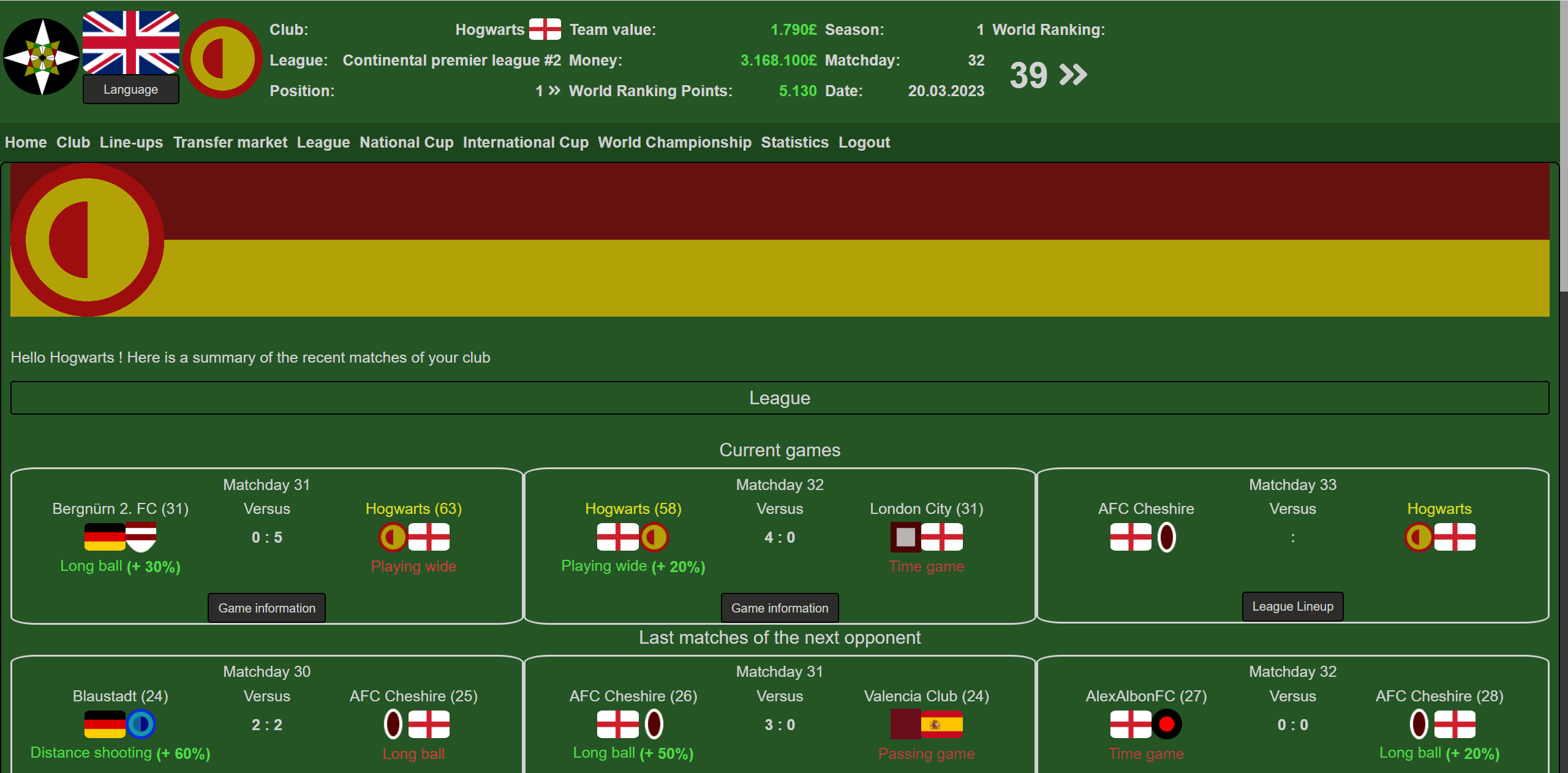
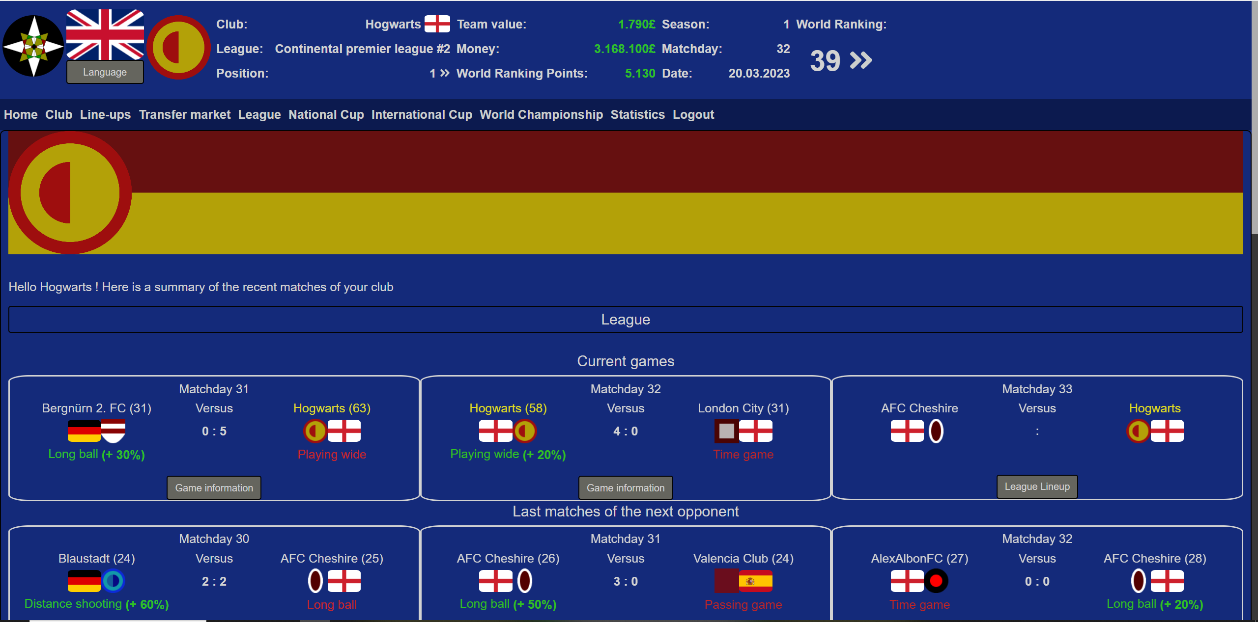
I could give you my subjective opinion, but that wouldn’t mean much since it would simply reflect which colors I like best. As for functionality and what other people might like, they all seem about the same to me.
Color blindness is a legitimate consideration, though, but I don’t see it being a huge issue here. There doesn’t seem to be any critical information that’s dependent upon differentiating between all the colors.
your subjective opinion is actually what i would like to know.
i have also created a reddit survey and so far the most liked color schemes are “Black White” and “Light”
i am searching for the one scheme that is liked by most people to set it as the new default