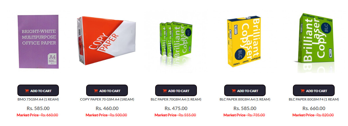
While the heavy black lineup in the first specimen leaves no doubt about how and where to click for add-to-cart, visually, they’re too heavy and pull the viewers eye off the products.
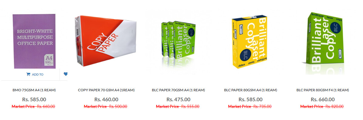
I like the idea of (presumably) the hover option demonstrated in the second specimen. It makes for a much cleaner presentation. However, don’t forget about mobile browsers, where hovering with one’s finger as the input device is a different proposition. It probably loses enough elegance in that application to rule it out, IMO.
Thankyou So much for your Comment this will help me to work further.
Thanks
I’m a stupid website user. If I don’t SEE an add-to-cart button, I’m not going to mouse around looking for one. I’ll assume you don’t want to sell the item and go elsewhere.
Also, if clicking on the item doesn’t give me an expanded description (brand, sizes/colors available, any tech specs) I’m also apt to go elsewhere so I can be sure of what I’m buying.
And also too, having market price made almost totally illegible by crossing it out isn’t useful. I’d probably want to fact check it, which invites searching competitors’ sites and maybe finding something I want more, over there. If it’s on sale, it’s on sale. If it is 25% off your normal price then it’s 25% off (I’d probably still fact check it elsewhere.)
Taking this apart even further, I wouldn’t show 3 reams in a photo, but then only sell 1 ream in the descriptor.
And why is the photo for the red label paper stretched if it is the same size paper as the green one?
yes its the same size paper as the green one. ill surely change the picture for that thanks.
If I did it, I would have made the font a bit bigger as it draws attention and make people see the button more easily. The color that has been used for the font is also a bit dull which would not make people focus.
Thanks for your Reply mate. i will surely look into this matter. as we are working in office supplies and stationery katib.pk