Hi
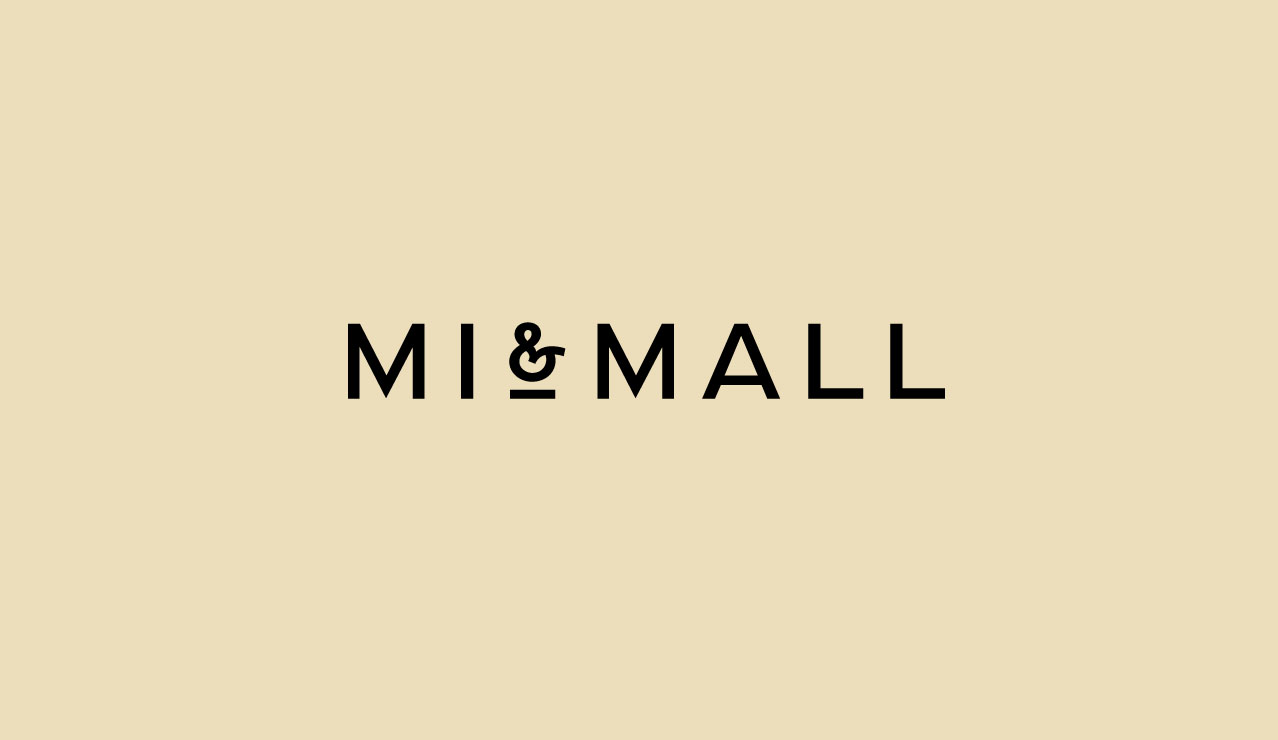
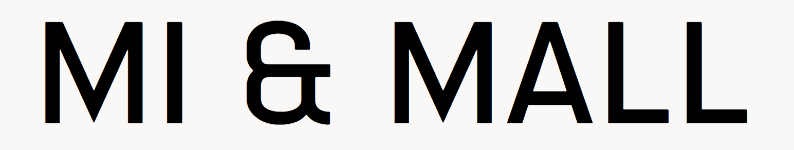
Kindly advise the Font type for the text ‘Mall’ in the image below ?
Well, Highway Sans is definitely the ampersand, and the other text could be a modified version of it.
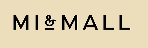
Hey @maverick, this is a logo for Mi & Mall created by Atipo design studio, which also runs a digital foundry. Something tells me that they used izoard, a font from their foundry, and customized it for this logo (except the ampersand, which looks to be from the font CraigB shared). It’s very similar - the biggest differences I see is that the A (and possibly the M too, not sure…) is stretched wider and the horizontal stroke of the L is a bit longer in the logo than in the font.
Here’s a comparison of the two:
Hope this helps!
I was wrong - just went through Atipo’s Instagram and saw that the logo and brand identity was created way before the font, so it’s most likely a fully custom logo type - maybe the letters of this logo were a starting point for creating izoard…I don’t know…but I think izoard is the closest you’ll get…
With some custom scaling/tracking
Thanks everyone for the valuable input !
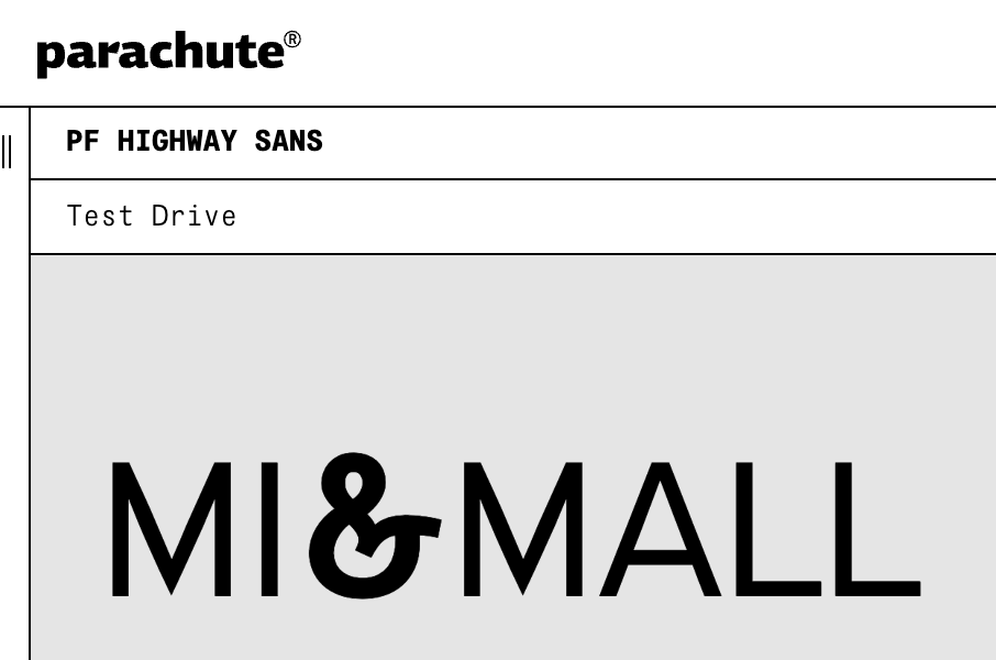
@Smurf2 Great find! Highway Sans that CraigB shared is from the same foundry as this one, but the foundry website doesn’t list it - so, glad you found it and shared. I guess I could be wrong again, maybe it’s not a fully custom logo type…
Rarely is
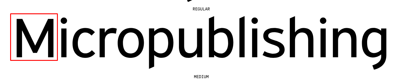
I noticed that for some reason the regular version of Highway Sans does not have a pointed M, but the other weights do.
It does look like it has been horizontally scaled though or modified.
I don’t remember ever designing a logotype where I didn’t design and draw my own letters. Sometimes, they might have been based on another typeface, but I’ve always made modifications or redrawn them to better reflect the personality I wanted them to have..
Whether my approach is common, I don’t know, but I’m mentioning this because sometimes the letters in logotypes are unique and don’t exist as letters in a typeface.
Most of my high end clients have their own designed complete typeface sets specific to their brand.
It’s very near impossible to get access to them too without all kinds of serious legal contracts.
“Be sure to outline your fonts.” is a very common sentence in my emails to them.
@CraigB Yeah, that is kind of strange cause the Highway Sans Pro version that Smurf2 shared does have the pointed M even for the regular weight.
Thanks everyone for sharing your thoughts here, I’ve learned a lot from this - great lesson in practice!
That’s what I do too. Aside from personality and design considerations, you often need to adjust the weight fractionally for instances below a given size anyway.
Hi Craig
Do you mind sharing details of the PF Highway Sans screenshot ?
Which weight(s) show the pointed M for the regular version ?
Can you also share the link ?
Cheers
@maverick It was the same link I shared earlier. At the bottom of that link on the left it says “Test Drive”, the weight Thin, Light, Medium and Bold appear to have the pointed M.