Will start to work on a book soon.
Usually I use a modular grid and crop images to make them fit.
For this project I was told most images can’t be cropped just proportionally scaled.
Which type of grid would work best for projects like these?
Also… any tips or best practices when working with images with different dimensions / aspect ratio.
I suspect your question is deeper than my answer, but rather than crop the photos to fit, in this case create the grid to conform to the aspect ratio of the images.
Of course, I’m assuming those aspect ratios are all the same. If they’re not, and if their proportions vary a lot, well, you can always try scaling them up or down a bit to fit. Otherwise, an option might be to consistently place them centered between two paragraphs of text rather than wrapping text around them.
It can be effective to just establish some kind of obvious consistency in how elements in the layout are treated — even when strict adherence to a grid isn’t possible. The goal being, in either case, to establish visual continuity and harmonious relationships between all the elements on the pages and throughout the book.
I created a modular grid today and added image lines at cap height of the running text font size.
Looks nice until there’s a bigger heading or smaller caption next to an image.
What to do? Just adjust the image height so it follows the font size cap height next to it? Or just leave it at running text cap height througout the document?
Without seeing it or knowing the nature of the book, I have no specific suggestions.
In general, though, grids and guidelines are, well, just guides to use as a starting point to provide a cohesive structure to the layout. When there’s a good reason to deviate from the grid structure, it’s perfectly fine to do so when done deliberately and intelligently.
Most publications I’ve designed have had multiple grids that can be used selectively throughout the publication. There’s rarely a one-size-fits-all approach that always works in every instance. For that matter, it’s almost always a good idea to break free of the grid in places to keep the layout from look to contrived and rigid. The exceptions that just refuse to fit within the grid are often the elements that can be used to break the grid, color outside the lines and provide that bit of spontaneity that most layouts need.
i [dot] ibb [dot] co/61DScqz/Screenshot-2019-12-12-at-23-01-00.png
The above example for instance. The image follows the grid but sticks out a bit compared with the text on right. If I bring down its height so it aligns with the cap height it will look better IMO but… if there’s a heading on the next page or column the same image would be too low. If I keep adjusting images the upper margin will vary with each image. This type of inconsistencies make me nervous.
You’ll get different opinions on this, but my opinion is that lining things up visually so they look right is more important than adhering to a precise grid.
I don’t even bother with a line-by-line grid due to the very kinds of problems you’re running into: multiple sizes of type require line-heights that vary by differing amounts.
Nope. Sometimes I’ll vertically justify columns of text and other times I’ll include a ragged bottom into the design. The columns themselves usually conform to a larger grid, but I rarely see any real point in worrying about baselines lining up from one column to the next. I’d much rather all the page elements look right than being mathematically accurate. Again, opinions differ on this issue and there have been discussions about it here in the past.
If I were designing publications that benefited from conforming to a rigid baseline grid due to speed, economy and overall minimalistic consistency, it would be fine. Flow everything into place, apply the style sheets and get it done. A novel, a technical journal, a set of user manuals, etc., would probably fall into that category.
However, most of my work has been for outdoor adventure magazines, daily newspapers, catalogs, marketing brochures, tourism booklets and that sort of thing, where a more casual, spontaneous and fun look with a bit of flexibility works best.
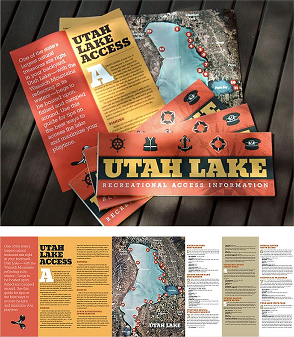
For example a baseline grid would have just gotten in the way on the following:
For what it’s worth, I got my MFA in publication design — well, actually, graphic design, but my work and thesis centered around publications and, to a slightly lesser degree, the typography used in publications. I argued like crazy over some of these kinds of things with the professors on my graduate committee.
I just find too many instances where I think to myself that a cutline really ought to be a bit closer to the photo or a bulleted list needs a few extra points of leading between the items or that an in-column heading would benefit from a little extra breathing room.