Simple question - which is better please? And why?
(1)
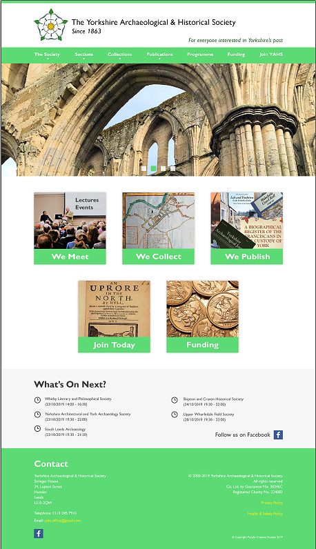
(2)

Thanks!
David
I will prefer first one cause i think the first one contain more details then 2nd and also it’s look user Friendly.
Second one! Visual content helps visitors to get a good user experience other than just mentioning categories.
The darker green is better but the orange is a mistake.
I like the second one more.
The first one for me. I like the uniform style you have in the layout.
The second one (Realizing this thread is 6 months old.)
Look at your demographic (that photo is fairly representative, from what I’ve seen on my trips over there.)
Don’t make it “cutesy” and certainly not hard to read (white text on light green???)
I concur with what PrintDriver said.
Second one! Because the angle this picture has been taken from is good!
2nd one but replace the orange colour in the boxes underneath the images with that dark green you have.
I’m sure this project is well-done by now. Original post was last December!
well well, i prefer the first one, why?
i don’t like it when the right side of the logo in the second design left so many whitespace.