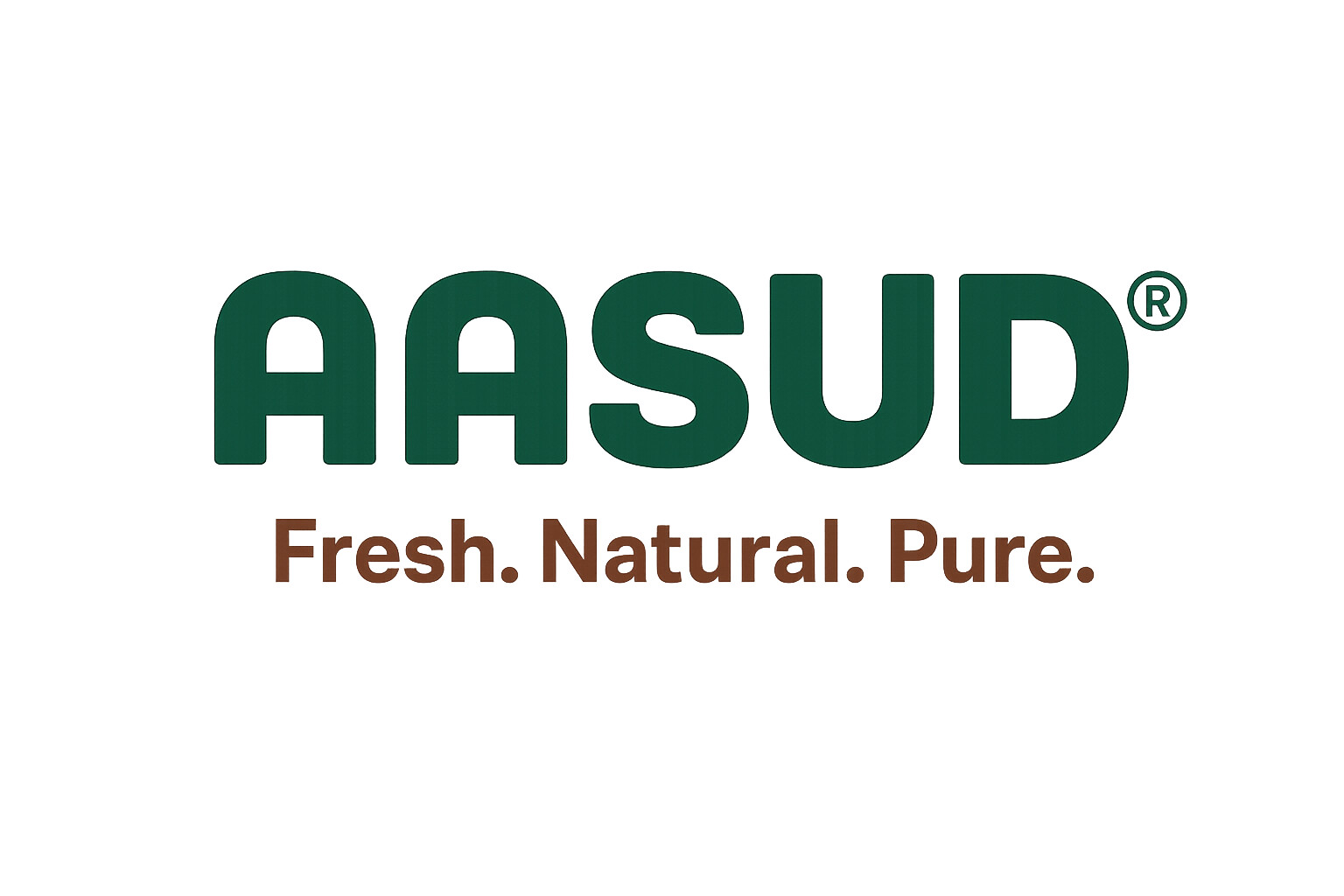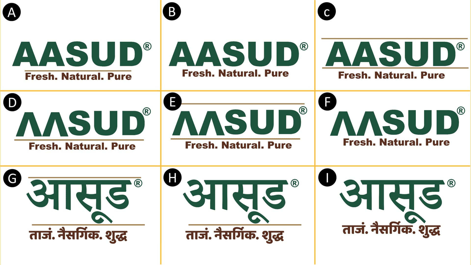
We’re finalizing the look for AASUD – your go-to for organic fruits, vegetables & cold-pressed oils.
Check out options A–I in the image and comment your favorite! ![]()
![]() 🅲
🅲
Thanks in advance for helping us choose! ![]() ”
”
Check out options A–I in the image and comment your favorite! ![]()
![]() 🅲
🅲
Thanks in advance for helping us choose! ![]() ”
”
I know very little about Devangari script or what might be appropriate in India. However, to me, here in the US, none of them suggest organic, freshness, vegetables, or fruit. Even the name and the typography, at least in English, is just a combination of stern-looking, bold letters that can’t be pronounced.
As I said, though, what is normal and appropriate in your part of India, I know nothing about. There may be a significant cultural gap that prevents me from fully appreciating what you’ve done.
I have to agree, none of these convey fresh, natural or pure … but maybe they work where you’re from.
are you talking about text or colour/font combination? Becasue word AASUD is meaningful in marathi and already registered, please suggest correct colour/background color and font.
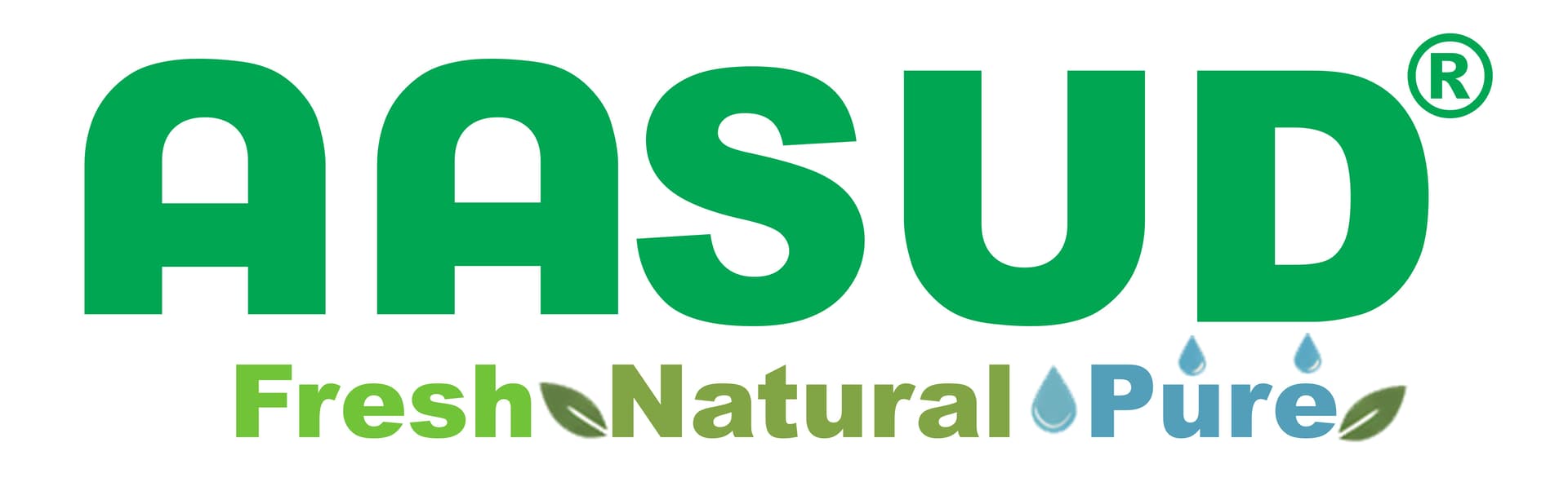
By the way with comments from other designers and voting from different i have selected one and modified as shown below, please take a look
If that’s the best you can get to then stick with it. Nothing wrong with it.
Thanks, just one request please take look on colour and font.
same for German speaking countries.
Colors could maybe be associated with organic products.
Overall it communicates rather military than nature.
Less does this one Which logo best says Fresh. Natural. Pure.? - #4 by mrnams
Agreed, understand meaning of word is not showing pure,natural and fresh. Here in my country it’s vary famous word AASUD meaning whip, used by farmers.
Also is part of book named Shetkaryancha Aasud by Jyotirao Phule.
I say I am lucky I got domain name and trademark for this name.
Apart from word,how do you feel in font,color,any changes to make it catchy but not disturbing it’s wording. Initially i thought to make AA without horizontal line like how TATA use.
I have three thoughts.
The font in the revised version is more appropriate.
It still don’t think the overall design particularly say “fresh, natural, and pure” to me.
The colors seem a bit muted or, worst case, almost like vegetable and fruit that is going bad. @Joe suggested military. I could see that. I could also see forestry.
As @Joe mentioned, setting the type in a bold, sans-serif, dark green typeface in all caps resembles something the military would use, or perhaps the initials of a bureaucratic government agency.
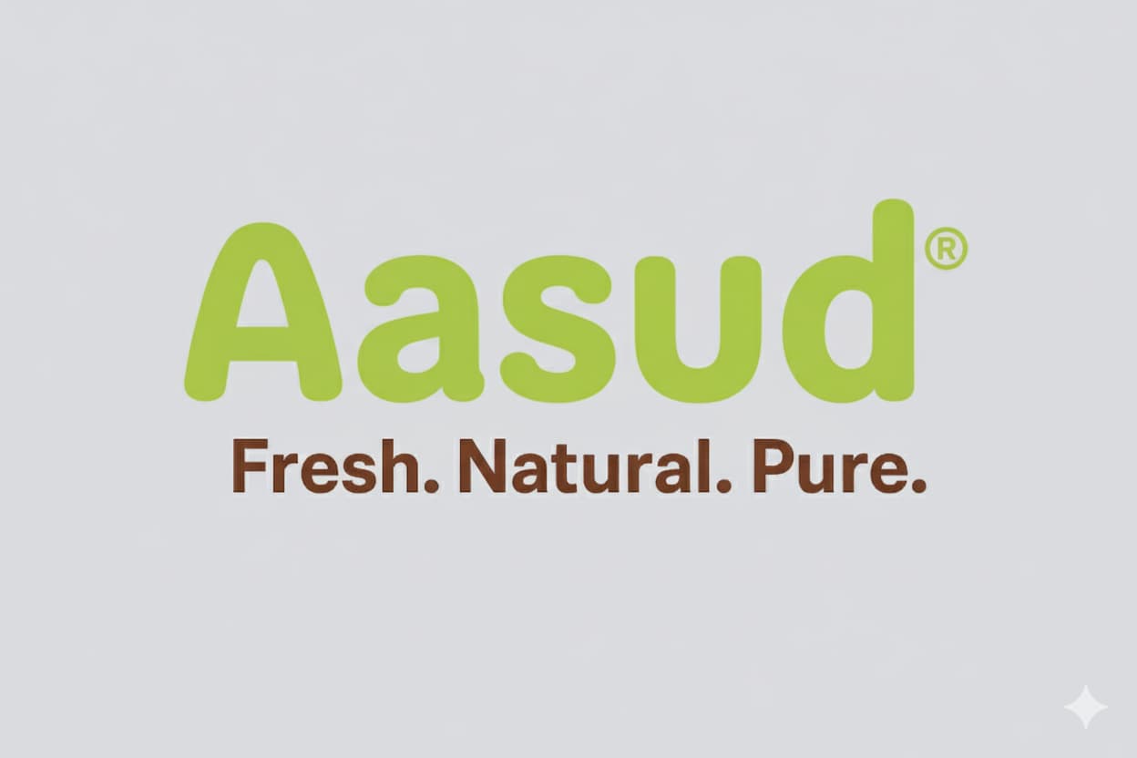
Have you tried a lighter, fresher green and using a more informal, friendlier typeface set in lowercase (with the first letter capitalized, of course)?
They all say Fresh. Natural. Pure., because the tagline says so.
Hi all, making first letter capital and all remaining small is not making it memorable as per offline review i took from different people’ so keeping it as ‘AASUD’ i have made another version as given below
Too many elements
other than that is it looking good now? I shall remove those leaf and oil drops
Go back to the original - then look up ‘logo food fresh natural pure’
Take a look at how others in your sector approach it.
None are amazing - but I preferred yours when it was just simple text and colours.
Green and Brown are common enough for this logo.
But you should really look at what works that’s already out there - not to copy.
@Eriskay @Smurf2 @Just-B @Steve_O @Joe
Thanks you all for your responses.
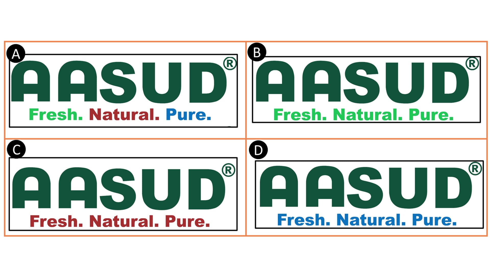
I have finalized everything except tagline color, could you please suggest me which color combination for tag line is most appealing, readable, and professional.
C
But the kerning is awful and i don’t like the s
Thanks