Hello, i made a few logos for my MountainLight distro. It is supposed to be a light version of Linux Mint. I am working on the logo. I got some inspiration from the Cinnamon logo. I have some ideas. These are the ideas i have. Please not that I’m new to graphics desing.


What you have here are not four different ideas — they are four variations on one idea.
I am sorry to say that this is not working — in my opinion. It’s pretty bland. I think you need to go back to the drawing board and spend some more time brainstorming.
All I saw was a one-eyed figure with fangs.
2 Likes
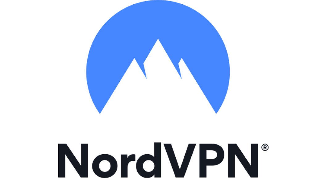
These designs are so similar to the Nord VPN logo that you would be violating their copyrighted registered trademark.
Not at all. Don’t see any issue there
1 Like
oh my god how did i not notice
I don’t see an issue with nord any more than cinnamon. Possibly the Trademark Office might. But I doubt it.
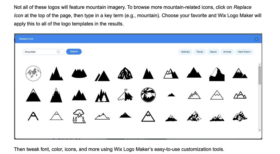
Then there are all these generic logos from an online clipart logo maker
Do better.
Smart man!—But better to know it now, huh? And beat yourself up about it. It could happen to any of us.
And I for one, would not want to bet my money on it. Regardless, it’s better to start over in a new direction.
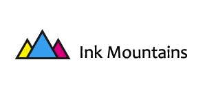
For something as important as an OS logo, I’d assume they’d run it by the Trademark office before implementation. But that’s an assumption. Three pointy triangles doesn’t even look close to either of the two mentioned logos, which actually look more like mountains.
I mean, put some color in those pointy triangles and this becomes a trademark infringement.
Don’t see any issue with it.
So the 4th one doesnt have copyright infringement. Is that what you mean?
Don’t think any of them do
Even if it didn’t, it still isn’t the best design for the project. It still needs a total makeover because I believe you can do better much better. Just my opinion. I wish you the best of success with it.
I actually agree. It fits today’s modern desing, but looks a bit lame. I will do a makeover of it.
Like Smurf, I don’t think any of your ideas are a direct infringement. But I’m just a random guy on the internet. Run your final through the Trademark Office and be sure before implementing.
No, it does not fit today’s modern designs. Yes, it’s minimal, clean, and devoid of decorations, but there’s nothing there of any interest.
The NordVPN logo that @PopsD posted or the Cinnamon logos you referenced are good logos. They’re clean and simple, but there’s a nice relationship between the negative and positive shapes and some nice typography paired with the NordVPN logo. Probably most notably, the mountains, as minimal as they are, look like mountains with crags, shadows, realistic profiles, and plausible slopes. Why something called Cinnamon would use a mountain as its logo, I don’t know, but that’s another matter.
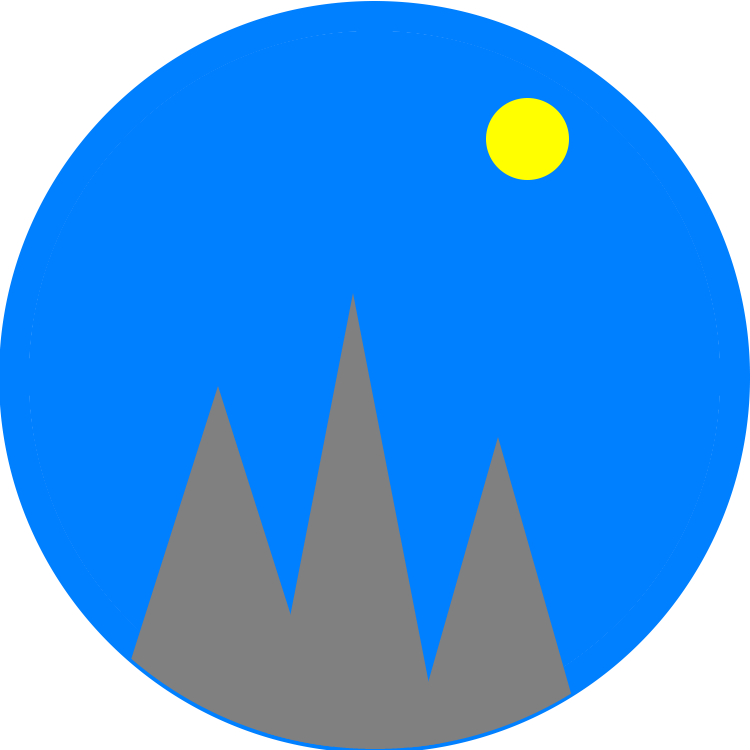
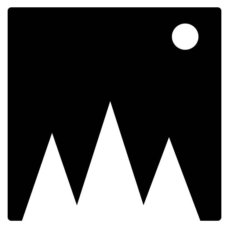
You’ve drawn a circle, then inserted three pointy triangles that don’t resemble the mountains they’re supposed to represent. The blue, grey, and yellow version lacks value contrast. If you squint your eyes or convert the image to greyscale, the blue completely blends in with the grey.
You’re not a designer any more than I’m a programmer of operating systems. If you’re serious about getting a suitable logo, find someone to do it for you.
As for the trademark problem, I think that’s secondary to what I’ve already mentioned, which I’d solve by starting over. However, if you do use one of the logos you came up with, I can easily imagine a problem with Cinnamon.
As you already know, Cinnamon is a desktop environment for Linux from the Linux Mint team. You’ve said your logo is supposed to be a “light version of Linux Mint.” You’re obviously and intentionally copying to create an association with Cinnamon. Yes, it’s all open-source software, but I don’t know if the logos are open-source. Do you?
I know nothing about your relationship with the Linux Mint people, but I’d certainly get everything about infringing on their logo cleared before moving ahead with your logo. If it turns out the Cinnamon logo hasn’t been released as open-source and if the person or people who own the copyright to the logo object to your similar logo for your related product, you would likely lose that legal argument.
1 Like
Nice logos
This topic was automatically closed 365 days after the last reply. New replies are no longer allowed.