Hi there,
First time posting here, hope this is acceptable.
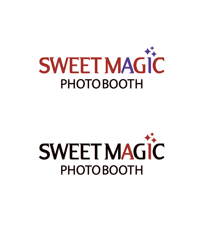
I would like your opinions on which logo design you prefer and why? Which is most appropriate as we head into 2026?
Thanks
- Did you make these logos?
- You didn’t give any context. I get that it’s a photo booth. Is it a real photo booth or a virtual one?
Hi there, it is a real photo booth experience, but I did not give details on purpose as I did not want to sway opinions based on what I am trying to communicate… if that makes sense. I’m looking to get opinions based merely on what you’re seeing, and what preferences you have for a logo in today’s market. Thanks.
I thought both are awful for a restaurant logo. Just glad you cleared that up.
Wow, that was really helpful and insightful, thank you so much for contributing.
Didn’t really get the ai part with the 2nd one only twigged it cos of the first one.
The first one is good but the hierarchy is nor sitting right with me.
Thanks for your thoughts. Can you please elaborate on the hierarchy issue you’re having. Also, do you find the fonts in the first logo to be modern enough to reflect the AI messaging, or are the fonts in the second more contemporary?
I
f
I simplified the second option, with all type in black except the A and I, would the AI then stand out more?
Sorry, but more context is needed to be able to judge their success. Who is the target demographic? Where will it be cited? Shopping malls? Railway stations? I assume the point is for fun, as I can’t see any official body, such as passport offices, accepting the output.
For me the two options are polar opposites and even then, carry mixed messages. The first one, typographically, looks more of a hen party night out sort of thing, but the colours are far too severe for that, The second looks more hard-nosed utilitarian, but the name and sparkly wand details fight that feel.
To that end, though I see your thinking in wanting unbiased feedback, you can still have that if you state, fully, the problem you are trying to solve.
If the first one is aimed at office parties for people in pin-stripe suits, it may be getting close, with some refinement, but if it’s for 6-10 year-old’s birthday party hire, it way off the mark. Context is everything.
This is a photo booth company that specializes in providing AI experiences for all events, ranging from weddings and bar mitzvah to corporate parties snd brand activations. It will be used at all
online touch points, website, socials, etc, and will be seen printed on business cards, signage, etc.
Then you want to create a more fun, party atmosphere. Personally, I think the first is nearer, but definitely with colour changes and also, the secondary font is not right, in my opinion. It all likes a bit too cake decorator. The second, as I mentioned is far too pedestrian and definitely does not evoke, fun party time.
Honestly, I’d have a rethink about the name too. It adds to the cake / catering feel, to my mind.
Now font is fine but take care of the color combination (awful …) sweet magic in black ? (it seems “black magic”) you need to use happy colors ! (like blue for a happy magician) white, blue and the red does not make sense ! take a look at disney : Merlin | Disney Wiki | Fandom

