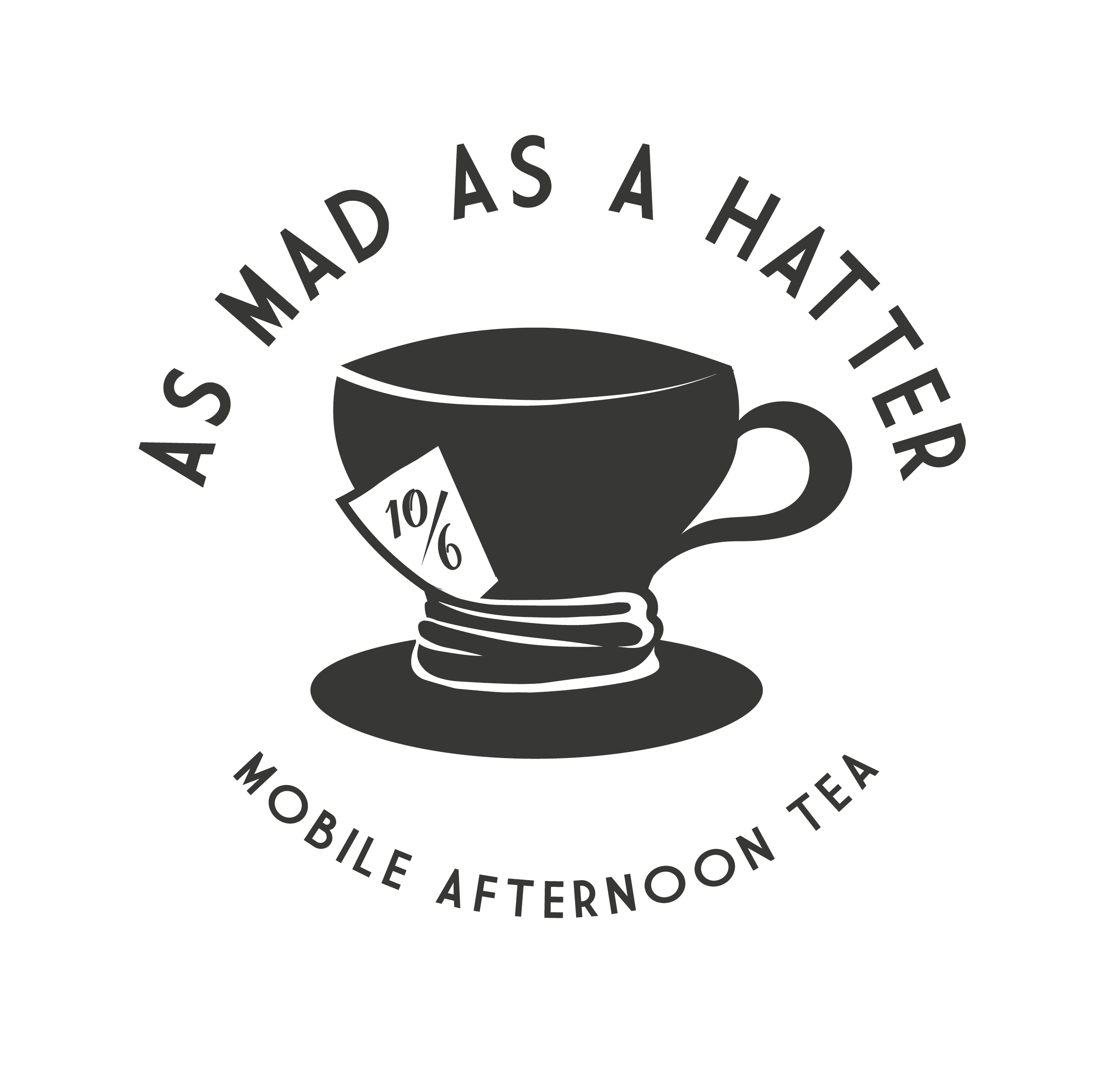
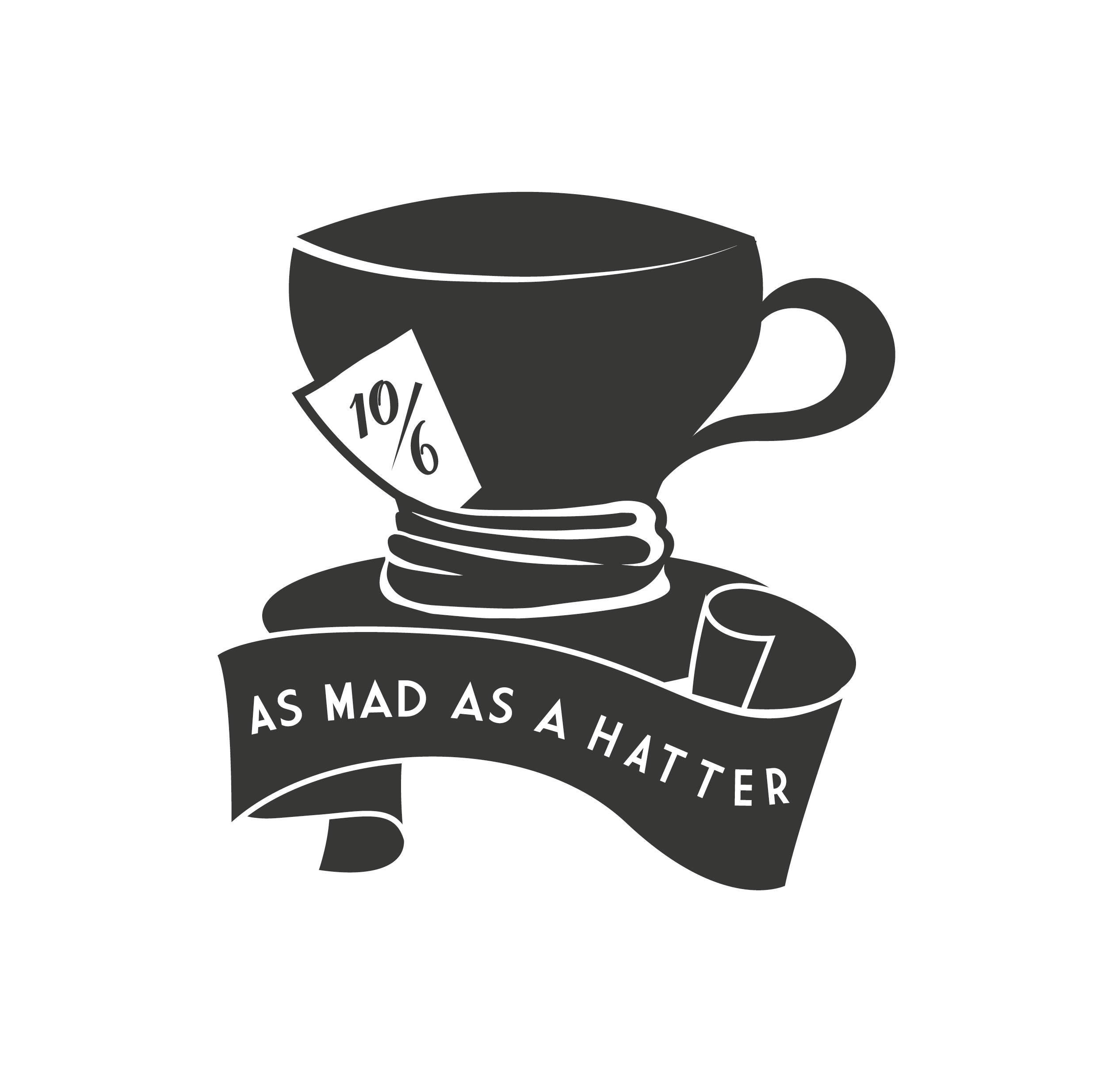
Hello! I am a Digital Media/Marketing student (not actually a graphic designer, go easy on me) I am however completing a branding project for a small afternoon tea business called As Mad as a Hatter. I’ve put together a few logo concepts (still a work in progress) and could really use some opinions on which ones are preferred and why?
Any other general feedback is also welcome! Thank you in advance!
I think first and second look great… But I personally like the second one more than the first one because it looks representative to me. However, I misread the ‘Hatter’ to ‘Hotter’… just my own perspective
Of the three, I like the second one best because of the interesting typography. However, the tea cup does not read as an A, which is a deal killer.
Speaking of tea cups, yours is, unfortunately, not well-drawn. If accuracy is a goal, the top of the cup should be the rounded ends of an ellipse, not sharp and pointed. Also, the bottom part of the cup, where it connects to the base, is awkward. I’m not even sure what those folds are supposed to be.
What is the 10/6 referring to? Why is it there?
The curled banner on the bottom on, like the tea cup is not drawn accurately. Again, the elliptical elements come to points instead of being rounded. The text does not accurately follow the flow of the banner. The banner itself varies in width.
The typography on the top one is too loose and spread out over a sea of left-over space. The type might be arranged in a perfect circle, but it’s so loosely organized that it’s difficult to say — the letters appear to be flying apart instead of hanging together.
Hello, thank you for your feedback. Allow me to address some of the points you have made where there seems to be a lack of context:
You refer to accuracy as a goal - in this case this isn’t as much of a concern for me, as (I’m not sure if you’re familiar with the reference) The Mad Hatter is from Alice in Wonderland, so things being a little distorted and imperfect is intentional (like the banner being different widths). However I think you’re right about the edges of the cup being more rounded instead of pointy - thanks!
The folds, the 10/6, and the fact that the cup doesn’t quite look like a cup: is because it’s also meant to be a hat - as in it’s kind of meant to be both. Popular depiction of the mad hatter shows his hat with fabric around the base of the hat. The 10/6 is from the original story of 'Alice’s Adventures in Wonderland" by C.S Lewis, in which the mad hatter has a price on his own hat “In this Style, 10/6” meaning: 10 shillings and sixpence in old English currency. This can also be seen in Tim Burton’s depiction of the mad hatter.
Now that I’ve looked closer at the typography you’re right, it looks quite odd - this is just done with an ellipse and type on a path in illustrator, no further adjustments. Will have to have a mess with that one!
Thanks again, hope that makes some of the design elements a bit clearer
When illustrators aim for that effect, they tend to make the work look more consistently accidental — perhaps like the consistent irregularity in woodcuts or scratch board illustrations. For example, the base of your teacup is perfectly elliptical, whereas other elements, like the top of the cup, look off. In other words, they clash due to the inconsistency of how the different parts are drawn.
John Tenniel’s illustrations from the books are meticulously drawn with small pen strokes — going for a blocky and imperfect look isn’t really reminiscent of his style.
I am familiar with the books, but it’s been years since I read them as a kid. I did miss the 10/6 reference, however. Now that you’ve mentioned it, I can also see that the base of the cup forms the brim of the hat. However, if I missed these things, in all likelihood, many (if not most) others will miss them too. The problem is that no one will be there to explain it to them.
Couple things beyond what B mentioned.
I got “hater” rather than “hatter.” The kerning between the two T’s in hatter at the top and bottom is off. Never saw “Hotter” at all. Actually all of the kerning needs work.
The alignment on your text arcs also needs help. For instance, on the top example, “mobile afternoon tea” takes a disconcerting dip under the saucer and it is not centered under the cup. There is a very fine line between distortion and mistake. I’d opt to leave distortion out of the equation altogether.
The 10/6 is too large and overpowering an element. I get why it’s there.
So what is the short form of this name of this place? It’s a very long, clumsy name.
“Where are you going?”
“To As Mad as a Hatter, for Tea.”
???
Thank you - will certainly work with your suggestions!
Unfortunately I have no power over the name, this is an existing business. Personally I think “The Mad Hatter” or something similar, would have been better, but that’s not my shout.
Also - I wasn’t referring to the original illustrations. I was referring to Tim Burton’s Alice in Wonderland with Johnny Depp. A little less of a condescending nature throughout this forum would be nice
I’ve been a professional designer and art director for going on 40 years now. Between PrintDriver and myself, we’ve been doing this kind of thing for, probably, 70 years. You, going by your own words, are a still student and not claiming to be designer at all.
I certainly don’t mean to sound condescending, but it’s difficult to give you feedback without couching my language in dozens of passive, weasel words that beat around the bush in ways that obfuscate the critique you came here to get. In person, I don’t think I come across that way — at least I hope not.
That comment wasn’t aimed at yourself at all. You gave me design critique which is exactly what I came here for. As did PrintDriver in their first comment. Thank you to both of you for that.
Including the “LOL” in the second comment and few other comments (from other users) on some other posts I’ve read, the environment is coming off as sometimes a little hostile. Granted, I’m new to this, maybe I’ve read comments with a different tone than they were intended - the joy of online commenting I guess! No disrespect intended in regards to your knowledge or experience.
Sometimes the questions posed in this forum are repetitive, and so the responses sometimes get a little cynical and sarcastic. Also, sometimes, some of us (like me today) are stuck working on a client project over a weekend that I’m not going to get, which sort of affects my mood.
None of that applies to your posts, however, or I wouldn’t have responded to them. I can’t speak for PrintDriver, but he’s one of the most knowledgeable persons in this field that I’ve ever come across, as well as being one of the most helpful and direct. I don’t think he meant to be condescending. Like you said, “The joy of online commenting.”
I do like the mix of upper and lowercase letters you’ve used in your second example.
I didn’t see the Tim Burton movie, but didn’t the Mad Hatter wear one of those old-fashioned top hats in the book? Maybe there’s a way to juxtapose a top hat with a teacup or a tea kettle in a way that preserves them being immediately recognized as what they are. Maybe a teacup wearing a top hat or the Mad Hatter himself drinking a cup of tea.
There are always several options that will work for any design problem. The mistake is often settling on and sticking with one idea too early in the process.
B, don’t you see the tophat?
It’s more apparent in the top example.
The saucer is the brim, The hatband is the cup base, the cup is the upper part of the hat.
It just happens to have a handle on it. It’s actually pretty clever.
Must be the weekend for work too. I just got off a 66 hour week late today. I get tomorrow to do the laundry and start another long haul next week. Most of the time my answers are short and terse because I just don’t have the time to do other than state the obvious.
(though sometimes it’s also exasperation over industry standards, or lack of them, but that wasn’t the case here. I was waiting on the timer for dinner. ;))
At first, I saw no hat at all — just a teacup and a saucer. Now, I see the saucer as being the brim, but I see the cup as being separate from the hat, which, to me, looks more like a flattened, smashed-down-by-the-teacup-fedora than a top hat.
It wasn’t until your last post that I looked at it again and saw what I think you’re seeing — a top hat with a handle on it. If that’s the case, though, what’s the folded, cloth-like thing squeezing the hat in the middle? The hat band? If so, why’s it constricting and distorting the hat like that?
These are sort of rhetorical questions, but I’m just not picking up on it, which if it’s just me, that’s one thing. If it’s lots of potential viewers of this logo, it’s a problem — despite the cluelessness of the target audience (which apparently includes me) .
You can have multiple versions of the logo all be standard for different uses. You don’t have to use the same logo everywhere necessarily, as long as they all clearly the same brand. Think of a brand like a person. You can take pictures of or draw a person from different angles, in different lighting, but it’s still going to be the same person, same face, same entity.