It’s a logo about luxurious hotel . They wanted the logo to be a goat and they wanted the luxurious look in the logo. Am I going in the right way here?
Not enough background to offer a meaningful critique, but I can guess from the name, one of a few locations.
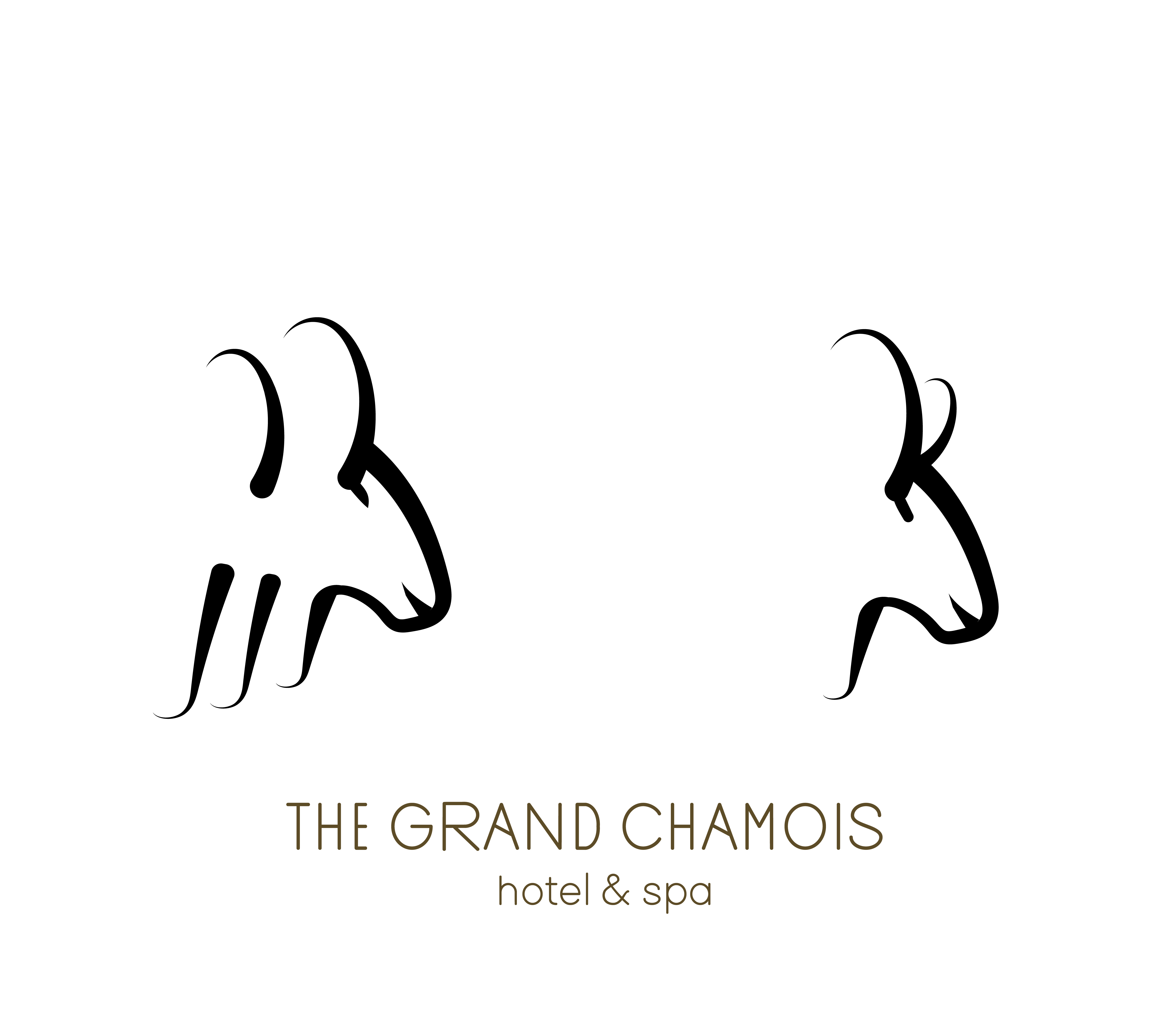
Visually speaking the second, more simple is the better of the two. I quite like the calligraphic, illustrative quality, with a few refinements. The eye on the first is better the second (my preferred) version. Looks clunky. You could just simplify even further and take the extra strokes off the first one and not put the second horn in. The more you can pare down whilst keeping the sense of it, the better. The mouth feels a little too high on the muzzle and slightly too smiley. You don’t want to have a cartoonish feel to it.
The other thing I’d say, is that this feels more like one of those majestic, large mountain goats. Whereas the chamois is pretty small and a bit cute. Maybe it just needs a tiny tweak. Perhaps just make the horns a bit smaller. I am nit-picking here. As I say, I quite like it, but it just feels a bit to big a beast for a chamois. Only a bit. Wouldn’t take much.
Now to the bad bit. The type. I think that font is awful. There are far better, more harmonious Art Deco fonts out there. Even then, unless it actually is an Art Deco hotel, I’d go for something else entirely. An elegant, more modern sans. Art Deco and hotels is so cliché. All a bit fake and Poirot. Where is the hotel. Use the type to evoke place. If in France, or example, pick an inherently French sans. Something that evokes the feel of place – without being cliché or pastiche.
Hope this helps.
It doesn’t say luxury to be. It seems to be on reference and imagery alone something I might see for dairy goat products.
One logo I’m really liking at the moment is the Rafa Nadal torro logo. It is confident, striking, comes across as aluxury logo.
Maybe you could heed from this. More angular. You don’t need to show the face, but to illustrate it’s a goat without showing it’s a goat.
Needs to be more abstract.
Just to add o think it’s a decent job so far. Refine the icon more.
I like the font choice, it’s quite nice and playful.
You’re on the right track.
There’s plenty to draw from searching goat luxury logo and chamois luxury logo.
The simpler one to the right but an almond shapes eye like the other one and the eye moved down, away from contact with the horn.
I vote for keeping the eye attached to the horns. The fewer smaller bits floating around, the better. I’m thinking about the signage. If this is upscale, they are gonna want that thing in 3D on the walls in the lobby and the lounge.
What if you lose the mouth altogether?
I don’t understand the reasoning behind the repeated shapes in the first example. In addition, until I read others’ comments, I thought the horns were large ears. That just might be me, though.
The one on the right has a nice calligraphic look, but I’m not sure about it having a luxury look. Luxury can head in opposite directions: overly ornate or minimal and clean. The little smile on the Chamois takes it off into a cartoon direction, which doesn’t suggest luxury to me.
I have mixed feelings about the typography’s personality. I could be appropriate if the hotel has an art deco ambiance. The quirky and different character widths are interesting and could add up to a nice look. Unfortunately, in my opinion, the letters — especially the R — aren’t that well proportioned.
There is a disconnect from the typography and the icon.
Yeah, probably so; there’s no hint of Art Deco in the icon.
This topic was automatically closed 365 days after the last reply. New replies are no longer allowed.