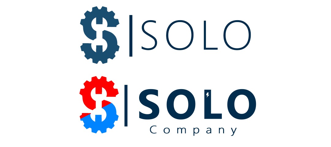
I need my clients to remember me. My business partner and I don’t know which one to choose?
For me, the colorful one will catch the client’s attention so I’ll be more memorable.
For my partner, the simpler one is more professional and modern so he chooses the simpler style.
Which one do you think is better, and makes customers remember us?

What does your company do?
What are your goods and services?
Who is your target market?
Who is your competition?
What are your competitive advantages?
All of these – and more – go into creating a good logo.
Without a thorough understanding, it’s tough to say which is a good logo and which isn’t (setting aside the “memorable” aspect of your question).
All of that said, my initial reaction is that the top option looks like it’s for a STEM product for grade school kids, the middle option looks like a corporate / mechanical mish-mash, and the third option looks like your designer is a sheep stealer who doesn’t have a firm grasp on RGB vs. CMYK.
I hope that helps.
4 Likes
Thank you for your reply. To answer your questions:
- My company is industrisl automation parts supplier.
- We provide electrical and electromechanical devices.
- Taregt market is companies that repair industrial machines and production lines or factories.
- Competitors are other supplying companies.
- Fast free delivery, and reliability.
I like the child-ish logo because it’s unique and people will remember this. I’ll not be like any other regular logo (not similar to my competitors). Am I right about that? Or should I choose the second one?
Did you or your partner create the logos? We have a forum rule that prohibits posting other people’s work for critique — for example, a logo created by a freelancer you hired.
Standing out from the crowd in ways that evoke desired emotional responses to the positive attributes of your company is great. Signaling to your customers that your company is childish seems completely counterproductive. You’re not selling Lego blocks and toddler toys; you’re selling industrial automation parts.
A memorable logo is good, but you don’t want to be remembered for the wrong thing.
1 Like
Sorry, but none of these logos are unique, memorable and/or communicative.
If you have the budget for it, please hire a real designer to create a logo for you. If you don’t have the budget, then consider how much your time spent working in your field is worth and then consider how much of that time will be wasted trying to do something outside your field and would be better spent hiring a professional designer.
Your logo will be the single most important factor in communicating your professionalism in your field. A bad logo will be the most expensive decision you will ever make.
1 Like
Yeah, you want to be remembered for the right reason – not because your logo looks child-ish (per your own description) compared to your competitor’s branding.
Also, in order to be remembered, you need a lot more than a great logo. The logo is more of a reminder of the memories (or feelings) a person has towards your brand.
1 Like
While that’s logical, it’s not enough, especially if it conveys the wrong image of the company. It’s not childish, it’s amateur.
I’ll not be like any other regular logo (not similar to my competitors). Am I right about that? Or should I choose the second one?
No, and no.
This topic was automatically closed 365 days after the last reply. New replies are no longer allowed.