Hi! Which design do you think is more appealing/ eye-catching as a YouTube thumbnail? This is for a language learning channel.
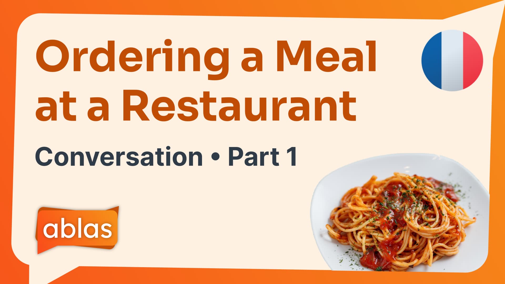
Design A
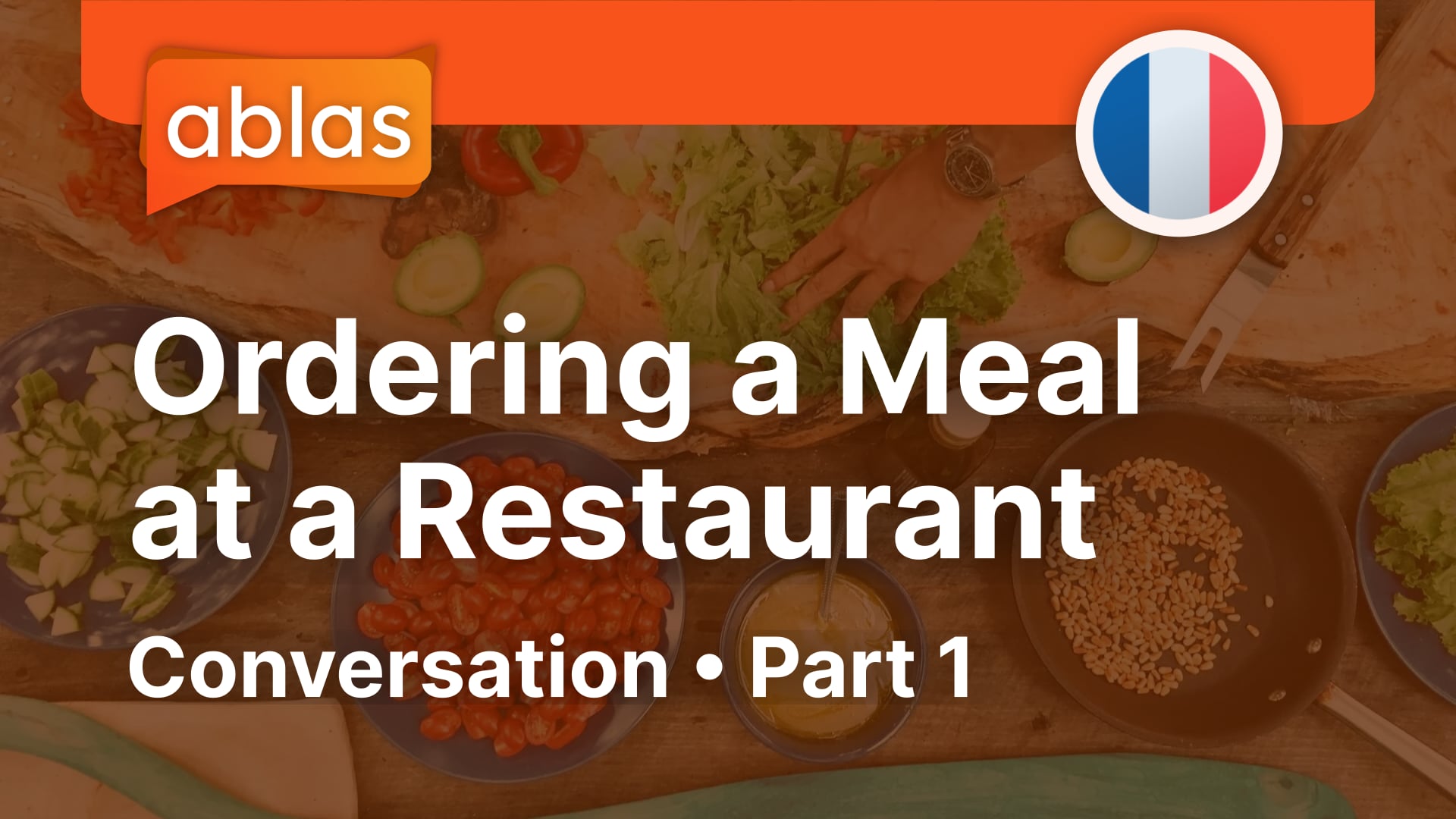
Design B
Thanks in advance!
Hi! Which design do you think is more appealing/ eye-catching as a YouTube thumbnail? This is for a language learning channel.
Design A
Design B
Thanks in advance!
If I had to pick,
The second one.
Not too keen on either one though.
Top one is boring colorwise and the second is too “plastic.”
The top example is more cohesive since all the parts work as a unified composition. However, it also reminds me of seeing dirty dishes covered with water in a sink.
The second example is clear and clean, but it’s also artificial and fragmented. Its visual components are spaced equidistantly with a similar visual weight on an unappetizing and lifeless beige background. In other words, it’s not dynamic and has an ambiguous visual hierarchy.
If I had to choose, I’d choose the second one because, everything else considered, clean and boring is better than dirty dishwater. Neither has significant visual or emotional appeal.
Why is there a French flag icon on the bottom example, when the photo shows Italian pasta? (I know nothing about French food.)
2nd one - remove the awkward knife and fork.
You can buy pasta in France. It’s ubiquitous.
I don’t think escargo would be appealing ![]()
You could go stereotypical - but why?
Thanks for everyone’s replies. It seems like the second option is the better of the two, but needs some work done on it.
While the position of the text, logo and flag would stay the same in every thumbnail, the graphic in the bottom-right would change depending on the subject of the video. The flag would also change depending on the language taught.
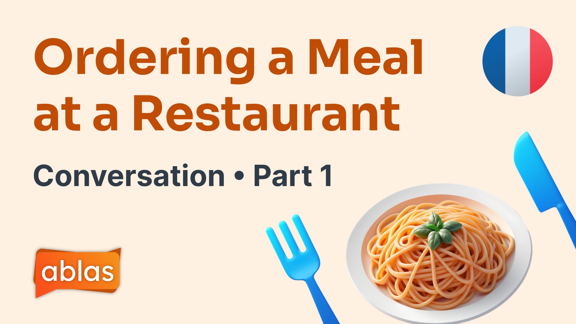
I’ve redesigned this with the goal of making the thumbnail more lively with the gradient background and real photo, rather than having a 3D-style illustration. Would appreciate your thoughts on this version!
Is this a video for conversational French classes?
@PrintDriver the video walks you through an example conversation in a particular language, in this case, on the topic of ordering a meal in a restaurant in French. The videos are on different topics, some short stories, some aimed at beginners, etc.
I preferred the other image of the food - looked cleaner and more apetising.
@Just-B 's first 2 sentences read my mind (and stated it more succinctly than I would have):
The top example is more cohesive since all the parts work as a unified composition. However, it also reminds me of seeing dirty dishes covered with water in a sink.
The upgraded version of Design B is a definite improvement, but still too flat and boring IMO. If it were me, I’d go with Design A and just change the overlay color on the image…maybe green?
You might also want to consider including the word “French” in the title. Many people in your presumed potential audience will be clueless about which flag is which country.
This topic was automatically closed 365 days after the last reply. New replies are no longer allowed.