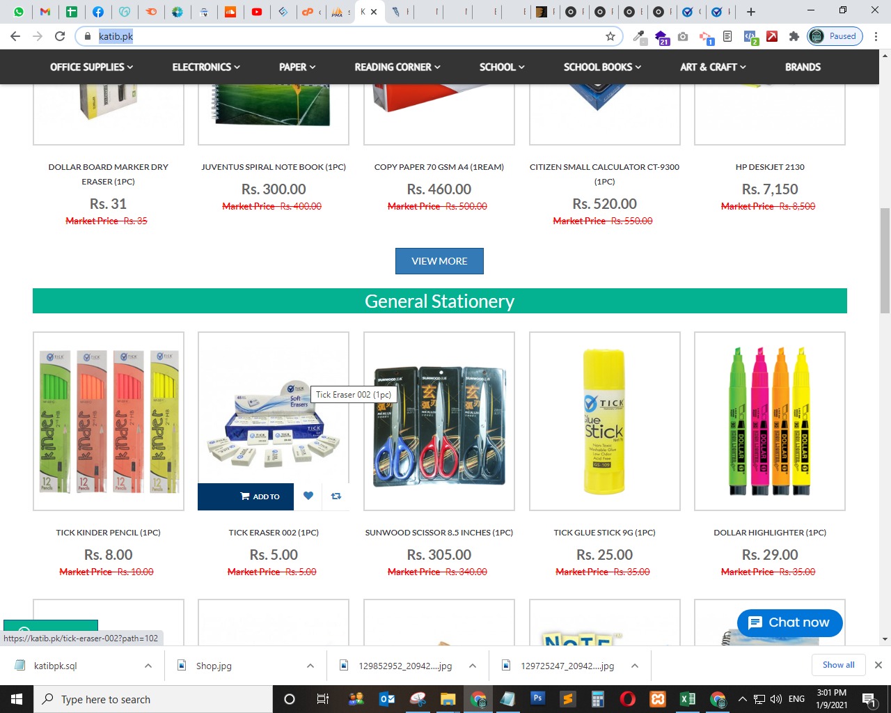
Highlighters. There are a lot of colours.
I like the binders. One can never have enough colors in binders.
But you know…scissors are a close second.
Normally, I skip over requests for critiques that provide no explanation or context, but every now and again, I’m in the mood to suggest that a good critique needs to be based on a question that doesn’t leave everyone scratching their heads over what’s being asked.
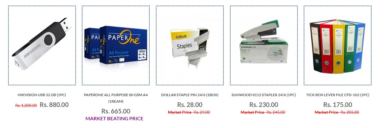
I don’t see any significant difference between your top and bottom options — they look the same other than the dotted line surrounding the merchandise. Is that what you’re asking about? If so, I’ll pick the top one for no other reason that it looks a bit more neutral.
As the url is highlighted in the screenshot, my guess is it’s spam.
No its not a Spam i took screen shot, Thankyou for reply, let me know which borders are looking good dotted or plane.
How is the business positioned and who are your clients?
If they’re marketing to the general public and want to appear “value driven” would opt for the dotted border.
If they’re marketing to businesses, I would opt for the solid border.
why have a border at all?
Right, with each item’s data outside the border, the border serves no purpose, and is superfluous/unneeded.
As for dotted/dashed vs. solid borders? Solid borders suggest division—literally a border—whereas dashed/dotted lines most often mean something else, i.e., cut here, fold here, tear here, or at least a “softer” division than a solid line.
its a website for online Shop for stationery and office supplies.
I’d suggest looking at current shopping sites and follow their trend but I don’t think using dotted vs. plain makes or breaks the design.