please review the poster, your views about both of these. These are my practice creative posters, please tell me did I played safe? or it can be more creative and functional.
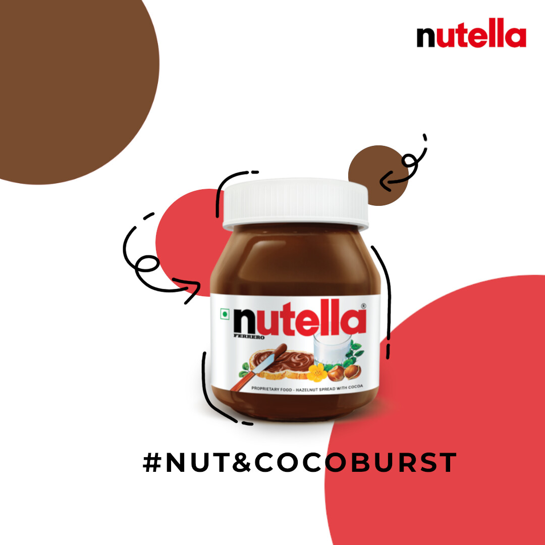
Thank you for your time
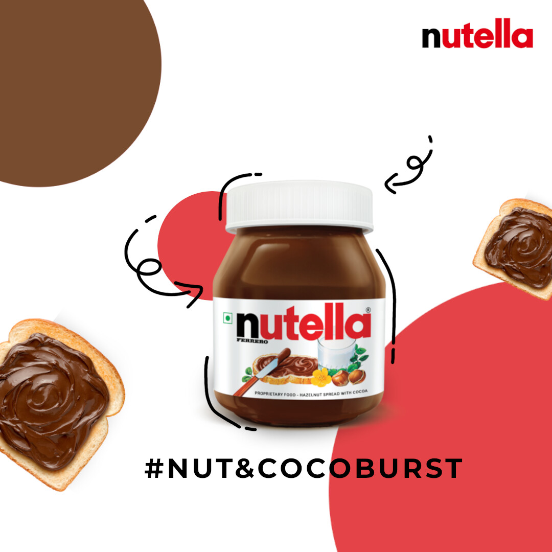
please review the poster, your views about both of these. These are my practice creative posters, please tell me did I played safe? or it can be more creative and functional.
Thank you for your time
They are the same concept (other than some color swaps.)
And neither has a call to action other than a cryptic hashtag.
On top of that, it’s uninspiring and lacking in focal point.
I assume you’re a student, so I’m moving this to the student section.
Design is about solving problems, but it’s not obvious what problem you were trying to solve. Do you have a brief or can you summarize the assignment? Without knowing more about what you’re trying to accomplish, answering your question amounts to an opinion on which is prettiest.
What message is the poster conveying?
![]() In German-speaking countries, it is a major controversy whether Nutella sandwiches should be with or without butter.
In German-speaking countries, it is a major controversy whether Nutella sandwiches should be with or without butter.
I suppose that’s not so important in your countries, is it?
If advertising were honest, Nutella would be something like: Now You Can Eat Chocolate Frosting for Breakfast
People eat that stuff on toast?
Toast always needs butter, Joe. Even here in the US. ![]()
I’ve only ever had the snack packs that come with a cookie sticks to dig it out of the cup.
Indeed ![]()
I’m down with butter and jelly or jam on toast. Butter and Nutella on toast sounds a little rich to me — rich as in the flavor profile not like “he’s so rich he can afford to put butter and Nutella on his toast.” But maybe I shouldn’t knock something I haven’t tried. My sister-in-law used to make butter and peanut butter sandwiches. This seems odd to me, too, but she liked them.

Guess I’m the only one eating it out of the jar…
Real butter though.
I think ya can get Kerrygold in the US.
I think they eat it on everything. I’ve had it on rye, but most people probably eat it on Deutsches Weißbrot, the not-so-perfect German version of ciabatta or baguette.
My favorite is inside a fresh croissant. ![]()
![]()
The best version of that of course is not Nutella but an original pain au chocolat ![]()
Yes, but it’s pretty expensive. It’s double our local butter cost. Sometimes I’ll get it for special occasions ![]()
… and I think I’m the only person on the planet who doesn’t eat Nutella lol ![]()
I’d rather have butter and jam or peanut butter on my toast ![]()
I used to always have a jar on hand when the kids were coming over. But, now they are all grown and doing their own thing, I realized no one was eating it. I haven’t purchased it in quite some time now.
I think you need to change the colors. It could be the fact that I dislike brown as a color.
Then you must dislike Nutella, LOL!
They used the colors on the jar.
Does this differ in principle from a musician saying they dislike E-sharp or a writer avoiding the letter K?
I prefer F myself.
(Sorry, couldn’t help it. You left that one far too wide open to resist!)
It does because as a graphic designer you can choose any colour depending on your personal taste, but as a writer you can’t avoid the letter K, letters are not colors, color choices are optional elements in a design, letters are necessary in a book. Many graphic designers produced a lot of black and white stuff.