Yes, First one is eye catcher. Go for it.
So helpful.. Thank you all so much for your attention… I will consider what you said thx again
That’s a VERY strong assumption. I don’t see that at all with the example you’ve posted and assumed OP copied from.
Simple recipe…
- Search da googe for ‘inspiration’
- Blur your search results by combining two examples from said search.
- Pimp it out as ‘original’
To be clear…
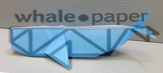
Take origami whale image + the line work whale image = OP’s 2nd effort
Call that creativity?
Um, nope.
Just wondering, do they teach this stuff?
Not sure if you are just having a bad day or what here but it seems to me you are getting a bit trollish. The OP said in one of his later posts that this was for his own website.
Also even if he had been hired, I can’t tell you how many times the client came to me with his or her own idea and said, “I really want something that looks sort of like this.” Even though I would try to present them with other ideas, often they still wanted to go with their own and could not be convinced otherwise. So I don’t think it would be entirely fair, without the back story, to say he was hired to design something unique.
Furthermore, if this was for a origami website (though I believe it is not), I would completely expect the logo to look like a common easily recognized origami figure. It is what would make the best connection with the demographic. It might not always be “creativity” but often it can still be good design. Good design depends a lot more upon environment and people, and people ignore designs that ignore people. Good design is continuing to tell a story that people already know and love. Someone once said that “Great design is transparent.” It serves its purpose and impresses its objective on the mind and imagination of the viewer, without being the only thing they remember.
1 Like
Where did OP say he used google to look up the images you are accusing him of searching? With the “evidence” you’ve provided, your case is very weak. I don’t see how you can prove OP copied from the images you’ve posted.
same general shape and fin location, add a few extra lines and tip the top tail fluke down so it doesn’t interfere with the typeography?
1 Like
I was making a small joke, of sorts, about the electrical tape and Sharpie.
A couple of years ago, I remember seeing a video of a guy with autism who draws incredibly complex line art cityscapes with a Sharpie — nothing like the applied vinyl whale, but all from memory.
End of tangent. ![]()
I’m sorry, but I am not convinced the designer saw the image you’ve provided and copied off of it. The lines are completely different, the tail is different and the overall shape is different. I know that you are saying the elements in the logo are generally the same as the picture, but I don’t want to call out the designer on something that non-convincing.
Unless OP states otherwise I will continue to assume they didn’t copy the images posted in this thread.
The lines are completely different, the tail is different and the overall shape is different.
The requisite “changed 3 things?”
I’m not disagreeing with you. They might very well have not seen that image - if they didn’t do a goggle search for “origami whale.” It’s quite possible it was subliminal too. That’s one reason I don’t design. I’m very susceptible to imitating things I’ve seen in the past.
So is everyone else. Creativity doesn’t just spring forth in a vacuum. There are really very few truly original ideas. Most everything we dream up is based upon other things we’ve seen and experienced — even when we’re not consciously aware of it.
Here’s evidence.

I was trained NOT to do what has been done.
It was both a brutal and an honest experience. Add to that, my father is/was (he died in '98 of cancer) one of the world’s foremost artists … his lines have been compared to that of Rembrandt and his treatment of subject matter compered to that of Goya. That’s the studio environment I grew up in. I was squeezing paint before I was squeezing tooth paste.
And if that wasn’t enuff, the people that came through his studio were some of the world’s most original thinkers. Financial leaders, newspaper chain owners, actors, … you name it they dropped over to share a weekend (or sometimes longer) and a bottle of the usual Redbreast.
It comes down to training … training your brain (usually to think laterally) and your emotions too. And that takes time.
Wrong … but not entirely dead wrong. It’s not exactly a vacuum, but it is a place where we can’t go … but it can/does come to us. Lot’s of people have tried to get there … and died along the way.
What is meant by a FLASH of brilliance? Where does that FLASH come from?
Absolutely great topic for discussion … Creativity … what is it … where does it come from … what and why and how is creativity being driven?
In the above vid … that’s called ‘doing the obvious’ … I guess it’s the same way the youts are being taught these days.
It ain’t called ‘creativity’.
How about being a little less cryptic?
1 Like
I like the concept of the second one. Some refinements to the shape - checkout an actual origami whale - Try making some of the lines thinner to indicate finer lines - a version using flat colors on the shapes would be very interesting
How about waiting on that … until my first short film is released.
I’d walk you through it here but you might think I’m crazy ![]()
We passed that point several weeks ago. ![]()
1 Like
I also like the first one better. For the sake of plenitude, you can try to refine the edges on the left, maybe.
I prefer # 1 only because I have a hard time recognizing that its a whale especially if I didn’t see the color image to know compare. Nice Work!
What is Whale Paper??
I’m not sure if I like either of them. I’d probably take #2 a little further, maybe drop that circle in the middle of the type, and refine the whale symbol to be less complex. To me the whale symbol in #1 looks like a wallet folded open and not very origami-like (which is what I’m assuming you were going for).