Hey guys.
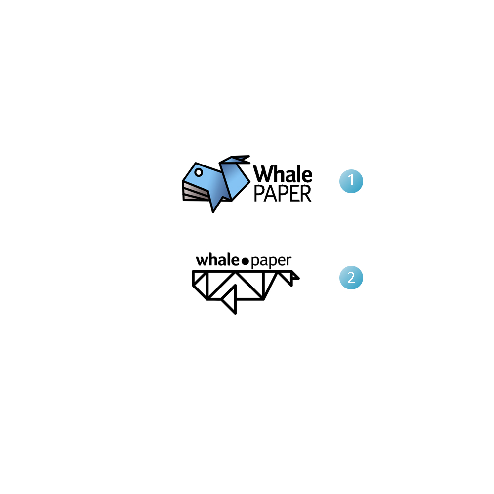
I’ve recently designed a logo… Actually two logos, and now I don’t know which one is better..
(according to the name of website Whale +Paper) which one do you prefer? Why? And how can I make them better?
1 Like
I am drawn towards the second one.. it looks like origami which is good. You can probably try adding some colour to it
The first one is more eye-catching, with a clear effect and a good color match. The first one is very good.
You mean u agree with 2nd one?
I myself like 2 more than first one… But when I asked some people, they said ‘’ first one is more like a paper ‘’
That’s a dilemma
Thx… And do you agree with the style of eye?
For example i can put another eye (instead of circle) to make it happier… Ya?
In the second one, the lines look like paper folds.. I like that look better. Can you tell what this website is about? Probably then we would get a better idea
I agree with you… It’s supposed to be my own website, and I will put my artwork on that… So, yeah it’s a design website
That’s great.
I think the 2nd one is better.
Why you didn’t give any colour like in the 1st?
I like the first one better because it seems more readily identifiable as a whale. To me it also looks more like folded paper than the second one because of its 3-dimensional quality, whereas the second one looks a bit more like a series of lines than folded paper. The second one also has an issue with the stroke weight of the typography not matching the line-widths of the logo, which is less important in the top logo.
Because I haven’t found a good coloring style for that…
I completely agree with this thing you mentioned to … And what do you think about the style of eye? … Doesn’t the whale look a bit serious ? .. I mean it can be changed to a happy whale, by putting another style of eye
I think this depends on the personality you want for the logo and the company it represents. Personally, I think it’s probably friendly and informal enough without trying to make the whale look happy. I don’t think it looks unhappy as it is, and making it look even happier might run the risk of it becoming cartoonish, which you might not want (or maybe you do).
As for the eye itself, whales have small eyes, and their bodies are not really shaped like your folded paper. Your whale might be seen as a fish rather than a whale. I don’t really see this as being a problem, however, since nobody expects a folded piece of paper to look exactly like a whale. Besides, it says whale off to the side, so it’s immediately obvious what the logo is about. The eye, though, really does sort of jump out at me, so if it were me, I might play around with it a bit, but I likely would not do so with the objective of making the whale look friendlier since I think it’s not at all unfriendly as it is.
I don’t like either.
The first looks like a fish is being jammed up length ways … the second like a truss bridge. I assume you got the idea from:
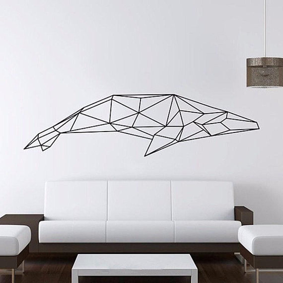
Simply search da googe … paper whale
The cuteness of #1 jumps out at me. I get the origami vibe with it and it’s more dynamic than #2. The second one doesn’t do anything for me. It’s kind of bland and looks like too many other things I’ve seen lately.
The second one is boring and all the problems B mentioned.
#1 is better.
A whale’s eye is down near it’s fin, not on the top of its head.
Could be maybe 75% of current size too.
What other sketches do you have?
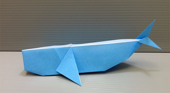
Maybe, but I’m not so sure I see a problem with a logo being inspired by someone’s image of folded paper or what looks like an electrical tape or Sharpie composition above a sofa. What I see is a logo inspired by origami, then modified and built upon to create something very different — a logo.
Even so, Google image searches can be both useful and dangerous when doing research and looking for inspiration. There’s a fine, but blurry line between copying and inspiration.
1 Like
…of almost the exact same shape and expression of someone eise’s creativity … and NOT that of the ‘graphic designer’ who has been hired to create a unique mark.
…sigh.
Cut and applied sign vinyl.