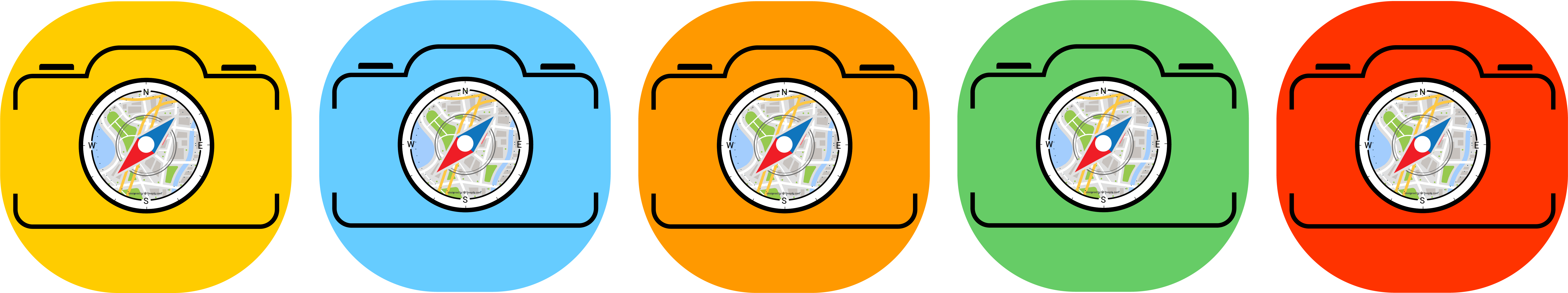
Hi all, which color is better for this app icon? It’s an augmented reality app that use camera, position and sensor value to calculate the places position
Thanks in advise
Hi all, which color is better for this app icon? It’s an augmented reality app that use camera, position and sensor value to calculate the places position
Thanks in advise
Based solely on the notion of which colors might sustain presence best on a variety of homescreen backgrounds, I’d say the yellow and red versions.
"pick yuh favorite cula’ "
Sorta depends on what the background and supporting colors are.
And whether or not you want to compliment or contrast these things.
I pick the orange one. Its warm and calm - not too aggressive but catching
If the background is a teal green, orange would be an inappropriate choice.
Design decisions are not supposed to be made in a vacuum.
I also suggest yellow and red versions.
You’re basically asking people about their favorite colors, which won’t get you a whole lot useful information.
Look at your mobile phone. If one color was better than the others, the designers of all those icons would have all picked the same color. They didn’t, though, because, as PrintDriver mentioned, these things can’t be decided in a vacuum. Everything in a design is related to everything else — including the background on which the icon resides.
You didn’t ask about anything but color, but as long as I’ve brought up the notion of the bigger picture being more important than the color, how about if we look at those app icons at a size more typical of how they will be seen.
![]()
Now you have more problems to work through than color. The compass in the middle has become illegible. It still sort of looks like the lens on a camera, but it’s a mystery as to what all those colored pixels inside the lens might be. I’m also not sure that having the outlines of the camera body butting up so tightly against the edges of the icon is working all that well either — it’s claustrophobic.
So back to color: you haven’t given us a black or white background option, but those two colors (if you consider them as colors) are probably the most reliable as far as achieving the maximum amount of contrast between the icon and whatever random imagery might be behind it.
You need to be mindful that your logo needs to look recognisable in 1 colour.
As @Just-B has shown above, this logo doesn’t work well at small sizes.
Think these:
You will need to work on the details and color will be just easy to decide
I am go for red.
Same opinion here. While I really like the “map within a compass” idea, I think it needs to be simplified & stylized a bit more so that it looks good even at a small size.
I would just get rid of all the colors and make the camera black.
To me green looks good.
What color would look best to the (targeted market) end user?
I wish we still had that beat-the-dead-horse gif.
RKK?
Ask and you shall receive lol ![]()

Oh, that is funny! ![]()
LOL!
Thank you!
(somehow I knew you’d saved it!)
![]() You know me too well lol
You know me too well lol ![]()