Hi I am a student for Arden University and I would like some feedback based on the 4 designs to see which is the best for the mental health message with the campaign for Walkers. See below the challenge:
What’s the challenge?
Use the power of humour to break the “I’m fine” autopilot response during world mental health day on 10th October. Develop a campaign that lives through social media and has the ability to gain traction to reach a wide array of audiences that showcases humour’s ability to empower the nation to open up.
Crisps can’t change the world but the reach of the Walkers brand can help people to change a moment and bring some levity and enjoyment to their day. They are keen to use their brand to champion positivity and mental wellness in a way that is truly Walkers. Using humour to make people think that ‘it’s fine not to be fine’; feel that its ok to open up, and break the ‘I’m fine’ autopilot response.
Wasn’t there another thread like this? I don’t see it now.
Anyway, I looked at the work before I read the brief. This is a challenging assignment. I think you need to spend some more time brainstorming and working on the copy. See what you can come up with that ties two unrelated ideas (crisps and mental health together).
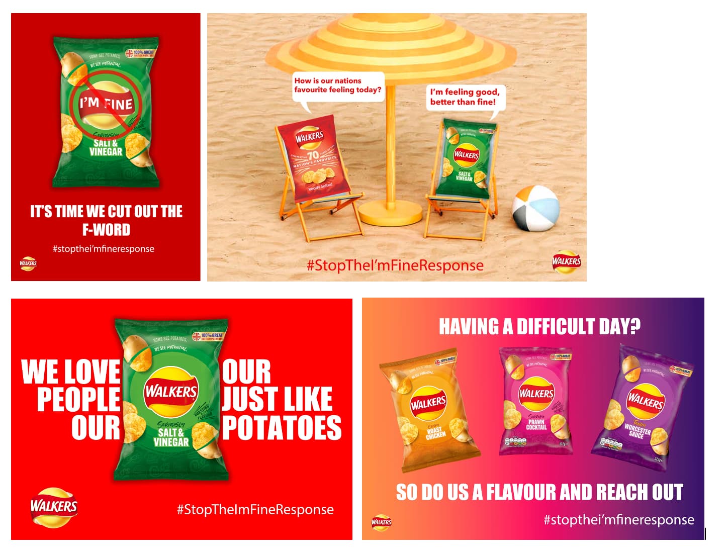
Regarding what you’ve shown here:
Top Left – The headline is okay. I can see some pretty subtle humor in it. From my experience, major brands usually don’t take to their logo being parodied. So I doubt this would fly in the real world. Also, there are possible subconscious ramification with putting the “no” symbol on the client’s product.
Top Right – Good for you for working this up, but it’s not the solution.
Bottom Left – Graphically speaking, this is the most appealing (pun intended). I like the bold type and the stark red background. What if the copy was tweaked to read “the only thing we love more than our potatoes is people”? As someone else pointed out in the other thread, this could be read as we love people out out just like potatoes.
Bottom Right – The gradient really isn’t doing anything for me. I get that it mimics the bags, but it’s not as up-to-date looking as the solid red background. Copy is sort of cute, but not the strongest option.
Hope that helps.
EDIT – The bottom right has a call to action but no way to fulfill the CTA. Who am I supposed to reach out to? Also, do apostrophes work in hashtags? I am asking because I don’t actually know.
This is actually a really difficult challenge for a brand to pull off without seeming as if they’re cashing in on an issue to promote their business.
I can’t help but be reminded of the time Pepsi made an advert centred around the BlackLivesMatter movement which actually caused a backlash against Pepsi:
There are some brands that do this well though, like Dove where they champion the cause of women’s perceptions of themselves and their self esteem:
At a glance, the most striking difference to me between the Pepsi commercial and the Dove commercials is that the Dove commercials don’t they try to promote their products - its all about the cause they stand for - and I think this is the trap you are falling into with your social media adverts: if Walkers really care about mental health and people opening up to each other, they would make the issue the most important message.
Do you have in-class critiques?
This is something we would have taken apart in my design classes.
Splitting text like that is not readable (We Love People Our Our Just Potatoes)
Bad punctuation.
As others noted, making a relevant social issue a pun aimed totally at selling a product. Bad form.
Punctuation and spelling errors in a portfolio or resume will get your stuff binned (I realize this is UK spelling but it goes with punctuation.) Shows lack of attention to detail and there are far more designers out there to consider.
I realize this is a student assignment, but it’s nearly an impossible problem to solve. Getting the aesthetics right is one thing, but the success of the ads depends on effectively communicating the message in a way that’s easily understood and resonates with those who read it.
In a real-world situation, I’d have a discussion with my client to see if I could steer them in a different direction. Here’s why.
Ads like these make little sense unless the viewer already understands what they’re about. There’s nothing in the posters providing context that spells out that mental health is the subject. There’s no explanation as to why asking someone how they’re doing and getting a perfunctory “I’m fine” response might be a problem.
The ads assume viewers are already familiar with the problem. Even if the viewers were already familiar, the ads do not present an alternative to saying “I’m fine.” This campaign might make the problem worse by clumsily attaching an awkward stigma to a simple social greeting while dragging the Walkers brand into the middle of it.
Then again, this is a typical half-baked student assignment cooked up by an instructor that apparently isn’t as critical of the concept as I am. Mental health is a serious problem, but this isn’t the way to address it.
As for your execution of this misguided assignment, I think you’ve done a good job with what you have to work with. The images look nice.
[quote=“DanielleSanger183, post:1, topic:22739”]
**Use the power of humour to break the “I’m fine” autopilot response [/quote]
I’ve a huge problem with this - using humour around a serious issue is damaging.
But humour doesn’t have to be crass. I’ll explain more below.
You don’t have the date or the topic anywhere here.
I’d expect to see ‘WORLD MENTAL HEALTH AWARENESS DAY’ as the largest portion of the page - along with the date 10th October 2022.
I don’t know where the campaign is - what social media platforms are your trying to gain traction with.
You should have the icons for YouTube Facebook Twitter etc. etc.
You should have a hashtag that’s memorable.
Earilier I spoke about humour doesn’t have to be crass.
Your first poster seems to think cutting out the F-word and Fine - where people think of the swear word first, then see the I’m Fine with a cross through it - it’s not funny - that’s pretty crass.
Packets of crisps sunbathing with no context and pretty lengthy dialog between is not a message that gets across easily - the poster needs to be studied to understand what’s going on. Remember you’re on social media - it’s scroll scroll scroll through content - your message needs to pop.
This is not humour. It’s confusion for a social media generation that will take one look at it, get confused and move on without getting the message.
As pointed out already - broken copy is not helping.
Having a difficult day and showing packs of crisps is not helping. It’s not even funny - so that misses the humour mark.
Looks like you’re struggling between the humour and the message and the content.
It’s a tricky balance.
My approach to the humour side would copy along the lines of - as it’s packets of crisps - and to me it’s pretty obvious.
Every advert starts with
WORLD MENTAL HEALTH DAY
10th OCTOBER 2022
And play on the ‘Care to Share’ - ‘Sharing is Caring’
You’ve got all the key words in the brief - from your opening post.
It’s Fine Not to Be Fine
(and remember it’s crisps)
It’s Ok to Open Up
“Break” The I’m Fine
From these 3 you can get lots of ideas
From a basic idea in my head
WORLD MENTAL HEALTH DAY
10th OCTOBER 2022
A perfect shape crisp with a thought bubble of a crumbly crisp
An open bag beside it - Speech bubble saying “You OK? We’re here for you!”
Sharing is Caring #ItsFineNotToBeFine
It’s not a perfect concept. But it shows a crisp that looks fine on the outside, but inside it’s crumbling. There’s an open packet and his tribe are shouting ‘Get in Here’ - basically saying we’re here for you.
There’s a joke
Two packets of crisps walking down the road.
A car pulls up and says ‘You need a lift?’
The packets of crisp turn to the car and say
‘No thanks, we’re Walkers!’
You could turn this into a concepts
Two crisps (not packets) walking in the rain
Car pulls up - Need a lift?
No - we’re Walkers! #ItsFineToBeNotFine
If You Need a Lift
Forgive me - it’s 6 in the morning - the copy needs work.
But you can play a bit more with humour without resorting to crassness.
Plus I’m not a copywriter.
And neither are you. And typically you are given the advert copy, the images and all the assets to create the advert.
It’s a bit of leap that a designer will create everything for a Campaign for another company from concept to full fledged design and social media campaign.
Typically all this is decided by the company marketing department then assets passed to designer to execute visually.
As said - this isn’t your fault.
I think your best effort is the first one. It’s a bit crass but it works well. And it’s not the worst idea I’ve ever seen - better than what my initial 4-6am thoughts on my approach would be.
It just needs to add the World Mental Health Day
Social Media Icons
A better hashtag
Sponsored by Walkers crisps being smaller but still dominant. www.walkers.co.uk/mentalhealth


")