Just a few editorial tweaks
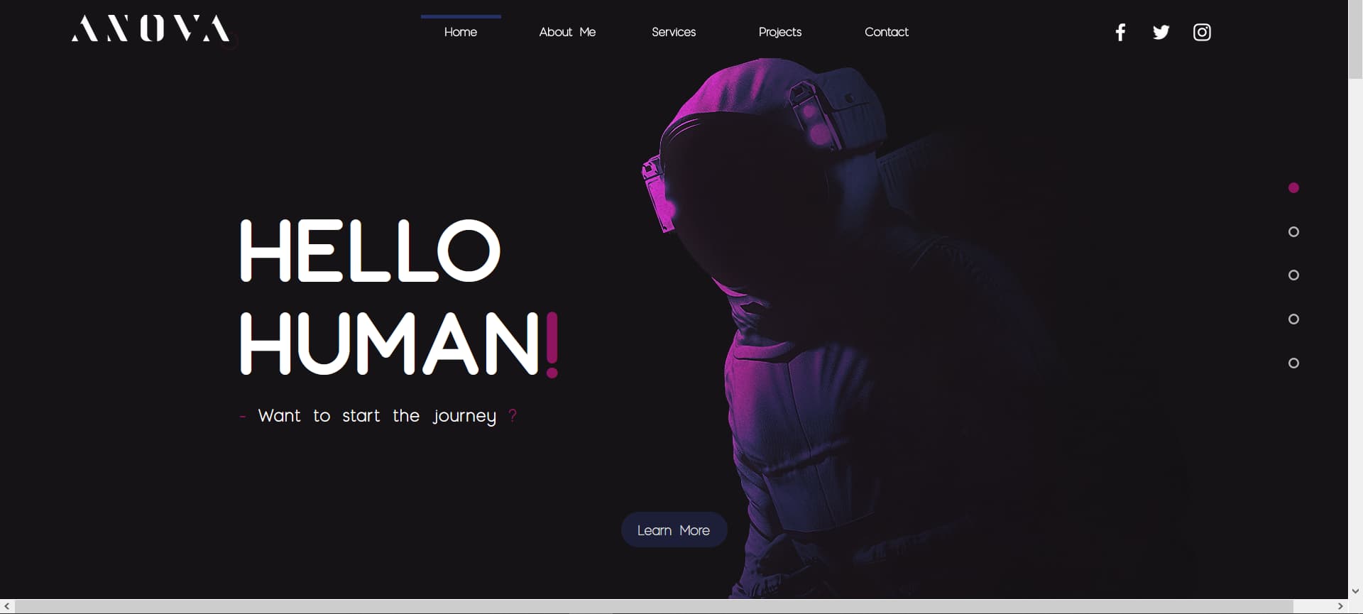
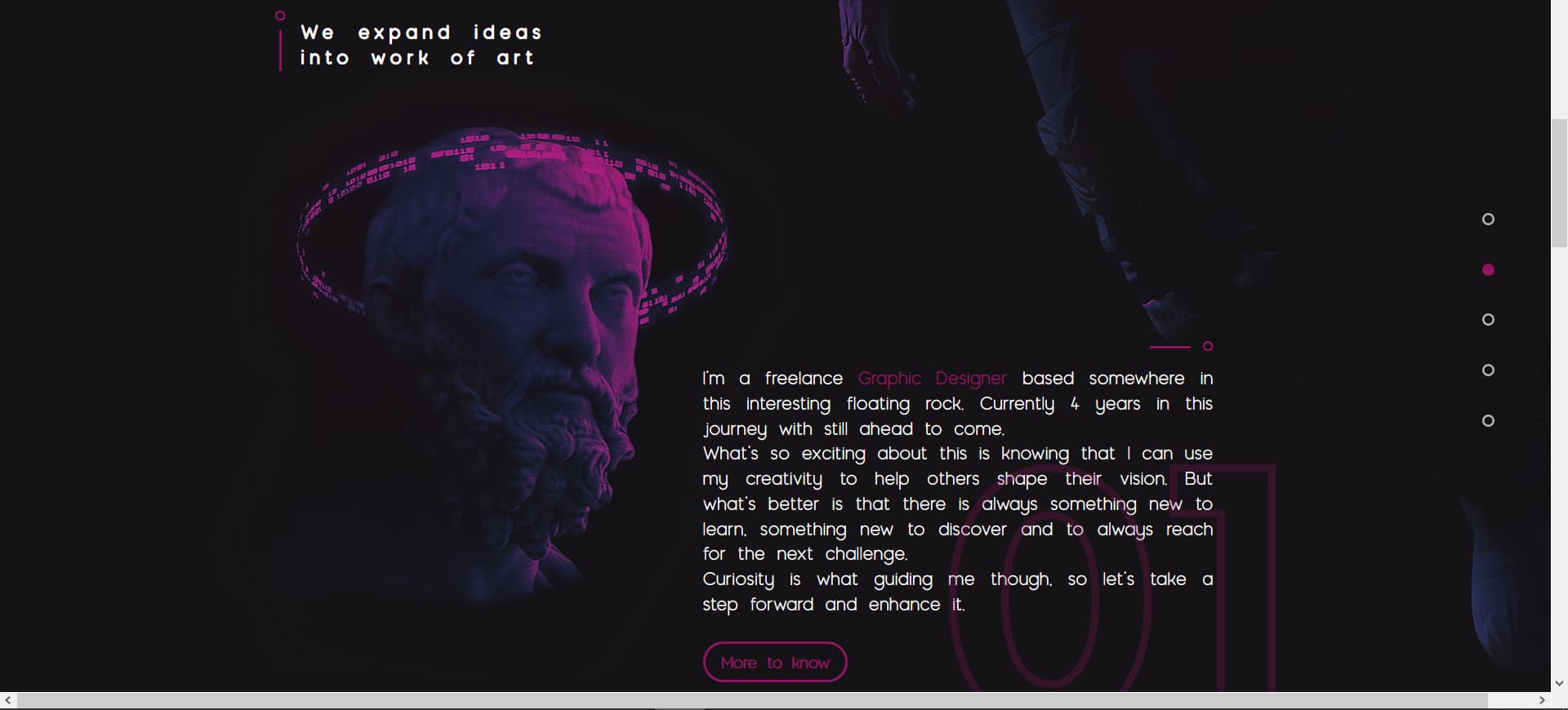
“We exapand ideas into works of art”
I am a freelance Graphic Designer based somewhere ‘on’ this interesting floating rock.
(technically we are not floating in Space but rather we’re falling towards the Sun)… anyway, I can let that technicality slide.
What ‘is’ so exciting …
But what’s better is that
There are always new things to learn, something new to discover, and to always reach for the next challenge.
Curiosity guides me, let us take a step forward together.
====
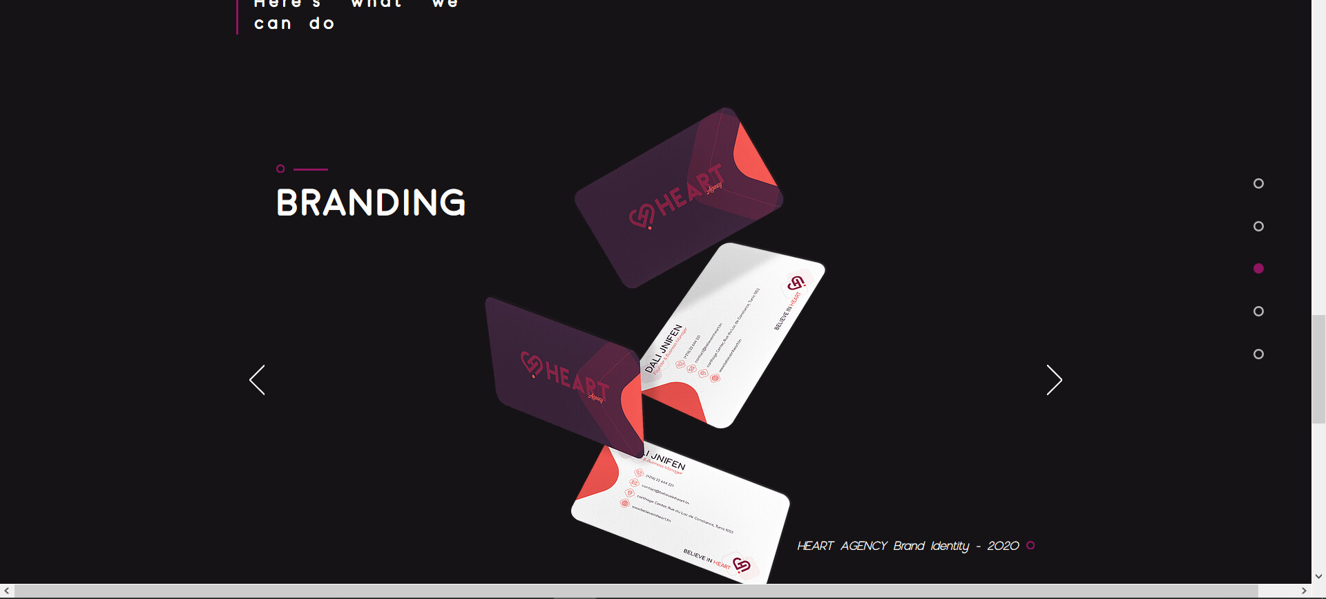
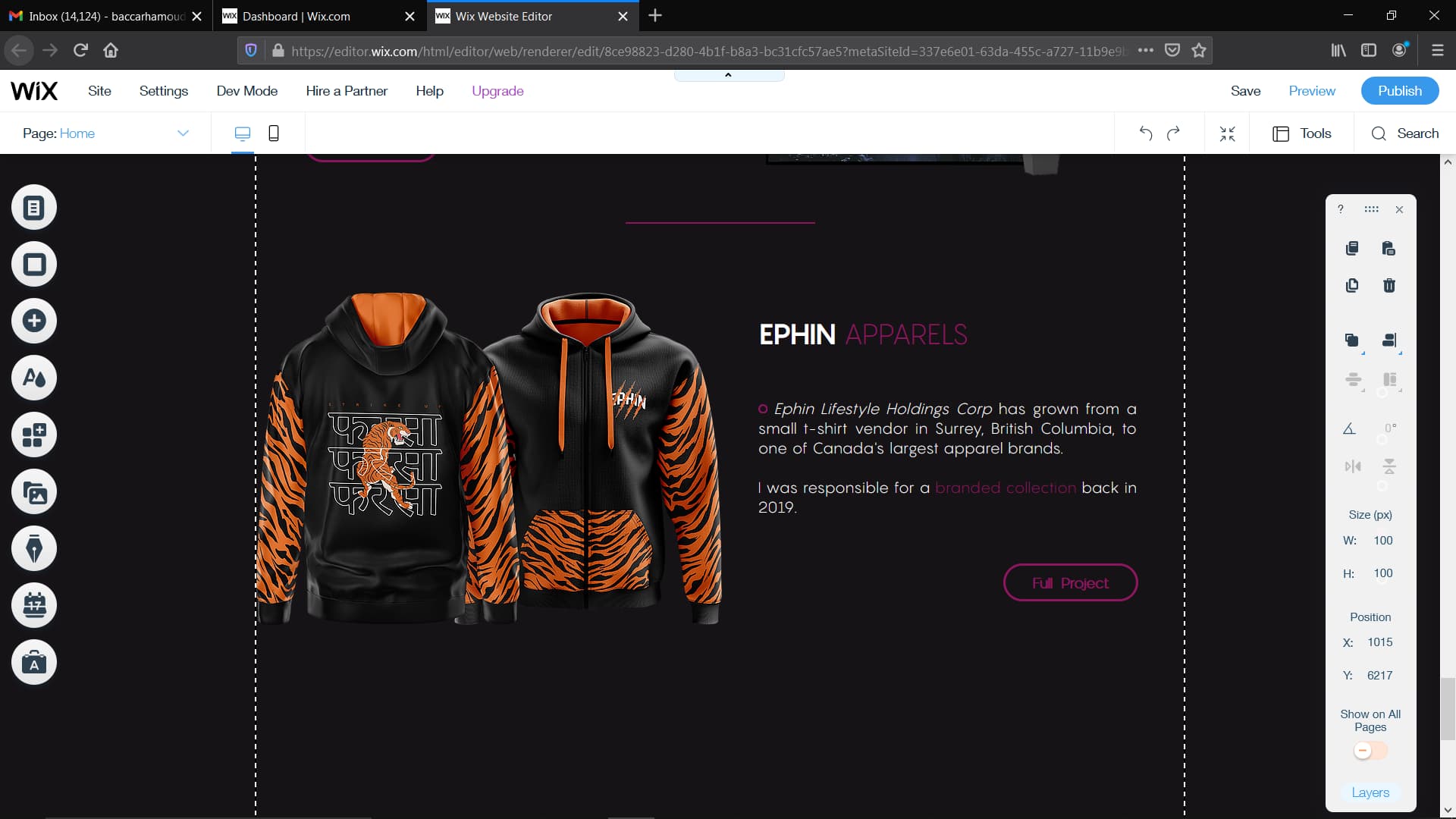
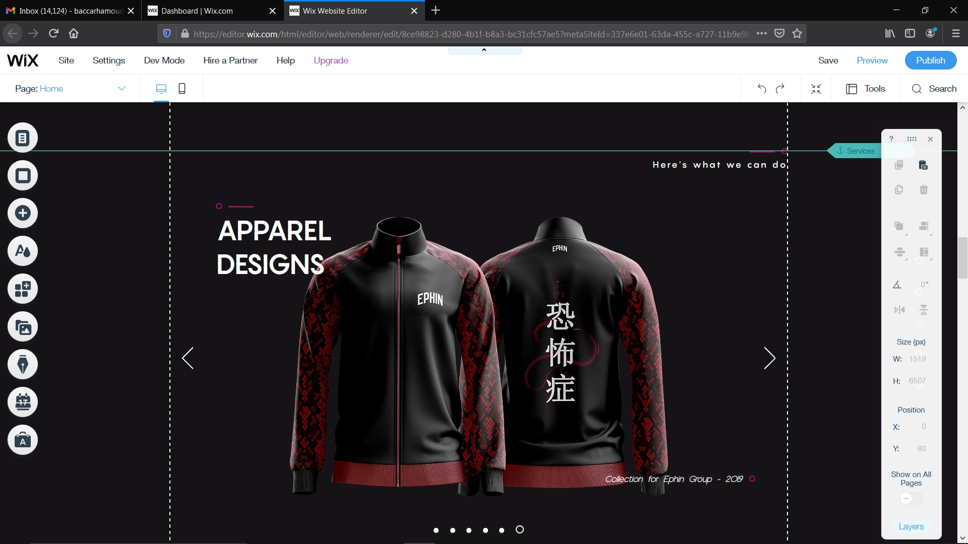
According to Ephin Apparels - the brand was created in 2002 - how did the branding only get done in 2019.
If you’re 19/20 years old now, you’d have been 16/17 years of age in Tunisia, building a brand for a clothing company based in Canada?
With a revenue of $4million …
I did a bit of research and seems like they do some crowdsourcing.
If I contacted Ephin Apparels - would they say they know you?
These are questions that clients (spending big money) would want to be answered and they do their research.
Be very careful about what you claim to be a part of.
I cannot find any of those designs on the Ephin website or using Wayback Machine.
I think a WIX site is fine for now - but you should really partner with someone who knows WordPress really well and see if there’s a skills trade you can do with someone to get a better website.
But for now, it will be enough to get you off the ground (pun intended).
I don’t think you have enough projects really.
What do you specialise in - what is the big item you want to push.
Is it branding - is it clothing apparel?
Can you showcase more?
I’d be inclined to have a submenu under the main headings listing different items like:
Branding - Clothing - Logos - Posters - etc.
Whatever is you need to get people into you and understand you and what you do.
The overall look is nice and clean - easy to follow.
Just needs more direction for the user when they land on your site.
What do you offer? (branding, logos, apparel, posters, book covers etc)
Why choose you? (testimonials)
How to get in touch (call to action)
These are 3 things that should be jumping off the page.
Look at this site - https://www.wakeuppueblo.com/
It immediately prompts you to get in touch. Fill in a few simple details.
It’s a bit too in my face for my liking - but it prompts the user to drop in their details.
You can then start building up a database of people who contacted you, why they contacted you, and what they are looking for.
Straightaway you see why to choose them
16 innovative thinkers- 10x mindsets - 1 creative hub
You’re not a million miles off.
But really think about what this website can do for you - not what you can do as a website.