I’m not so sure it’s “debranding” as much as “simplification,” but this is worth 3 minutes of your time.

I’m not so sure it’s “debranding” as much as “simplification,” but this is worth 3 minutes of your time.
Understand all of it and did it myself except for little black dress logos. That I do not understand what would be the benefit in that. This could actually be debranding.
The do it cuz they want to make life boring.
I looked at the box of Irish Spring this morning when I opened a new bar and thought, “Really?” Block type, all caps and you can’t even tell the background is supposed to be a babbling brook or something spring-like.
And remember that whole Tropicana fiasco?
I swear I stood looking at the OJ shelf for a good 10 minutes. Thought that was a store brand. Then trying to read the little tiny type to find the one with most pulp…
As someone who usually leans towards minimalism when it comes to type and design, I welcome it. I loathe when technique – latest, shiny, spinny plugins – determine and overrule the integrity and credibility of communication. That video talks as though reduction means a cessation of personality. I would argue the opposite is the case. Purity allows for a more subtle communication of personality which is not swamped by gimmick and has an almost cartoon-like feel. I feel that for the last 20 or so years brand identity has been heavily adulterated by technology and gimmick. So, for me, long may this return to visual brevity last.
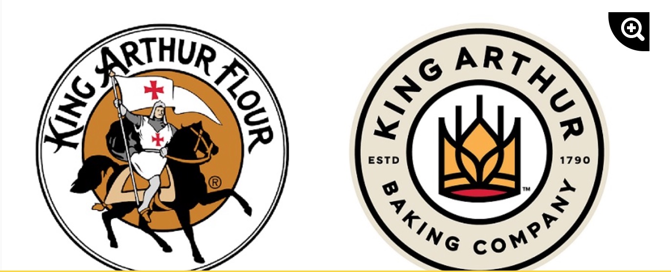
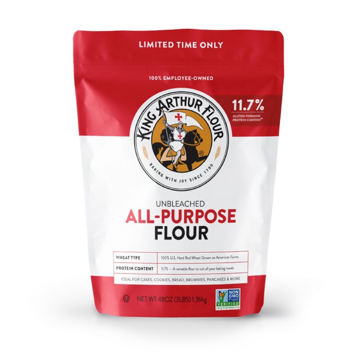
I suppose this is an improvement? 230 year old company changing logo and name. I like the old logo better.
If someone posted the old logo for critique, it would get ripped to shreds. Too many fine details to get lost at small sizes — especially the double ring outer edge.
From a branding perspective, I wonder if the name change and dropping flour from the name came about when gluten became public enemy number one?
I do really like their new logo with the wheat worked into the crown.
Context
Futura (?) font and red cross flag seems a bit medical to me.
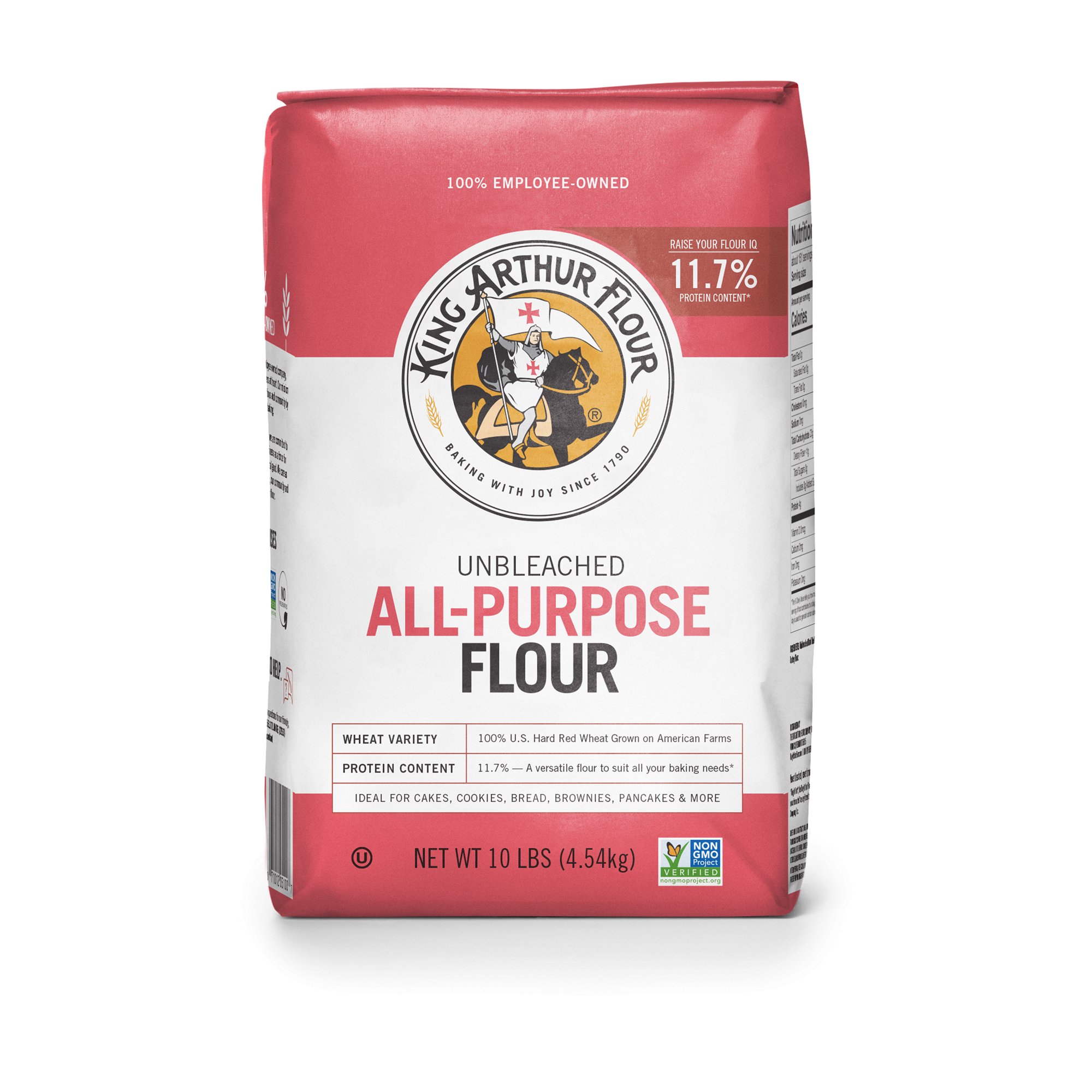
old website King Arthur Unbleached All-Purpose Flour - 3 lb. | Shop King Arthur
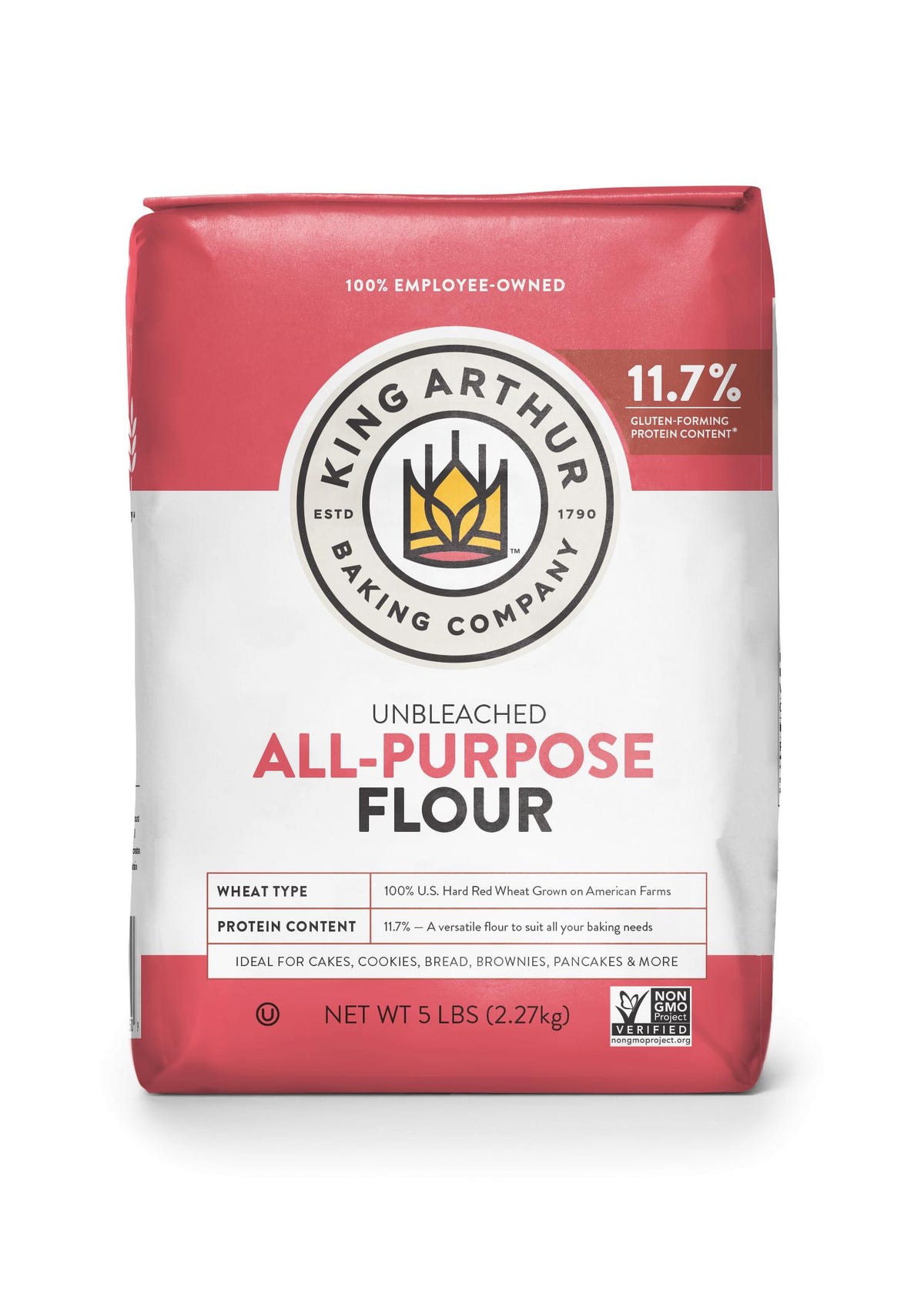
new
I guess they are selling more than flour today
100% employee owned
The word “debranding” seems entirely inaccurate and makes me cringe when I hear the guy in the video repeatedly say it. I also disagree that it’s a new phenomenon. This kind of simplification and modernization has gone on ever since the Bauhaus set it in motion nearly 100 years ago.
That aside, I’m reminded of an old video I once saw of Prince Charles floating down the river Thames and complaining about the modern architecture destroying the traditional character of the City of London.
Okay, he had a valid point. The new clashes with the old in an uncomfortable way. Even so, I really do like the looks of modern architecture (well, some of it anyway). I think there’s a place for both.
I have mixed feelings about updating classic old brands to look new. The Tropicana rebranding was a disaster. If I saw the old and new King Arthur Flour logos juxtaposed for the first time, I’d greatly prefer the new one to the old. However, the old King Arthur Flour logo is one I’ve known since childhood, so its demise seems a bit sad — like losing an old friend.
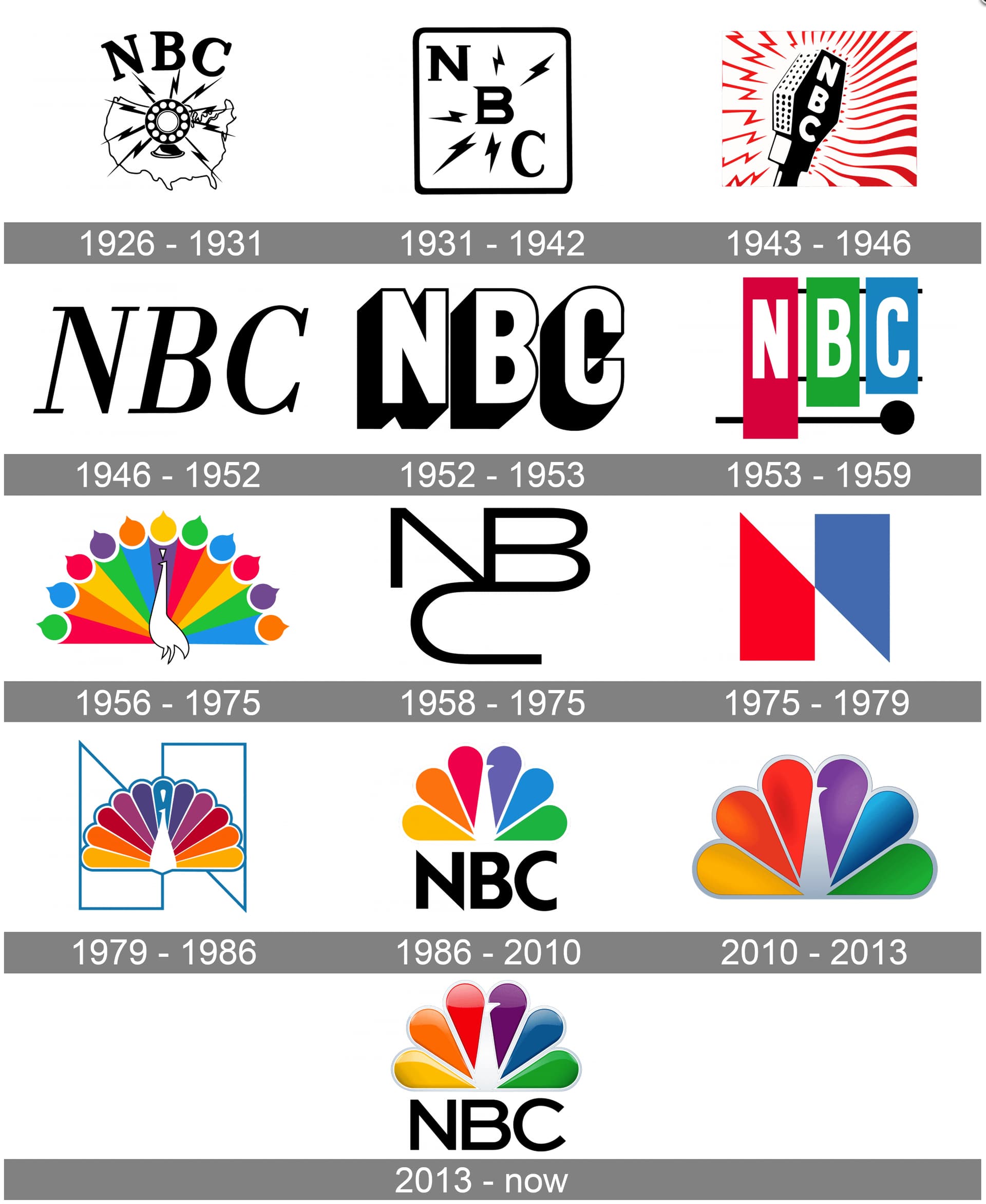
The U.S. television network, NBC, is the best example of awful logos getting better, then devolving into inappropriate modernism, before finally reaching a nice, comfortable middle ground.
I think Just-B and I must be brothers from a different mother. He has again said everything that is on my mind. All I can say is “Thanks again for sharing, B. You are right on target.”
My issue with the new King Arthur logo is not really with the design itself, in the abstract, but that it looks so much like trendy logos you can buy online now.
https://creativemarket.com/buqancreative/4091159-Letter-R-T-logo
Which brings up a point: how does the standard consumer, who’s not a designer, react to it? I feel like it will look dated very soon, but maybe that’s not an issue for someone who isn’t exposed to design trends as a topic of study.
I’m sure King Arthur will go the way of Starbucks. If I were going to do it, I would have planned ahead. Keep the circles for recognizability for now and get rid of them later. It’s still too complex for my taste.
Now that I search for a SVG or PDF to free the crown I see they already play with it here
King Arthur Flour changed its name to King Arthur Baking, which coincided with the logo update. I agree that the new logo looks trendy and might look more dated than the old one in a few years.
I read about the rebrand in Ad Week, but I can’t remember the details of which agency did the work. I do remember that the pandemic caused an upsurge in home cooking and baking, resulting in a huge sales increase for King Arthur Flour. The company saw this as an opportunity to engage a new generation with an updated name and look. If I remember right, the company also hired an agency for a subsequent ad/marketing campaign.
I suppose my point is to distinguish between a simple logo redo by a solo designer and an agency-led rebrand where they likely spent several hundred thousand dollars on research, testing, surveys, focus groups, etc. Of course this doesn’t provide an iron-clad guarantee they got it right, but I suspect the decisions were based on data and lots of experience.
“seems a bit medical”
The red-cross-on-white flag is the flag of England, and St. George’s emblem, as well as a reference to the Crusades, but you bring up a good point: many people today would not get that, plus associations with the Crusades are no longer considered positive by the majority. I was sad to see the knight and horse go away, but after looking into it further, I’m not sure the red cross has a real connection with King Arthur, anyway. I guess the image was supposed to evoke just a generic, do-gooding knight; it’s more like someone inspired by Arthur than Arthur himself. Saint George's Cross - Wikipedia
P.S. I wonder if there was a bit of an intentional medical look sneaked in there, to give the idea that their flour is sanitary/healthy.
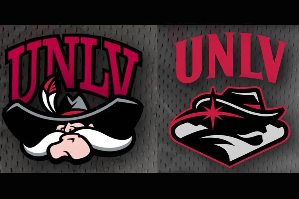
I agree this is more of a simplification than a “debranding”. I have always tried to do clean and simple so it can be output in any format from digital all the way to cut vinyl. Maybe it is because I am from Vegas I am unfamiliar with the flour but this did remind me of the disaster that was UNLV trying to redo their sports logo. This image shows the before and after. It was so convoluted the design company which charged $50k for this monstrosity had to include a chart showing what each element stood for. There was such an uproar about this change they went back to the original. For perspective they are the UNLV Rebels and their mascot is named Reb.
Never heard of them - both are truly awful. At least the original is less awful.
Less is more