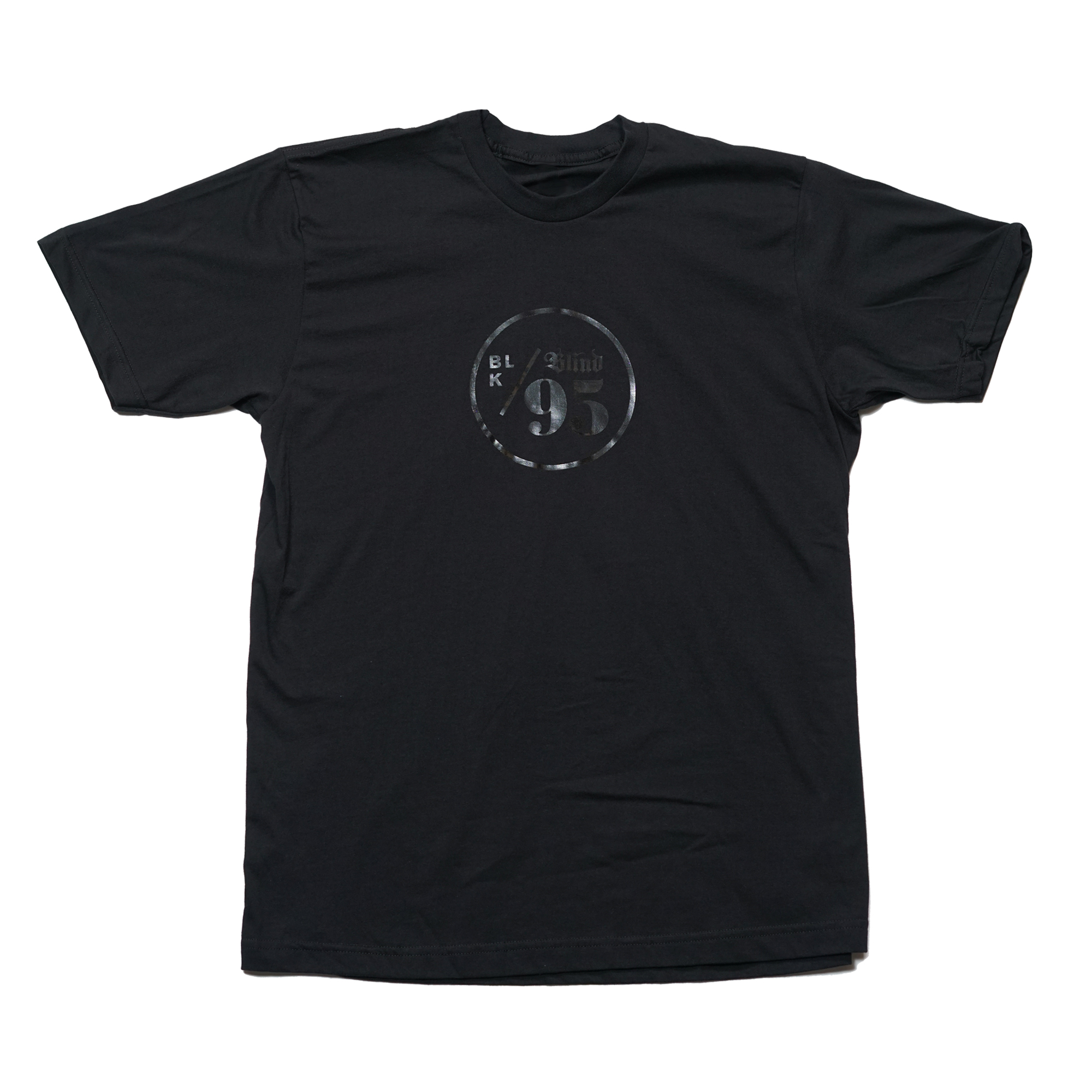
The general rule(assumption) is to use a max. of 2 typeface. If many typefaces have various weights what’s the point of using 3 typefaces? This question struck me when I saw the following T-shirt:
This was created by a design agency named The Blind.
Since I’m not an expert on typography I thought it would be wiser to seek the opinions of the experts over here rather than making any judgements myself.
Keeping the number of typefaces in a layout to a minimum is just a good rule of thumb to help maintain visual cohesiveness; it’s not something that is necessarily always the thing to do.
Using various weights of the same typeface does not typically cause a loss of this visual cohesiveness since the different weights will almost always match each other without introducing multiple typographic personalities into the layout.
When these things aren’t a concern, do what works for the layout. For example, if you’re aiming for a purposely chaotic look, a dozen different typefaces just might be the key to creating or enhancing that quality.
The bottom line is to do what works. Rules of thumb are just guidelines that are generally advisable, but not always so. A good designer knows the rules, but also knows when to break them.