recently designed a banner for a temporary indoor exhibit, and I was asked to adapt the same design for a roadside banner outside the museum. The indoor banner looks vibrant and the text is very easy to read, but the outdoor banner doesn’t feel nearly as vibrant. The contrast that worked well indoors seems to be missing outside.
For example, there are feather overlays in the background that are clearly visible on the indoor banner, but they’re barely noticeable on the roadside version.
I’m wondering if anyone has advice or resources on how to adapt a design so it stays vibrant and readable in an outdoor environment.
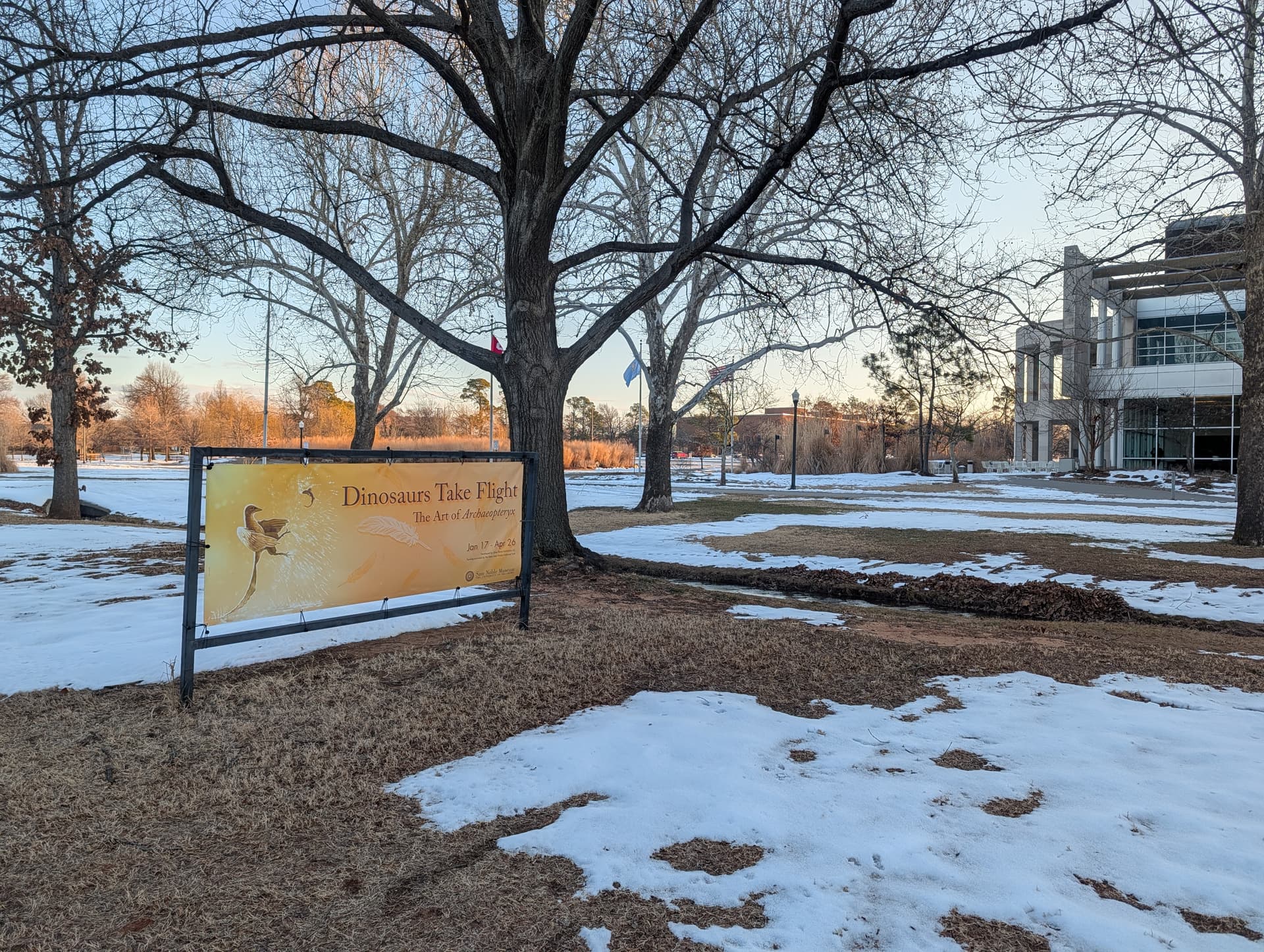
For context, the roadside banner location doesn’t have any direct lighting and sits under several trees, so it’s often in shade.
Any tips or resources would be greatly appreciated. Thanks!
There are several things to consider, and they don’t all relate to vibrancy, but they do all add up to something with a bit less visual juice than you might have wanted.
Your first example appears to be exported from the original art. So, of course, it’s brighter and more vibrant than a photo of a printed banner taken under less-than-ideal conditions.
Did you send the artwork to the digital printer in RGB or CMYK? RGB is usually better for digital output because the digital press separates the colors to take advantage of the additional inks it might have.
The indoor banner is likely viewed from a closer distance, so small typography and delicate background details are more easily visible than from 80 feet away while driving past. Many graphic designers default to a ‘reading distance’ perspective, focusing on how a composition appears within their immediate field of vision. When a design is meant to be seen and legible from a distance, it takes up a smaller part of the viewer’s field of vision, so it must be designed to be seen and quickly read from that distance. This usually means making the type and imagery larger and bolder, prioritizing legibility over fine details.
Your photo shows an orange and brown sign at a distance, which was in the shade, and blending into the orange and brown wintery scenery. In other words, there’s a lack of color contrast between it and the background. If it were summer and the background were green, the color contrast would be greater, and the banner would stand out more, but it would probably be in an even deeper shade beneath the trees.
When designing environmental graphics, it’s necessary to consider the environment in which the composition will be viewed — the background, the sunshine or shade, the distance from which it will be viewed, the amount of text that can be quickly read by a passerby, and every other thing competing for attention.
I might be repeating what @Just-B says but doubling down and backing up is not bad.
Could be as simple as the substrate it’s printed on.
Indoor posters are often printed on gloss or satin coated papers, which reflect light and make colours appear brighter and more saturated.
Outdoor banners, on the other hand, are usually printed on PVC banner vinyl, mesh, or fabric materials designed for durability. These materials are typically matte and slightly textured, which absorb light instead of reflecting it. That naturally makes colours appear less vibrant and lower contrast compared to glossy indoor prints.
There are a couple of additional factors that can affect how vibrant it looks outdoors:
Lighting conditions, indoor displays often have controlled lighting, while outdoor banners rely on ambient light. If it’s under trees or in shade, colours will appear flatter.
Viewing distance, roadside banners are usually viewed from farther away, so subtle background elements (like feather overlays) can easily disappear.
Ink limits and durability of outdoor printing sometimes prioritises weather resistance over maximum colour density, which can slightly reduce saturation.
For outdoor banners it often helps to:
Increase contrast and colour saturation
Avoid subtle overlays or low-opacity textures
Use bolder colours and heavier type
Designing for outdoor signage usually means simplifying the artwork so it still reads clearly in uncontrolled lighting and from a distance.
CMYK ink dots used to achieve colors are very adept at picking up the light you don’t want.
Your banner is in a low light situation, almost blue light rather than normal daylight. It isn’t reflecting the yellow inks the way you want it to. I bet it looks entirely different when sunlit or even in brighter daylight.
We run into this all the time with theatrical or industrial show drops. It’s usually only a matter of getting the lighting designer to tweak a few settings to make it look the way it should. Like getting the pink/amber talent light off the light purple backdrop…