On the logo designing process there are a lot of things which are taken for the consideration like colours, designs, themes etc. I would like to know why there is so much emphasis on it. I mean most of the target audiences are just an average guy who does not know what these colours or what designs these represent. The logo should good and original is one thing but extra importance on even a single line does not make sense to average folks for which it is target. For example each colour represent something like blue represent peace, green represent calmness etc. Now these things are known to the folks of the graphics industry or fine arts industry but other than that I don’t know any other field folks have the idea about these things.
One doesn’t have to know about the psychological effects of color in order to experience them.
Exactly, colours, shapes, etc have an underlying response in people that view them.
Art evokes a sense of emotion, not everyone understands an emotional resposones from a square on painted on a canvas, others derive pleasure or other emotions from it.
That’s why art is subjective. Design isn’t subjective, it conveys a message and the same message to everyone who views it.
What we need to understand from a logo is what message is the company portraying and who their audience is.
1 Like
The logo is important because it is the thing that grabs the attention. It is the first impression that we get of a company so it has to represent the company’s philosophy, ethos and image to the world.
It has to be distinct from other logos in order to stand out.
It must stand on its own as a piece of design.
It must become instantly recognisable.
It must work (often amended) as an icon for online navigation.
It has to be distinct from other logos in order to stand out.
It must stand on its own as a piece of design.
It must become instantly recognisable.
It must work (often amended) as an icon for online navigation
I agree with all these points except how it can represent the company’s philosophy, ethos and image to the world to the regular folks I am thinking as a regular person who don’t have any background in graphics or fine arts how they logo can speak to them the company philosophy , ethos etc?
Design isn’t subjective, it conveys a message and the same message to everyone who views it.
Can you elaborate it. What do you mean by design is not subjective and how average folks can easily understand it?
Haziq,
Your questions are all based on the notion that designers know things that “average folks” don’t, so how can average folks get it?
Those things that designers know are important in design because those things are what designers know about average folks. The effects of color, shape, and tenor on the psychology of the target audience (made up of those ‘average folks’), are the designer’s tools for communicating on a subliminal or subconscious level. That’s how “effect” is produced as an instantaneous reaction. If the audience could only process those effects consciously through analysis, and react only after drawing conclusions based on that analysis, “effect” would be lost. So in that sense, it is the very unawareness of the average target audience member that makes “effect” possible.
3 Likes
From an early age we learn colours mean things, red is hot, or stop, or danger. Green is ok, or environmental (grass), blue is calming, sky, ocean, etc.
It’s built from an early age, a lot of people don’t know it, but colour is a communication tool before language was considered or able.
Same with shapes.
If I told a baby from an early age that green was actually purple, they would believe it, right? If they didn’t go out in the world or talk to anyone, they would grow up thinking green = purple.
But that’s harder when something is hot, as it’s red - it’s a visible indicator. And we can then use red as symbol for danger, or hot, or STOP (danger).
Thanks for the explanation now it had provided me the answer to my question which I was looking for.
Never thought like that folks mind is already trained from the early age as given the example of colours, shapes and everything between.
Hi Smurf,
Thank you for your effort.
It’s a smart answer.
Best.
Hi Haziq,
Although we designers are more interested in colors and designs and we craft logos with our own hands. Logo is the symbol of a company, more importantly logo is the identity of a company. This is the age of technology and knowingness. Even a common man has more awareness about colors and symbols than we think.
Flag is one such example. In olden days when graphic designing and relevant softwares were no more, the flag shape, color, design or anything to be written on, were decided by the intellectuals not by professional designers. In flag even a single and minor letter or symbol has meaning. It is just because of the fact that common people have fundamental awareness.
It’s a know it all that usually people wear black color on death ceremony as it is the symbol of grief and mourning. By this example we come to know that common people have awareness.
That’s why there is much emphasis on logo.
Hope it will be helpful.
Best.
Thanks
While the opening post was a tad, shall we say, provocative for this forum - and all the responses to it 100% reflect what I’d say as well - it does raise two questions that we need to ask ourselves more often as creatives: “How does my work help the company?” and “Does branding always need to differentiate to be successful?”
A few years ago there was some analysis done of all logos of Fortune 500 Companies (in other words, those companies where you’d assume that they would be successful at least in part due to their branding), and they made a few interesting observations:
- 37% of Fortune 500 Companies don’t use an “image logo”, only a wordmark
- 75% of Fortune 500 Companies use a Sans Serif font only
- 46% of Fortune 500 Companies use ALL CAPS
So, what does this mean for logo design? Do we - the creative crowd - often overthink it?
1 Like
Different horse for different courses.
Facebook logo was done overnight, just an f in a blue square.
Google was done last minute with a change in the G as they didn’t like it in the font they picked.
Etc.
Some just don’t really need a fancy logo or any overthinking, the product and experience is the brand. A logo is just a message at the start of it all so people know where they are.
We touched on it recently, Nikes logo was picked from 5 or 6 and wasn’t really what they wanted but had to go with something, it’s the most recognisible logo in the world now.
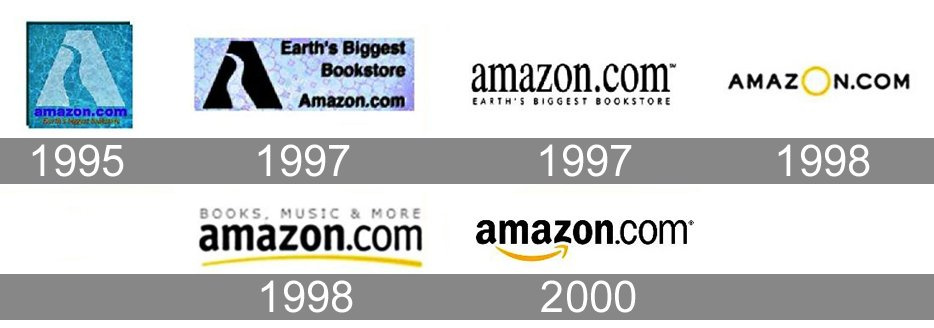
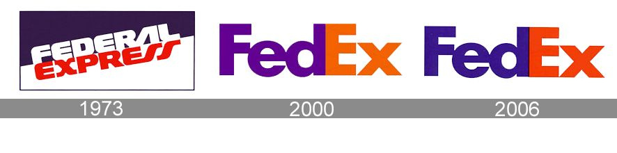
But then look at the likes of FedEx with the hidden arrow, the Amazon smile arrow going from A-Z etc.
Some companies need clever logos that are overthought.
As I said, different horses for different courses.
The Amazon thing is a smile? I thought it was something else…
![]()
(j/k)
Amazon - ******* the retail industry since 1994! ![]()
@Smurf2, can we really conclude that Fedex, Amazon, etc. would not be as successful as they are if they had plainer, blander, “unclever” logos? How much of their brand power is really due to their logos?
Impossible to know, Amazon went through years of developing their logo to align with the corporate values. They were originally an online 2nd hand book store. Now they are much more. Their corporate values grew and the logo expanded to what it is today.
Fed Ex hasn’t gone through as many iterations, but their original logo up to 2000 was quite bland.
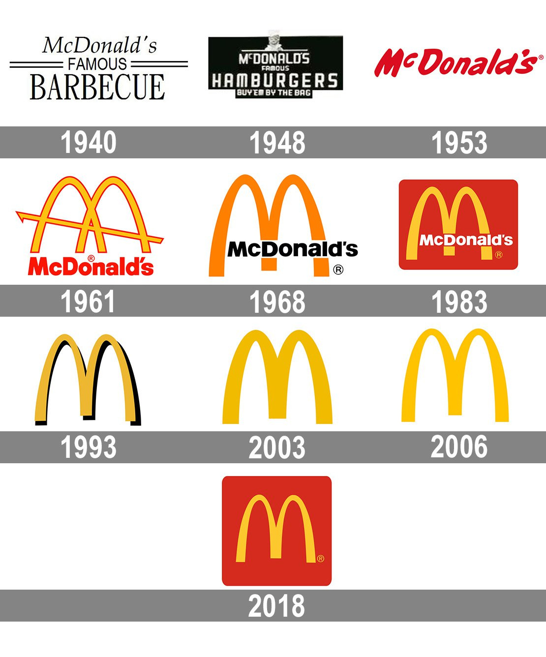
Same with McDonalds - it hasn’t changed much since the 60’s but they saw some sense in designing a new logo to better match their values.
Then you have Coca Cola - which has not really changed much.
Take from that what you will. But each logo that is recognisible is because of the companies success, and probably not the success of the logo.
It’s probably the most common mistake a company can make starting out - focussing on the logo. Like an author focussing on the title and making the story fit the title.
Most don’t really need a logo - and think that a logo can make or break their business.
In truth, if you have a good business model and good work track record, your logo can be anything.
This is a real logo - for a real company - that actively trades.

What have we learned - probably best to focus on the business than putting a pretty picture out there first.
McD’s logo always cracks me up.
Started out skinny, got really a lot fatter in 2003, then lost some weight in 2006, then again in 2018…
![]()
That’s the one that cracked you up?