For my second Design class at university, i developed a wine label. I want to use it in my portfolio, so i was wondering if critique could be provided.
Being as it is student work, here are my relatively minor suggestions:
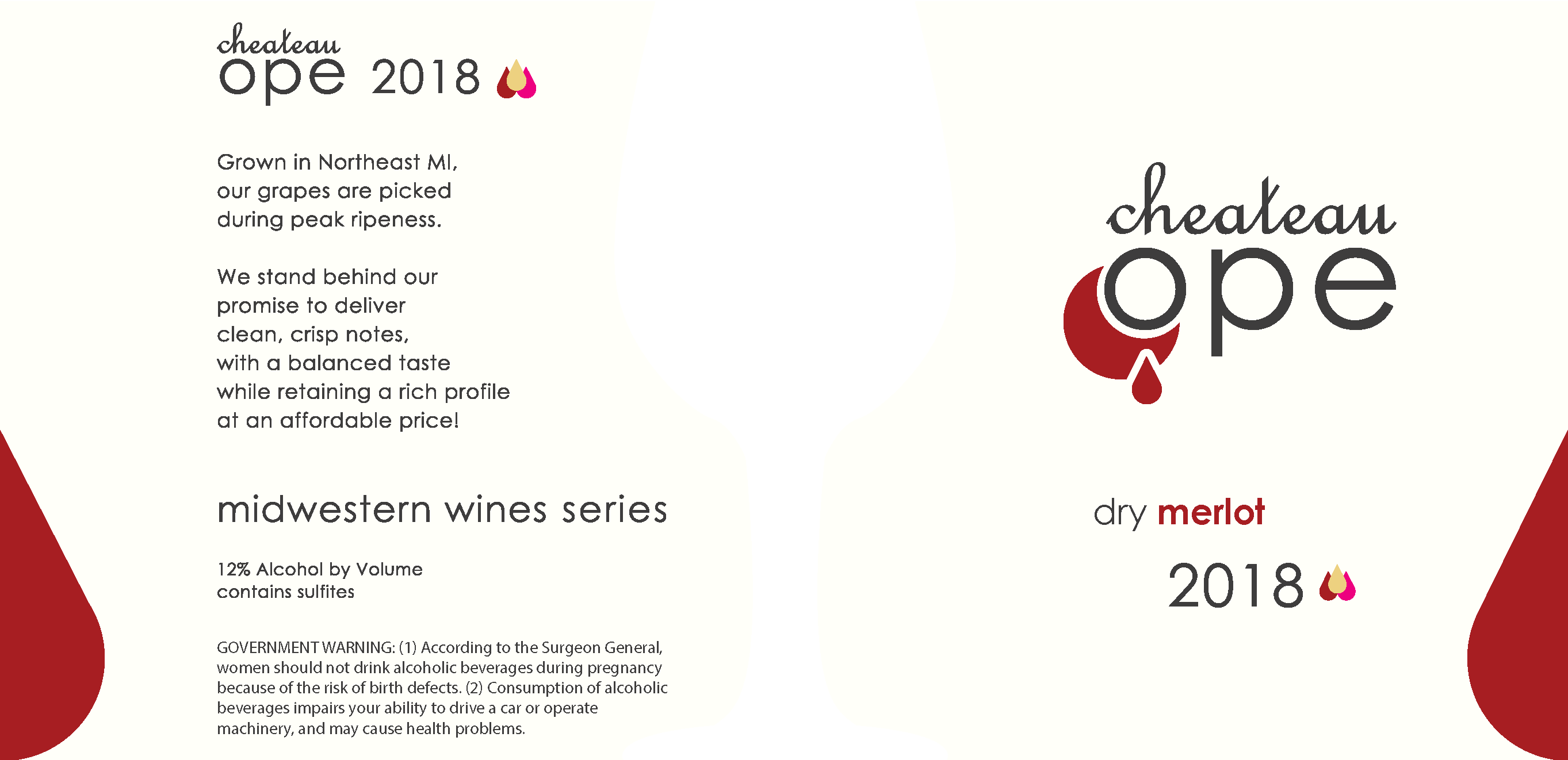
- chateau is spelled wrong
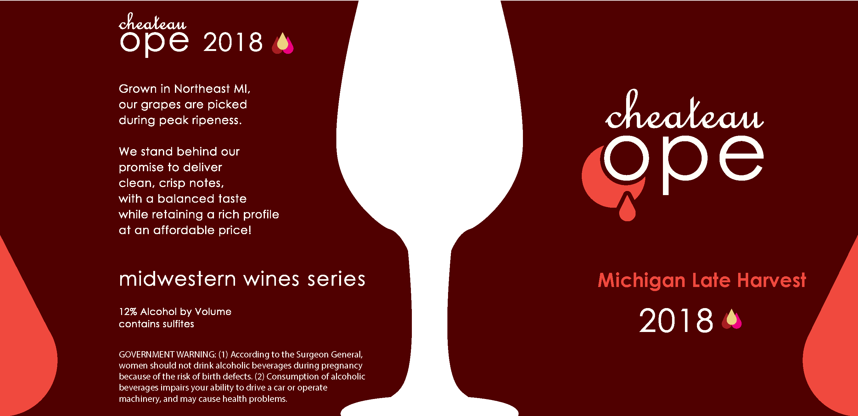
- There are a few kerning issues throughout. Especially noticeable on the “2018” and “Michigan Late Harvest” and “Dry Merlot”
- Spell out MI in the text. You’re not using it as an address so it looks out of place.
For student work, it’s not bad. The text on the back is pretty uninspired and plain, but it’s okay. The government warning seems exceptionally large, but I’ve never designed a wine label. I’m sure there are guidelines on how large the text must be for the government warning.
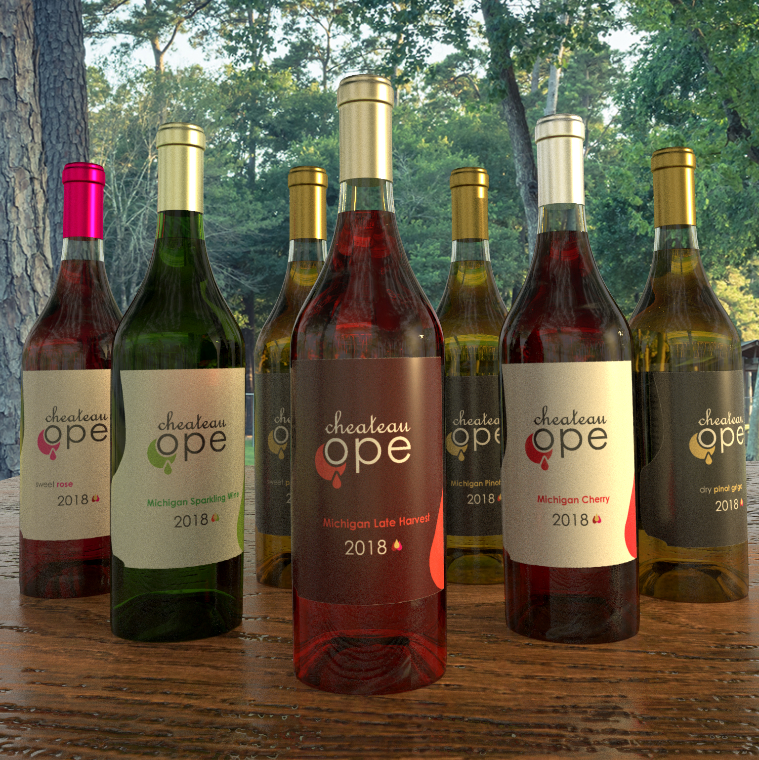
Oh, and the obviously photoshoppped pink foil on the far left bottle looks really, really out of place.
I’ll second what Craig’s already said.
In addition, château should probably have a circumflex over the first a if you want it to be a bit uppity and French. The English spelling doesn’t use the circumflex, but it’s a French word, and the circumflex is usually used there for this word (much of the time) as far as I can tell.
The huge goblet silhouette dominates the design in a way that isn’t really warranted given that it’s a plain and uninteresting shape for its size. Then again, it doesn’t show on your photograph, so I’m assuming it’s something that’s only on the sides. Even so, if the sides are part of the design, they’re important.
I didn’t check too closely, but the body copy text looks like Avant Garde (or something similar). I probably would use another typeface for that. There’s nothing wrong with Avant Garde itself — it’s just that it doesn’t really have the right personality to be used for text on this particular project.
Just how much wine is in one of those bottles?
1 Like
I believe the typeface is avenir, probably close to what you’re thinking. Chateau is french script.
I should reformat the label. The wine glass would be where the label ends so its using the edge of the label to indicate a glass.
I looked at some winebottles to see what they did and the government warning seemed fairly uniform.
I used Adobe Dimensions for the 3d render, so I can easily rotate the bottle to show the wine silothette
I forgot to mention one thing: it really does look pretty nice. ![]()
1 Like
Looks like a heavy baggy bag shiner under one eye … shedding a tear or a drop of blood.
1 Like
As others have said, this is pretty nice for student work. A couple of things.
– The crescent moon shape with the drop surrounding the “o,” I’m trying to figure it out. Oddly enough, I don’t find it offensive, I’m just wondering what the intent or meaning is.
– The three drops next to the date are a distraction to my eye, and I’d say they are not needed.
– I’d work on the alignment on the front. cheateau ope is centered. Sometimes the variety appears to be centered on cheateau ope, and sometimes it’s not. Then you’re jogging back to centered type for the date, but the date looks off due to the three drops. Overall, tighten this up and make it uniform across all labels.
Imagine a face on view of a wine glass pouring. Uses the O in Ope as the rim, and the crescent as the glass shape with liquid
Got it. I see it now. Nice job on a hidden meaning.
1 Like
Oh, I remember the days of designing labels… That was a project I ended up redoing! LOL.
I like the contrast of the script with the sanserif. I think the font choice depends on what look you’re going for. I am a wine drinker and there are “snooty” brands, playful brands (with labradors on them even!), “girly” brands, etc.
If you’re going for a “chateau” kind of feel, then maybe that’s a more luxury brand and not one that would dictate the use of this particular sanserif and might use all caps for the “ope.”
The wording says “clean, crisp notes” and I do think the design reflects that.
I too was trying to figure out the droplet shape on the front as well. (I saw your reply.)
Overall, great job. Kudos to you for being brave to ask for critique. That will help you enhance your skills.
BTW, if you need a wine mockup, I saw one somewhere free. I could probably find the link and send it to you.
1 Like
I like how you have used colour to distinguish between each type of wine.
The volume and abv should be included on the front.
I realise this isn’t a real job but I think including a barcode would make this more realistic. Barcodes never help a design but it’s an important element to consider when designing labels.
2 Likes
This is some of the best student work I’ve seen on this forum.
Others have given you valuable feedback that you should certainly take into consideration. The only thing I would add is to refine the wine glass silhouette. The inner curves of the top of the shape seem rigid; almost as if you couldn’t get your pen tool to work properly with your anchor points. I would also consider thinning up the neck of the silhouette. When I think of a wine glass, the neck or handle is pretty skinny. Having a skinnier silhouette may give you a more elegant look that would certainly fit for a wine company.
Anyway great work and good luck on this project!
1 Like
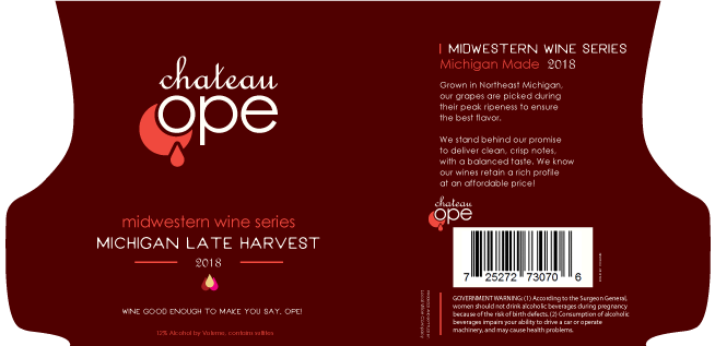
I will reserve the design in depth design critique for the pros. I work for a label manufacturer/printer and see a crapload of labels of all sorts. I would enjoy seeing this printed on a clear poly material with white as an additional spot color and the glass shape left transparent to let the color of the liquid show through. or the label die cut as you see it here. That is assuming the bottle would be clear glass…Willy runs back to photography forum !!!
The glass shape is transparent, so you would see the liquid through it
1 Like