When designing a visual identity, how do you determine whether it should be a wordmark or a symbol?
50% market research, 50% guided by experience, 50% intuition.
2 Likes
In addition to @Steve_O’s innovative arithmetic, I’d squeeze in yet another 50% that considers what the client seems to want.
Nah, that only merits a cursory, slightly dismissive, four or five percent!!
2 Likes
I don’t see the two as opposites or competition. For me, it depends a lot on the name, the purpose of the company and the brand history. ![]() cheers
cheers
1 Like
It depends on whether it’s an internationally known company, or a fresh start-up.
1 Like
![]()
Thanks guys. My reason for asking, is that while browsing Behance, I saw a lot of work where people had made beautiful symbols, but then I wondered how effective from a practical point of view they were and what their decision making process was behind it.
It really depends - not everything needs a picture to go with it.
I’ve had clients demand a logo with a picture - great I can show you that no problem.
But I’ve had times where I’ve shown them just a word mark and they loved it and ditched the idea of an ‘icon’ for the logo.
1 Like
I’ve thought a lot about logos and visual branding over the years, and I’ve come to several conclusions about the subject that haven’t changed much over the last couple of decades.
The visual recognition that a good visual brand confers warrants paying a good deal of attention to the brand’s development. However, I think there’s a mistaken assumption that a clever logo is a must-have item for every organization or product.
For example, a logo is one of the first things new start-ups want. They don’t usually know the ins and outs of building a visual brand, but somehow they’ve picked up on the supposed need for a clever little symbol that embodies their hopes, dreams, and the realization that they’ve taken the leap.
The problem is that the logo won’t mean much to anyone else. When seen enough times, a big company’s logo eventually registers with people, but a small start-up’s logo is rarely seen enough to stick in people’s minds.
Rather than an ill-conceived logo, a wordmark is often better (not always, but often) for a small business because the mark itself contains the company or product name. Not only does it serve the purpose of a logo, but it also effectively anchors the name to the general branding.
However…
Trying to convince a naive client of that is often an exercise in futility. As often as not, they’ve been dreaming about their new business for months or years and have already decided they want a clever logo. Present them with a wordmark, and more often than not, they stare at it and say something to the effect of, “All you did was type out the name of my company. I could have done that myself.”
That puts the designer on the defensive of having to explain that the individual letters were custom designed to fit together and be distinctive in a memorable way, fit the company’s personality, and communicate to the prospective target audience better than a logo that few will recognize. You can even explain that they can either have the name of their company two meters high on the side of their building, or they can have a stylized drawing of a giraffe that size with their name in smaller type off to the side.
From experience, I’ve always found it a challenging concept to sell. More often than not, they disagree, think you’re bullsh*ting them, and trying to overcharge for what they see as a half hour’s worth of work. They end up insisting on their giraffe drawing, and you realize that you probably should have just given them that in the first place since you already knew that’s what they wanted.
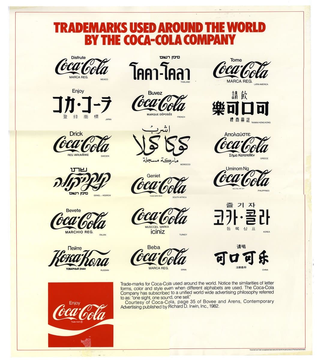
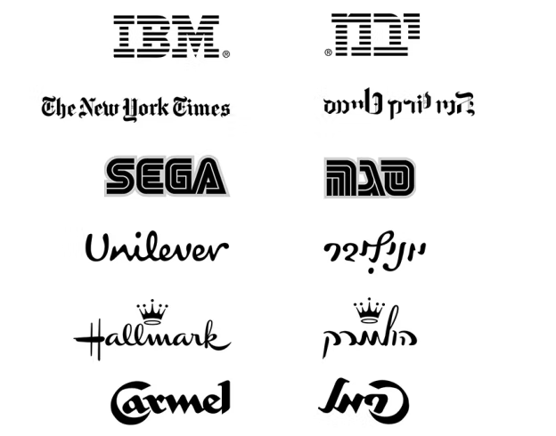
However, I will mention one huge caveat with wordmarks. When there’s any chance of the business setting up a presence or selling their products in another country that uses a different language, a wordmark can be a huge problem when it must be translated into the new language.
3 Likes

Those are both really great points, thanks for your thoughtful answer.
It all depends on industry and demographic, but as a general rule higher end, luxury brands do just fine with only a wordmark. I’m currently branding a high-end Napa inn and plan to just use a wordmark and to use type, color, and white space to convey the brand’s values. Wordmarks to me have a sense of quietude and maturity while logo marks come across as trying harder to capture attention.
1 Like
This topic was automatically closed 365 days after the last reply. New replies are no longer allowed.