Would you please give me your critique of this poster. Anything
you believe would improve this poster.
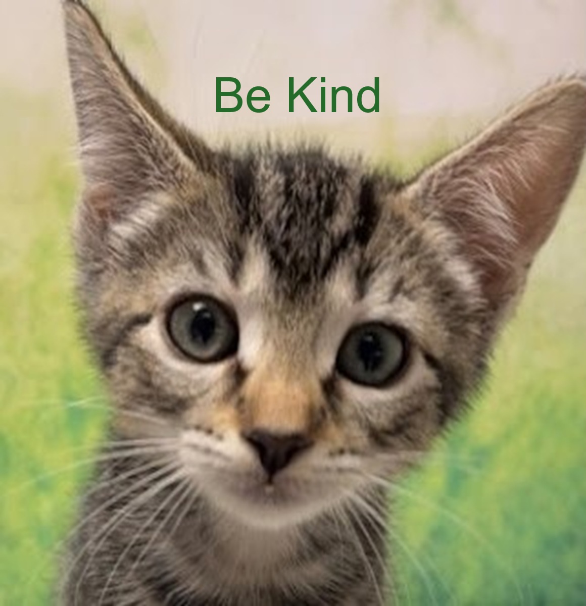
Seriously? It’s a snapshot of a kitten with two words typed at the top that have only a tenuous relationship to the photo. There’s not much more than that to critique. If you’re 12 years old, it’s a start — barely. I don’t mean to be unkind, but you need to aim for something a little more interesting.
2 Likes
Two legible words, on a not-busy background of a decent photograph – not much for critique.
The only editable element is the typography. Work on that.
Still, does not look like a paying job.
2 Likes
I showed the wrong poster. It was the unfinished one. Here is the
address for the finished one.
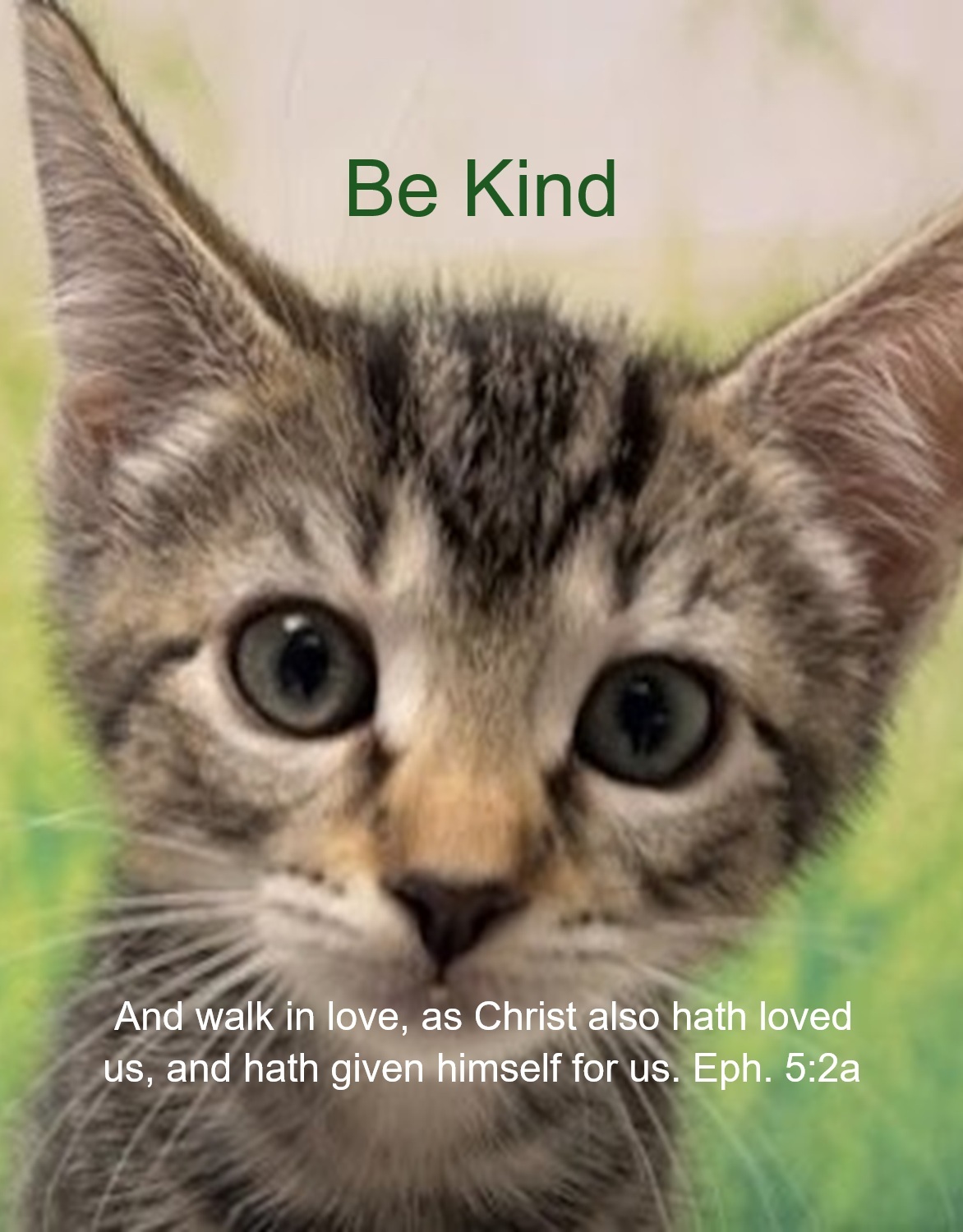
Thank you for being so straight forward and honest.
Philip
1 Like
OK. What you’re aiming at makes more sense now.
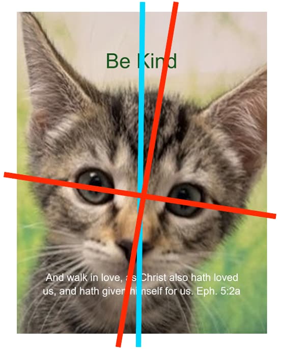
Although it’s a cute kitten, it’s not a great photo — at least in terms of it fitting in well with the layout. The headline and the text are horizontally centered (blue line). However, the kitten’s head and body are angled (red lines), which throws a skiwompus kink into the otherwise centered symmetry.
As an aside, have you ever heard of the rule of thirds for photography? It’s not a strict rule, but it helps to compose photos by forcing the photographer (or the designer) to think in terms of compositional frameworks that provide an underlying structure to the photo.
Another problem is your typography. First, you’ve used a generic typeface on a poster that demands something a little more interesting.
In addition, the headline is way too small. It needs to dominate the space rather than look as though it’s been placed there as a hesitant afterthought.
The scripture at the bottom also warrants more visual care and prominence. The current placement causes it to get lost in the visual clutter. You could help remedy this by making the text larger and bolder or using a different, less generic typeface and possibly darkening the bottom of the photo slightly to provide more visual contrast.
If it were me, I’d start with a photo that doesn’t have the problems I mentioned, then go from there with adding better, more interesting, and more visually aggressive typography.
4 Likes
This topic was automatically closed 365 days after the last reply. New replies are no longer allowed.