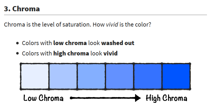
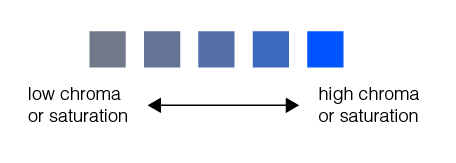
I would consider what they’re showing on the example as “low chroma” as a “tint” or a high value rather than low chroma or desaturated (although I guess technically it is less saturatrated, but it’s not a very good example).
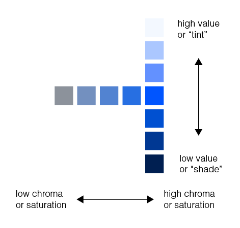
Have redrawn the diagrams the way I understand they should be:
Chroma is the purity of colour. High chroma has no black, white or gray. If you add either of these it affects the chroma as a reduction. It’s like a saturation, but it’s not really the same thing. If you are looking at Chroma, you’re looking at the comparison of the brightness to white.
Brightness of a colour is how intense the mix is with the hue. A hue of light is when the two primary light colours are combined, whether that’s a + or a - combination.
In essence, what you’re reading looks like a bit of rubbish thrown together by someone.
That whole thing of girls and boys with blue and pink is garbage. Pure shite.
Traditionally boys were dressed in pink and girls in blue. It was only mid 20th century when the colours were flipped around post World War 2.
Here’s an interesting fact, some women have more cones in their eye than men, allowing them to see the colour pink in a completely different way than we mere men can ever view it, not only pink, but it’s one of those colours that is derived from hue (mixing of primary colours) as pink doesn’t have a unique space on the spectrum.
Does it really make a difference what these things are called?
Like many things in this field, different people in different parts of the world call things by different names. I can’t remember of ever being asked or needing to know the difference between a shade or a tint or value or between chroma or vibrancy or hue or whatever. Most designers seem to agree on what saturation means, but that’s about it.
On the very rare occasion when I’ve used some of these terms, the person I’ve been talking to hasn’t known what they mean, which makes them of somewhat limited usefulness in my vocabulary.
The graph you illustrated in the end is correct. It would have been nice if your text used a 3 dimensional gamut or color space instead of these linear models.
The only part that you’re a bit wrong in, is where you use the word “hue”.
Hue refers to the varying wavelength of light reflected back to the viewer. Or combination of wavelengths for that matter. For example blue vs purple - the viewer’s eyes pick of the broad/wide wavelength of red in the purple, while the blue lacks that wavelength altogether. Therefore the hue is different.
To reference the blue color swatches in your example, they all have the same hue. The same wavelength is present in all. What differed is the intensity of light.
The same way your blue shirt may appear nearly black when you’re walking about at night, but under the mid day sun, it’s remarkable vibrant
@Just-B you’re totally right about the limited practicality of these terms, however for the sake of understanding the aforementioned article, I want to understand what’s being referenced. It may sound like I’m talking semantics, however I think there’s a difference between what’s being said and what’s being shown and I want to check I’m not alone in this understanding.
So does that mean that “chroma” and “saturation” essentially refer to the same thing and thus this diagram probably isn’t the best way to illustrate that point?
You’re correlation between chroma and saturation are correct.
However your model doesn’t depict your understanding quite so well. Unless your model isn’t displaying as you intended it, but it looks as though you’ve started from a neutral gray and drifted into a pure blue.
Although the blue wavelength is, in fact, increasing in chroma, you’re also changing in hue at the same time.
Black or gray objects absorb all wavelengths of color, while white objects reflect all wavelengths back to the viewer.
So starting with a gray would mean you started with the presence of all wavelengths and two of the three disappeared to reveal blue alone.
Have you touched on Delta-E variances yet? It’s easier to explain your model numerically. For example you could have a value in place that would explain the change in color from gray to blue. There would multiple values actually, for each color present.
I’m only a novice with color analytics, and my experience and training are print industry specific. A master analyst could recreate your graph visually just from the numbers/data alone. Most would tell you that without those numbers, the swatches hold no relevance - they’re simply something colorful to look at.