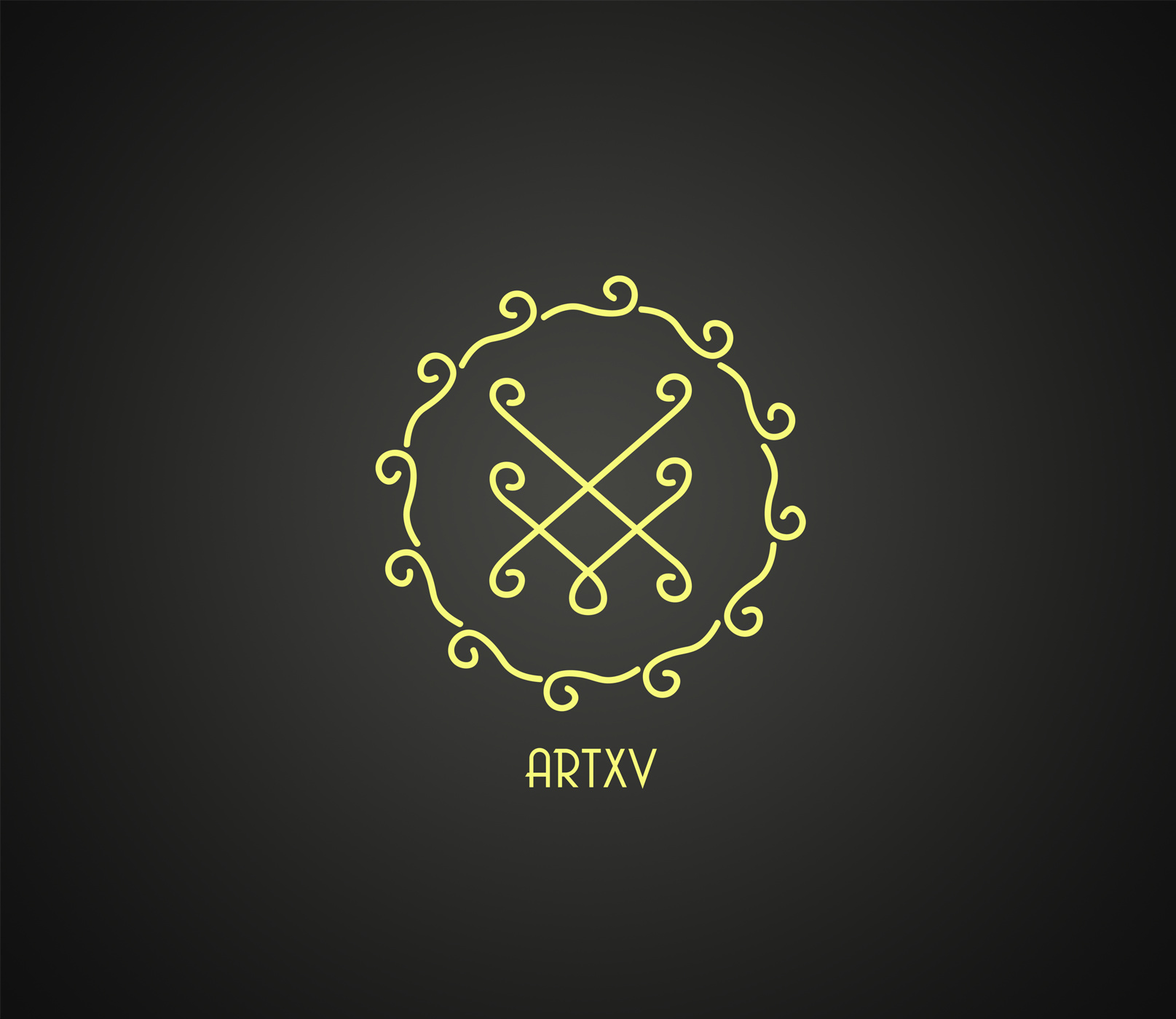
I designed 2 logos for my art page on instagram. I tried something simple without using common stuff for this like pencil, pen, paper etc. What do u think, which is better and what to change?
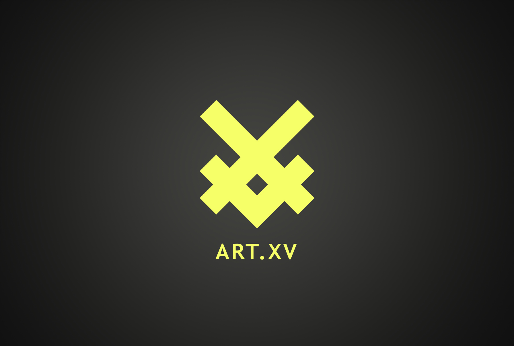
The stronger is currently the better of the two.
Would like to see the curly one with a slightly heavier line weight or maybe a varied weight line, and sans the circle border.
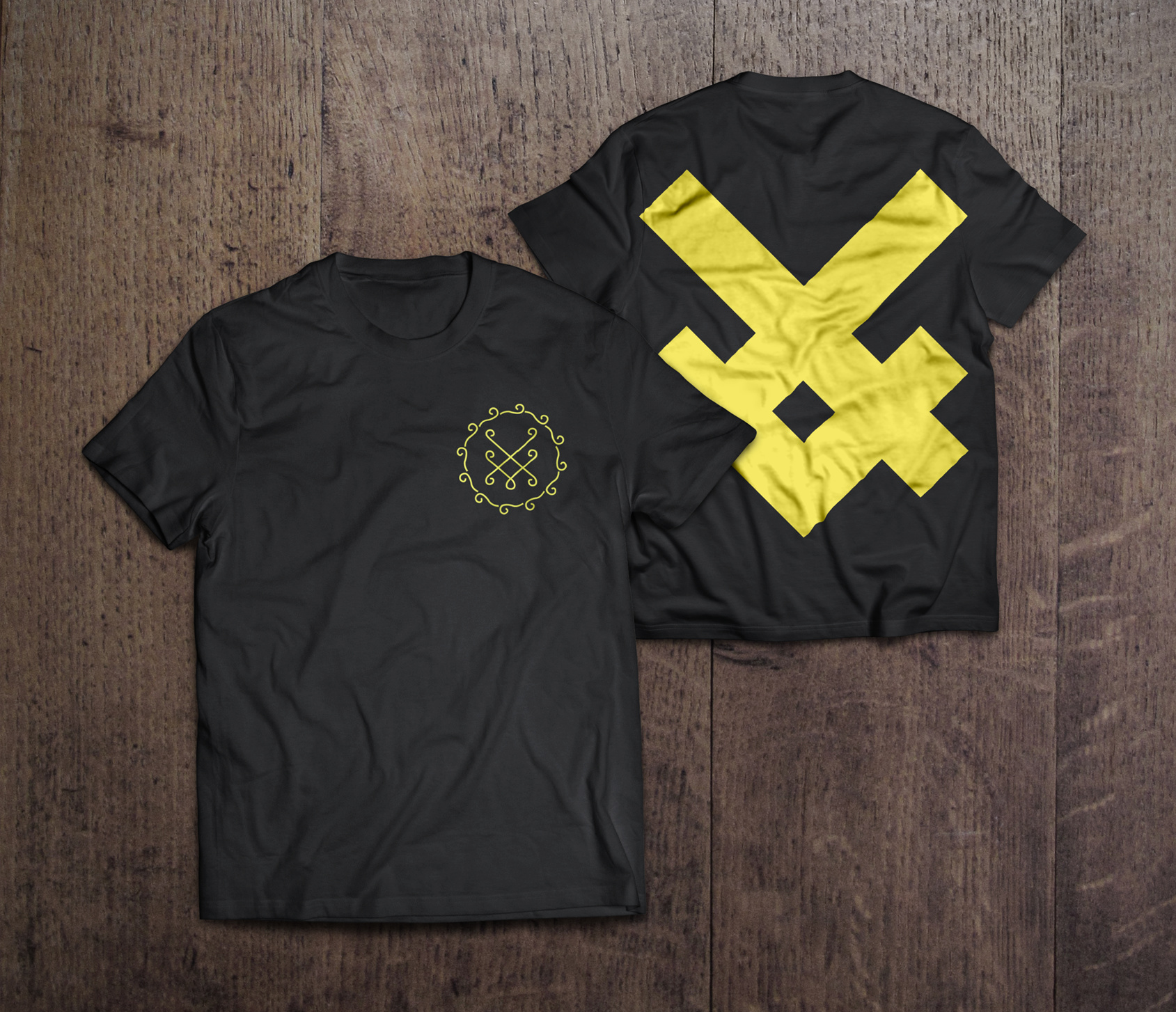
Very clever combination.
1 Like
Great branding and use of shape on the UV logo variations. Very unique style.
1 Like