Hi there!
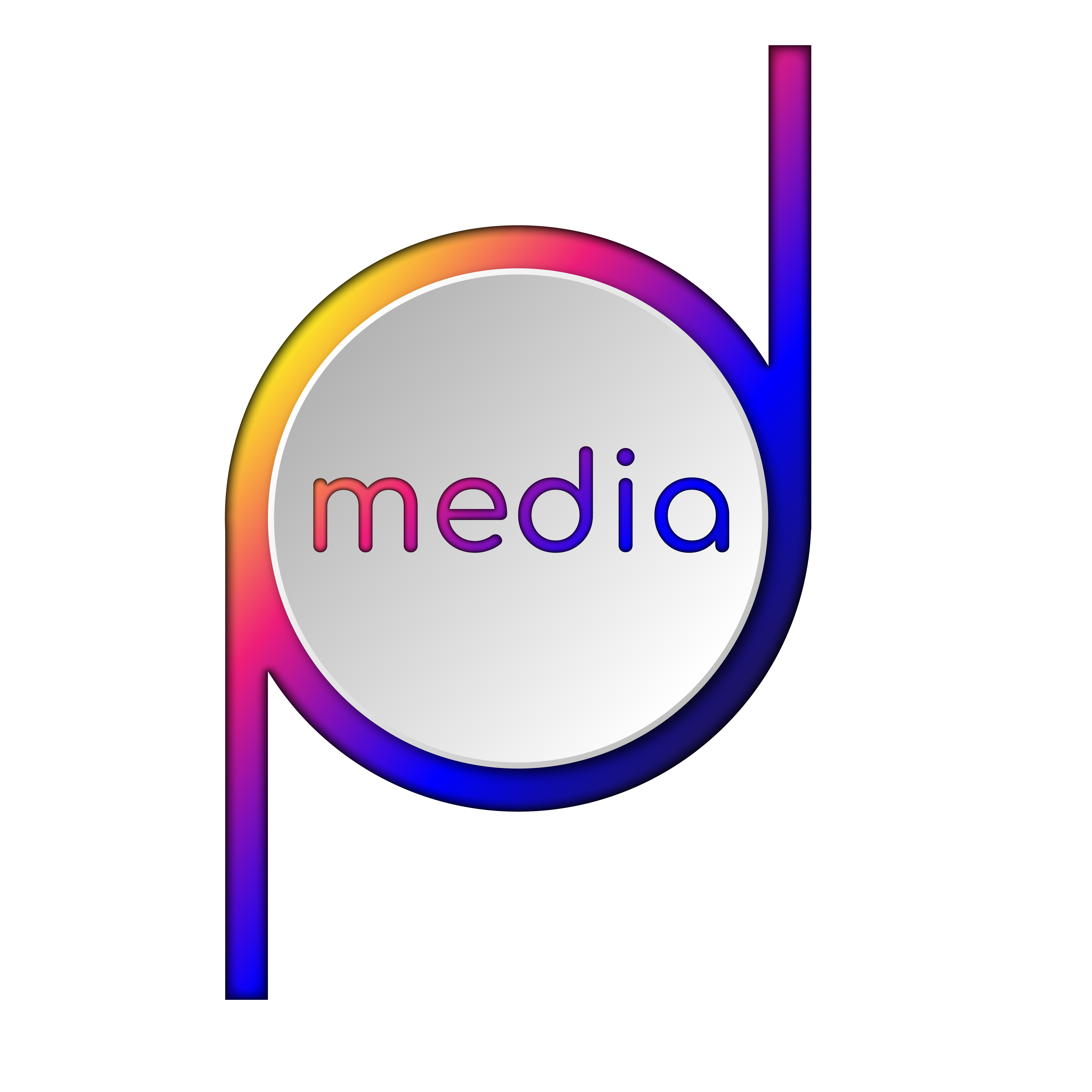
I need your comments on this logo. It is for a small company PD Media which creates short video for different needs. Thank you <3
Hi there!
I need your comments on this logo. It is for a small company PD Media which creates short video for different needs. Thank you <3
At smaller sizes do you read it ok?

i guess i should put ‘media’ outside of the ‘pd’ symbol
Are you ever going to try to print that? Not happening. At least not in the way you imagine.
What does the single color version look like?
It’s a good online/digital version
Really need to consider print/fax/email/etc.
Different types of print - or embroidery for t-shirts etc.
One colour version - two colour versions
It’s ok to keep the text on the inside - but perhaps for smaller versions it goes without text - or with text on the outside.
As far as the logo goes - I would say that it looks more like POD than PD.
Hard to distinguish the P and D as separate entities.
I don’t dislike it - but it could be better.
The name of the company is Media? While I like the P and D combination (even though I think it’s a bit on the skinny side…) it doesn’t read as PD Media. You may have to consider separating the bug from the name.
Hmm … I wonder why.
No idea ![]()
I glanced at your image and read “media.” Then @Smurf2’s post caught my eye, and I looked at the smaller version. I didn’t see the pd until I read your post.
Aside from the legibility issues, I get the distinct impression that you’re relying on gradients and inner glows rather than a solid concept. If I were working on a logo for a company with the initials p d, a monogram like this is an obvious direction and one that I would explore, so I’m not faulting you for considering this. But how hard did you push this? It’s not a terribly interesting p d combination which makes me think you went with the low hanging fruit and then started throwing on the effects.
My suggestion is that you spend a lot more time pushing this concept. I’m sure there is a more unique solution out there that won’t rely on the effects to make it interesting.
dark blue
thank you very much!
That shape doesn’t read as a pd. Also the negative space it creates with those ascenders and descenders is going to be a pain when placing the logo.
If you use some sort of stylized PD as a logo, that’s great, but you still need to spell out the entire name of the company, as in PD Media. I don’t think obfuscating the name of the company in some sort of hybrid logo/text treatment is anything but a hindrance to clarity.
Never be afraid to scrap a logo and start over. Some of the best artists will go through 20 different designs before they choose one that works and most importantly pleases the clients needs.
Its only when we try another design, and another design, that we find that our first few designs were so subpar. But when we had only designed one or two concepts in the beginning, they actually look good to us. It’s like we don’t know better until we do better. Keep at it!
Thank you very much! Actually I just started working as a designer, so your words are highly needed to be heard.